Chinese Checkers [Quenched] May '07 re-opener?
Forum rules
Please read the Community Guidelines before posting.
Please read the Community Guidelines before posting.

-
sully800

- Posts: 4978
- Joined: Wed Jun 14, 2006 5:45 pm
- Gender: Male
- Location: Bethlehem, Pennsylvania
He had two other backgrounds I believe- the plain black first attempt and the purple-ish one with a bit of texture.reverend_kyle wrote:every other background you had was better.
I like this background far better than either of those, and I think most people agree. It's also awesome that he drew the colors for the continents from the background itself in some cases. If we went back to the purple background or old continent colors when you said it was final forge ready weeks ago, I think it would be a huge step backwards.
Also- the marbles look very nice but not with the current layout. I think they would look good if you tried to make it look like a table top, but since its more of a tapestry/painting I don't think they fit.

agreed... as i said, i think i hate them myself. but it took so long to figure out how to make something look more or less 3D in photoshop i had to at least post them.
it's been said that the board should be more "chinese checkerish" but i'm not sure how to address this. I really like the background, so if there's something else I can add that works with the theme i'm all ears.
otherwise... what happens next?
it's been said that the board should be more "chinese checkerish" but i'm not sure how to address this. I really like the background, so if there's something else I can add that works with the theme i'm all ears.
otherwise... what happens next?


-
Guiscard

- Posts: 4103
- Joined: Fri Dec 08, 2006 7:27 pm
- Location: In the bar... With my head on the bar
The background is fine in my opinion but the marbles look like sweets... mmm... actually maybe leave them on  joke
joke
qwert wrote:Can i ask you something?What is porpose for you to open these Political topic in ConquerClub? Why you mix politic with Risk? Why you not open topic like HOT AND SEXY,or something like that.
-
sully800
- Posts: 4978
- Joined: Wed Jun 14, 2006 5:45 pm
- Gender: Male
- Location: Bethlehem, Pennsylvania
Well I'm in favor of the current background over plain black any day.
Also, something I think could use some work is your title. It's rather bland and doesn't stand out at all from the instructions below it. It looks alright but I don't think its up to par with the rest of the graphics you've created.
Also, something I think could use some work is your title. It's rather bland and doesn't stand out at all from the instructions below it. It looks alright but I don't think its up to par with the rest of the graphics you've created.
-
AndyDufresne

- Posts: 24919
- Joined: Fri Mar 03, 2006 8:22 pm
- Location: A Banana Palm in Zihuatanejo
- Contact:
i think the riskopoly map thats being made is using the table background idea, so keep the current background to make things different.
i really like andys idea though of adding depth to the army circles.
i really like andys idea though of adding depth to the army circles.
Do you need an excuse to have a war? I mean, who for? Can't you just say "You got lots of cash and land, but I've got a big sword, so divy up right now, chop chop."
Terry Pratchet
Terry Pratchet

I don't necessarily need to make it more chinese-checkerish... rather, it was a suggestion thrown at me without any specifics.AndyDufresne wrote:If you really want to try to make it perhaps more 'chinese-checkerish', and play with visual and style...consider adding depth to each of the army shadow 'holes', like a real gameboard would have.
My original intent was to make the map look more like the metal game surface I played on as a kid, but the feedback i received pushed it further and further away from that until i arrived on what we currently have, sans silly marbles. I can go back to trying to add depth to the spaces, but it makes the army circles busier - the feedback seems to point toward simple army circles.
There have been voices asking to to go back to the original look all along... I'll change to poll.
I tend to agree... it's not work that I think will pay off, such as the time that went into making a marble.sully800 wrote:Actually, it probably wouldn't be worth your time to add depth to the circles since they will just be covered up by numbers anyway. .
I hope the new poll will put the question of new v. old background to bed, one way or another.
-
gavin_sidhu

- Posts: 1428
- Joined: Mon May 22, 2006 6:16 am
- Location: Brisbane, Australia
sure:gavin_sidhu wrote:can you post both images so i know which one is which for the poll plz.
original black version; in all fairness this is an early version that would undergo much improvement before finally being used:
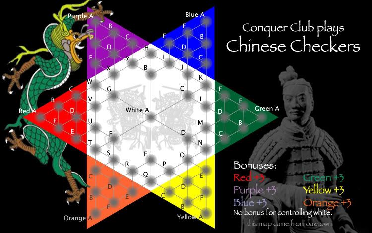
latest version with painted background:
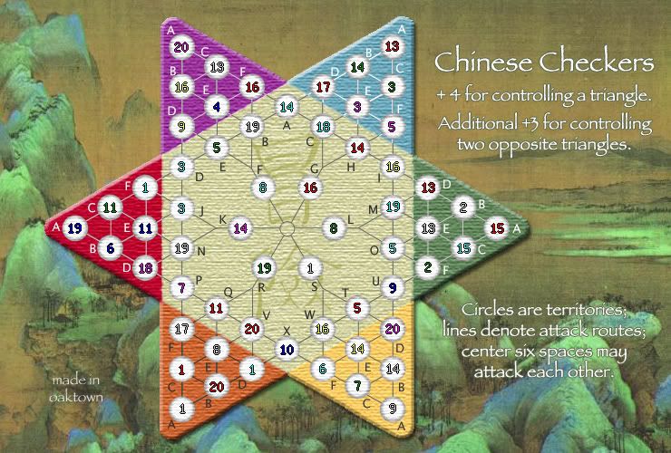
Last edited by oaktown on Tue Feb 06, 2007 10:43 pm, edited 1 time in total.

-
gavin_sidhu
- Posts: 1428
- Joined: Mon May 22, 2006 6:16 am
- Location: Brisbane, Australia
depth
You don't have to spend any more time... just use the marble you already made. Flip the marble image 180 degrees and switch it to grayscale... there you have it, circles with depth. I'd like to see one; it might look good.oaktown wrote:I tend to agree... it's not work that I think will pay off, such as the time that went into making a marble.sully800 wrote:Actually, it probably wouldn't be worth your time to add depth to the circles since they will just be covered up by numbers anyway. .
But do it on the newer map! We've moved past the black background.
-
previsualconsent

- Posts: 39
- Joined: Mon Nov 20, 2006 8:53 pm
OK, that poll should ne the end of any efforts to bring back the original black background. Here's what I'm working on...
Changes:
-more "chinese" looking font, and text no longer in white
-moved map to the left 20 pixels to give text more space; this will require reworking the coordinates, but whatever
-lost my marbles (that happens to you in this forum)
-included 3 options for army circles, which are as follows; 1. old white circles, as per purple triangle, 2. shadowed 'depth' circles, as per red triangle, 3. softer version of originals, as per green triangle.
I'd like feedback on the circles. Adding depth to the circles, as per my original intent, was recently suggested by Andy and others. Now that I've done it, I feel that the new look map looks better flat, as if the board is a woven mat. With that in mind I tried simply softening the existing army circles to match a light tan from the center of the board, and made the text the same color. This eliminates all white from the map. I think this may be the way to go, but tell me if you disagree.
And please ignore the fact that many army counts are off - I just dropped the numbers on to give you a sense of what it would look like.