Testosterone VS Estrogen (v18)
Moderator: Cartographers
Forum rules
Please read the Community Guidelines before posting.
Please read the Community Guidelines before posting.
-
mattosaurus

- Posts: 73
- Joined: Thu Feb 26, 2009 1:38 pm
- Gender: Male
- Location: North Carolina
Re: [Poll]Testosterone VS Estrogen (v16,17)
So I got the poll thing fixed, so here's the poll that I was trying to do earlier.

Re: [Poll]Testosterone VS Estrogen (v16,17)
Nice work on the bonus descriptions, just what I had in mind, and I think they are quite clear. I voted for blue, provided it is muted compared to the male symbol, just as the pink carbons are compared to the female symbol. If you go with the blue, you might consider using grey for the bonus description diagrams, so they don't look too specifically female, though I doubt this would be a problem with any but the very dimmest players.

Re: [Poll]Testosterone VS Estrogen (v16,17)
you have some artistic talent for sure, but what a stupid theme. I can't believe this map is still in production.

Re: [Poll]Testosterone VS Estrogen (v16,17)
That's a bit harsh, isn't it? Let's face it, every map is just a way of illustrating a network of troop circles. Structural depictions of molecules have a useful level of connectedness for this purpose and haven't been used before on CC, so they give the map some originality. And once you are using molecules, I think using these two, which are at least perceived to be opposites, does provide a little conflict. So what is so stupid about the theme?
Re: [Poll]Testosterone VS Estrogen (v16,17)
I consider Risk to be a warfare style game - battles. I mean sure it's just networked colored numbers in circles - but if that was the case, why not just have photograph in the background, and some army circles placed randomly on top? For me, the map is a big part of what makes the gameplay fun. I taunt my friends about their weak armies, and if feels good to stack troops on defending borders. I just don't think I could get into a game played on a molocule. Sorry. But like i said, you've got good graphic skills, I just wish you would have applied them to a georgraphic map.
-
mattosaurus
- Posts: 73
- Joined: Thu Feb 26, 2009 1:38 pm
- Gender: Male
- Location: North Carolina
Re: [Poll]Testosterone VS Estrogen (v16,17)
Like Ender516 said, we have tons of geographic maps. What makes this one unique is that its being played on molecules. Every continent is decently represented, (one might say that europe is over represented) we have tons of maps of totally made up places, but this one is unique in the fact that its not just territories made of land. They are atoms, those essential building blocks of life. It makes just as mush sense to me that we fight over that as fighting over a made up territory.
-
Kabanellas
- Posts: 1482
- Joined: Fri Feb 27, 2009 12:21 pm
- Gender: Male
- Location: Porto, Portugal
Re: [Poll]Testosterone VS Estrogen (v16,17)
Mattos, I like more of the Blue version. But I feel like that kind of blue isn't the best - what if it had a little bit more of gray in its composition?


Re: [Poll]Testosterone VS Estrogen (v16,17)
Hmm, I think the Blue is too dark, it doesn't stand out enough from the background
-
Silent Killer

- Posts: 54
- Joined: Wed Apr 30, 2008 5:59 pm
Re: [Poll]Testosterone VS Estrogen (v16,17)
Blue is too dark, hence I chose grey..Echospree wrote:Hmm, I think the Blue is too dark, it doesn't stand out enough from the background
Maybe a different shad of blue is required??

-
mattosaurus
- Posts: 73
- Joined: Thu Feb 26, 2009 1:38 pm
- Gender: Male
- Location: North Carolina
Re: [Poll]Testosterone VS Estrogen (v16,17)
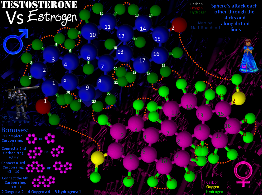
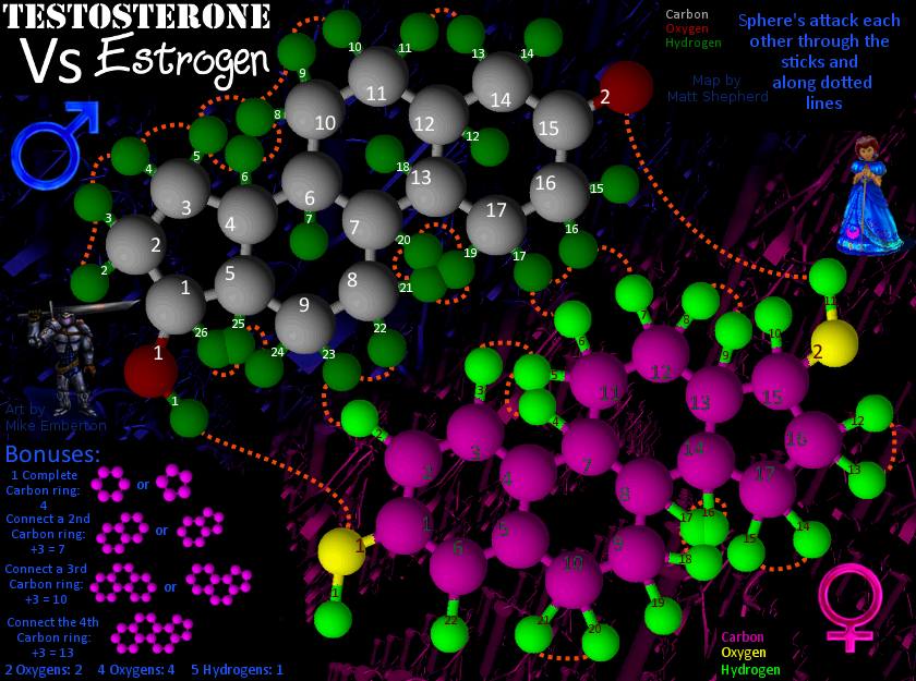
Now I have two versions, one with Gray Testosterone Carbons, and one with blue ones. Let's see which everyone thinks is better.
So I adjusted the way bonuses were displayed to make how they work clearer. These were done by suggestion by Ender516 and I hope they are totally clear now.
- Click image to enlarge.
- Click image to enlarge.
Check out my map in the making: Testosterone VS Estrogen
http://www.conquerclub.com/forum/viewto ... 41&t=85196
http://www.conquerclub.com/forum/viewto ... 41&t=85196
-
Silent Killer
- Posts: 54
- Joined: Wed Apr 30, 2008 5:59 pm
Re: Testosterone VS Estrogen (v18)
Hmmm..
I still prefer the grey if Im honest...
The map looks better balanced with the grey carbons, I think the blue is a little too overpowering and darkens the map too much.
...or maybe its just me!
SK
I still prefer the grey if Im honest...
The map looks better balanced with the grey carbons, I think the blue is a little too overpowering and darkens the map too much.
...or maybe its just me!
SK
Re: Testosterone VS Estrogen (v18)
The blue on pg 1 is better than the one just before SK's post, but even that one may be too dark. That testosterone seems to recede a fair bit relative to the estrogen. Maybe lighten the whole testosterone molecule (blues and greens)?
-
thenobodies80

- Posts: 5401
- Joined: Wed Sep 05, 2007 4:30 am
- Gender: Male
- Location: Milan
Re: Testosterone VS Estrogen (v18)
[Moved]
It would appear that development of this map has stalled. If the mapmaker wants to continue with the map, then one of the Foundry Moderators will be able to help put the thread back into the Foundry system, after an update has been made.
It would appear that development of this map has stalled. If the mapmaker wants to continue with the map, then one of the Foundry Moderators will be able to help put the thread back into the Foundry system, after an update has been made.
-
mattosaurus
- Posts: 73
- Joined: Thu Feb 26, 2009 1:38 pm
- Gender: Male
- Location: North Carolina
Re: Testosterone VS Estrogen (v18)
I worked on this map many years ago. Anyone think it would be interesting to try and revive this map? It has very unique gameplay.
Check out my map in the making: Testosterone VS Estrogen
http://www.conquerclub.com/forum/viewto ... 41&t=85196
http://www.conquerclub.com/forum/viewto ... 41&t=85196


Re: Testosterone VS Estrogen (v18)
Always interested in new maps!mattosaurus wrote:I worked on this map many years ago. Anyone think it would be interesting to try and revive this map? It has very unique gameplay.
Though the map is very dark which makes it hard to read the map. I am struggling to see how the regions connect and to read all of the key information on bonuses and such
plurple is not purple 
-
Swimmerdude99
- Posts: 2680
- Joined: Mon Aug 09, 2010 6:07 pm
- Gender: Male
- Location: North Carolina
