- Click image to enlarge.

[Abandoned] - Zombie Invasion!
Moderator: Cartographers
Forum rules
Please read the Community Guidelines before posting.
Please read the Community Guidelines before posting.
-
natty dread

- Posts: 12876
- Joined: Fri Feb 08, 2008 8:58 pm
- Location: just plain fucked
Re: Zombie Invasion- Version 2.0
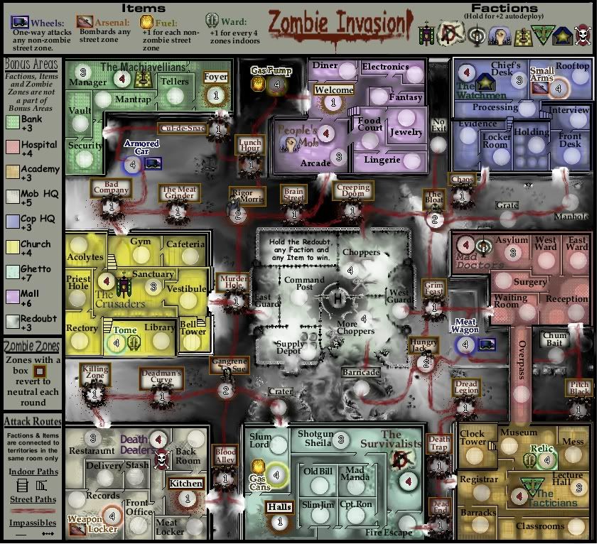
It may seem obvious, but some factions are further from the choppers than others. The Machiavellans must pass 5 terr, whereas The Cruasders and Mad Doctors must only pass one. CCmaps should be as unbiased to the drop as possible.
Also, maybe the starting territory can actually be a decay of -1 since you actually eat, drink etc.
Ps. Redoubt is a really un-obvious name and not immediately recognisable, despite the obvious objective.
Also, maybe the starting territory can actually be a decay of -1 since you actually eat, drink etc.
Ps. Redoubt is a really un-obvious name and not immediately recognisable, despite the obvious objective.
-
natty dread
- Posts: 12876
- Joined: Fri Feb 08, 2008 8:58 pm
- Location: just plain fucked
Re: Zombie Invasion- Version 2.0
Not sure about that overpass thing. Why are two of the factions directly connected when none of the others are? I would think this would put these two at a disadvantage...
However if you're still planning to do a mixed drop then the balancing of the factions probably won't matter that much.
However if you're still planning to do a mixed drop then the balancing of the factions probably won't matter that much.

Re: Zombie Invasion- Version 2.0
Is the redoubt troop decay, or normal territory? If it's decay, the drop shouldn't matter as much.

My Tournaments:
Age of Conquerors [WINNER: br4nd0n2002]
Team Clash [WINNERS: bfunny27 & DBandit70]
Sibling Rivalry [ONGOING]
-
MarshalNey
- Posts: 781
- Joined: Mon Sep 28, 2009 9:02 pm
- Gender: Male
- Location: St. Louis, MO
Re: Zombie Invasion- Version 2.0
While each Faction is a starting point, the map is otherwise open deployment. So, while the Faction buildings have different distances to the center region, that doesn't have any real bearing on how far the players will have to go. The key is to make the map fair on the drop for every player; as for the Factions, I have no interest in making the map symmetrical.00iCon wrote:It may seem obvious, but some factions are further from the choppers than others. The Machiavellans must pass 5 terr, whereas The Cruasders and Mad Doctors must only pass one. CCmaps should be as unbiased to the drop as possible.
That said, you might have a point about the magnitude of the disparity (although I count 4 from the Armored Car, not 5). The map certainly is structured to encourage players to take over a building, but that isn't the only way to go, particuarly if they pursue the Items. I'll take a harder look at it.
I see what you're saying, but I'd prefer for the Factions to have an autodeploy rather than a decay, so that they have a better chance at dominating their building the longer they hold the territory. I might reduce the Autodeploy to +1... we'll see.00iCon wrote:Also, maybe the starting territory can actually be a decay of -1 since you actually eat, drink etc.
Mmmm... oh well.00iCon wrote:Ps. Redoubt is a really un-obvious name and not immediately recognisable, despite the obvious objective.
Well, in particular Mr Benn's comment that the map looked similar to Operation Drug War and that it needed to be 'mixed up a little' spurred me to keep things like the Overpass. I tried to make each building unique, and the overpass is part of that- the only way to go from one building to another without wading through the deadly streets...natty_dread wrote:Not sure about that overpass thing. Why are two of the factions directly connected when none of the others are? I would think this would put these two at a disadvantage...
However if you're still planning to do a mixed drop then the balancing of the factions probably won't matter that much.
Anyway, yeah, as with the above comments about 00iCon's post, I'm not really aiming to balance the Faction buildings- I just need to make sure that the bonus values reflect the difficulty of holding a region. Any thoughts about the bonus values? Do they look reasonable?
I'd like to make it decay, perhaps... but then any player who ended up with those territories would kind of get screwed a bit (although that situation does exist in Dust Bowl). Hmmmm....I was hoping too, though, that with 3 neutral territories needed for victory (two 4's on the Choppers, and one 4 on any Item) that the drop wouldn't be too unfair. You know, I think decay might be a good idea. What does everyone else think?b00kw0rm wrote:Is the redoubt troop decay, or normal territory? If it's decay, the drop shouldn't matter as much.
Btw, I notice you called it the Redoubt. Do you like the name?
Thanks for the quick comments everyone, as always the feedback is extremely helpful.
-
natty dread
- Posts: 12876
- Joined: Fri Feb 08, 2008 8:58 pm
- Location: just plain fucked
Re: Zombie Invasion- Version 2.0
Hmm... I think the overpass thing might fly better if you had another one between 2 other buildings. Say, between People's mob and Watchmen...
As for bonuses. Can you put out some bonus data so I can take a look at it... List each bonus area with number of territories, number of borders to defend and bonus value.
As for bonuses. Can you put out some bonus data so I can take a look at it... List each bonus area with number of territories, number of borders to defend and bonus value.
-
MarshalNey
- Posts: 781
- Joined: Mon Sep 28, 2009 9:02 pm
- Gender: Male
- Location: St. Louis, MO
Re: Zombie Invasion- Version 2.0
I took this from my first post and added the border descriptions (which will go on the first post as well).
Bonus region descriptions:
Redoubt (located in the center):
Bonus: +2
Territories: 6
Borders: 4
Neutrals: 2 territories begin as neutral-4
Killer Neutrals: none
Holding the Redoubt counts as 3/4 of victory objective (6 territories out of 8 required)
ALL other bonus regions contain 1/4 of the victory objective (2 out 8 required)
Hospital (located in the middle of the righthand side):
Bonus: +3
Territories: 7
Borders: 3
Neutrals: 1 territory begins as neutral-3
Killer Neutrals: none
Bank (located at top of the lefthand side):
Bonus: +3
Territories: 5
Borders: 3
Neutrals: 1 territory begins as neutral-3
Killer Neutrals: 1 zombie zone separates 1 territory from the rest.
Academy (located at the bottom of the righthand side):
Bonus: +3
Territories: 7
Borders: 2
Neutrals: 1 territory beings as neutral-3
Killer Neutrals: none
Mob HQ (located at the bottom of the lefthand side):
Bonus: +4
Territories: 7
Borders: 4
Neutrals: 1 territory begins as neutral-3
Killer Neutrals: 1 zombie zone separates 1 territory from the rest
Cop HQ (located at the top of the righthand side):
Bonus: +4
Territories: 8
Borders: 2
Neutrals: 1 territory begins as neutral-3
Killer Neutrals: none
Church (located in the middle of the lefthand side):
Bonus: +5
Territories: 9
Borders: 2
Neutrals: 1 territory begins as neutral-3
Killer Neutrals: none
Mall (located in the middle of the top side):
Bonus: +5
Territories: 7
Borders: 5
Neutrals: 1 territory begins as neutral-3
Killer Neutrals: 1 zombie zone separates 3 territories from the rest.
Ghetto (located in the middle of the bottom side):
Bonus: +5
Territories: 7
Borders: 7
Neutrals: 1 territory begins as neutral-3
Killer Neutrals: 1 zombie zone separates 4 territories from the rest.
-----------------------------
Okay, it's a good thing you asked for the borders. I hadn't quite realized that the zombie zones inside the buildings created quite so many borders....
Looking at this, I see that the Ghetto bonus should be way higher, since every one of its territories is vulnerable. Maybe a +7 or +8?
Similarly, maybe the Mall should be a +6 for having 5 borders.
The Hospital should probably be bumped up to +4.
The Cop HQ might benefit from an overpass, indeed... or maybe bumping it down to a +3 bonus.
I've kept the Redout intentionally low, so players won't pursue it for the bonus but rather for its own sake. I'm also seriously considering putting a -1 decay on all of its terts.
-
natty dread
- Posts: 12876
- Joined: Fri Feb 08, 2008 8:58 pm
- Location: just plain fucked
Re: Zombie Invasion- Version 2.0
Here's what I suggest...
Redoubt: 5
Hospital: 4
Bank: 3
Academy: 3
Mob HQ: 5
Cop HQ: 3
Church: 3 or 4
Mall: 6
Ghetto: 7, maybe 8
Redoubt: 5
Hospital: 4
Bank: 3
Academy: 3
Mob HQ: 5
Cop HQ: 3
Church: 3 or 4
Mall: 6
Ghetto: 7, maybe 8
Re: Zombie Invasion- Version 2.0
Looks good... I like the shadows for the most part, maybe they could be tweaked a bit but I do like 'em...
High Score: 1384 w/ 42% games won
-
MarshalNey
- Posts: 781
- Joined: Mon Sep 28, 2009 9:02 pm
- Gender: Male
- Location: St. Louis, MO
Re: Zombie Invasion- Version 2.0
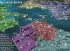
Well, here's an "improved" version, using Natty's suggestions for the bonus areas except for the Redoubt, which I am still keeping undervalued intentionally for reasons mentioned earlier (don't want a victory objective to be too shiny and desireable in its own right)
I'm finding the shadows to look quite obnoxious, I'm trying to soften them up but haven't really found the time (soon hopefully). I'm also planning on adding a couple of "safe zone" territories to the streets on the left side, I've noticed a deficiency there.
Any further thoughts? How about the victory objective, does it look too easy or too hard?
I'm finding the shadows to look quite obnoxious, I'm trying to soften them up but haven't really found the time (soon hopefully). I'm also planning on adding a couple of "safe zone" territories to the streets on the left side, I've noticed a deficiency there.
- Click image to enlarge.
-
natty dread
- Posts: 12876
- Joined: Fri Feb 08, 2008 8:58 pm
- Location: just plain fucked
Re: Zombie Invasion- Version 2.0
You know... The word "chopper" reminds me of motorcycles and big bearded guys riding them... how about you just name it "helicopter storage" or something like that.
-
MarshalNey
- Posts: 781
- Joined: Mon Sep 28, 2009 9:02 pm
- Gender: Male
- Location: St. Louis, MO
Re: Zombie Invasion- Version 2.0
Been sort of busy until today... sorry for neglecting the thread.
Ermmm, I liked using "Choppers" because it had a much more vicious sound than say "Helis" or "Hueys" or "Helicopters".
I do agree, they sound a bit like motorcycles... does anyone else have an opinion? Does the name 'Choppers' add flavor or confusion?
Besides that, does anyone have thoughts about the gameplay of the Items? Are they balanced against each other, and are they too powerful or just right?
Finally, thoughts about the victory objective?
-
Industrial Helix

- Posts: 3462
- Joined: Mon Jul 14, 2008 6:49 pm
- Gender: Female
- Location: Ohio
Re: Zombie Invasion- Version 2.0
No way. In the film Predator when Arnold screamed "get to the chopper!" nobody went looking for a damn motorcycle.natty_dread wrote:You know... The word "chopper" reminds me of motorcycles and big bearded guys riding them... how about you just name it "helicopter storage" or something like that.
For further clarification, make the choppers more visible on the landing pad?
Sketchblog [Update 07/25/11]: http://indyhelixsketch.blogspot.com/
Living in Japan [Update 07/17/11]: http://mirrorcountryih.blogspot.com/
Russian Revolution map for ConquerClub [07/20/11]: http://www.conquerclub.com/forum/viewto ... 1&t=116575
Living in Japan [Update 07/17/11]: http://mirrorcountryih.blogspot.com/
Russian Revolution map for ConquerClub [07/20/11]: http://www.conquerclub.com/forum/viewto ... 1&t=116575
-
Evil DIMwit

- Posts: 1616
- Joined: Thu Mar 22, 2007 1:47 pm
- Gender: Male
- Location: Philadelphia, NJ
Re: Zombie Invasion- Version 2.0
"Choppers" work fine as it is. Anyway, even if they were motorcycles instead, they'd have to be pretty badass motorcycles to be relevant in a zombie attack.
I suspect having the group called "People's Mob" not start in the "Mob HQ" might confuse some people. Aesthetically I certainly don't like it.
At any rate, nice map. I suspect it'd be interesting to play with 5 players, where 3 of the auto-deploys start neutral.
I suspect having the group called "People's Mob" not start in the "Mob HQ" might confuse some people. Aesthetically I certainly don't like it.
At any rate, nice map. I suspect it'd be interesting to play with 5 players, where 3 of the auto-deploys start neutral.


-
MarshalNey
- Posts: 781
- Joined: Mon Sep 28, 2009 9:02 pm
- Gender: Male
- Location: St. Louis, MO
Re: Zombie Invasion- Version 2.0
Heh, okay, good enough for me. Choppers it is.Evil DIMwit wrote:"Choppers" work fine as it is. Anyway, even if they were motorcycles instead, they'd have to be pretty badass motorcycles to be relevant in a zombie attack.
Hmmm, I guess maybe I could give them a bit of color. I hate making them too clear, it messes with the dark, foggy vibe I'm trying. Still, I'll fiddle and see.Industrial Helix wrote:No way. In the film Predator when Arnold screamed "get to the chopper!" nobody went looking for a damn motorcycle.
For further clarification, make the choppers more visible on the landing pad?
Check, I put in "Mob HQ" because I was worried about space, but really that's a lame excuse. How about the original "Mafia HQ"?Evil DIMwit wrote:I suspect having the group called "People's Mob" not start in the "Mob HQ" might confuse some people. Aesthetically I certainly don't like it.
I sorta thought fog of war with 4-6 players might be ideal on this map, it would make things an adventure both indoors and outdoorsEvil DIMwit wrote:At any rate, nice map. I suspect it'd be interesting to play with 5 players, where 3 of the auto-deploys start neutral.
Anyway, thanks for the kind words, EvilD... any other thoughts about the gameplay?
-
Evil DIMwit
- Posts: 1616
- Joined: Thu Mar 22, 2007 1:47 pm
- Gender: Male
- Location: Philadelphia, NJ
Re: Zombie Invasion- Version 2.0
Let's see here...
1. It's odd to me that the Vestibule has an entrance since it's on the second floor
...I had a couple of actual gameplay points but on closer inspection, you seem to have them addressed already. Maybe you can add a couple spots where people can one-way jump out the second-story window? It wouldn't necessarily improve the gameplay but it would be pretty action.
One other thing: This really only might be an issue with some of the legend, but make sure everything can be legible when you shrink it down to small size.
Re: Zombie Invasion- Version 2.0
Something rather striking is the fonts for People's Mob and The Anarcho-survivalists. Peoples Mob could be a bit less goofy, maybe Comic Sans. The Anarcho-survivalists should look a bit more radical.
apart from that i like the floor patterns! good job!
apart from that i like the floor patterns! good job!
Re: Zombie Invasion- Version 2.0
perhaps lighten up the shadows in a few places other than that the map looks good... gameplay looks solid. Definitely change redoubt to something simple, I know you love ur word choice but I don't think it looks good there...
As for the victory condition I have nothing to say cuz I'm not a big fan of objective games but it all looks solid, good job man...
still think you should connect the territories cuz for example I have no definite idea where old bill or front office can attack... just try to make it more clear if you can...
I'm not sure if front office can attack death dealers or the kitchen or weapon locker or if you have to go through the records first or all of them??
High Score: 1384 w/ 42% games won
Re: Zombie Invasion- Version 2.0
Evil DIMwit wrote:"Choppers" work fine as it is. Anyway, even if they were motorcycles instead, they'd have to be pretty badass motorcycles to be relevant in a zombie attack.

My Tournaments:
Age of Conquerors [WINNER: br4nd0n2002]
Team Clash [WINNERS: bfunny27 & DBandit70]
Sibling Rivalry [ONGOING]
-
MarshalNey
- Posts: 781
- Joined: Mon Sep 28, 2009 9:02 pm
- Gender: Male
- Location: St. Louis, MO
Re: Zombie Invasion- Version 2.0
Thanks again for the feedback, Evil! I swear I'm still following the De Bello Gallico (click here to view topic) map... I just don't have anything intelligent to add yet.Evil DIMwit wrote:...
... It's odd to me that the Vestibule has an entrance since it's on the second floor
... .... Maybe you can add a couple spots where people can one-way jump out the second-story window? It wouldn't necessarily improve the gameplay but it would be pretty action.
One other thing: This really only might be an issue with some of the legend, but make sure everything can be legible when you shrink it down to small size.
Check, Vestibule... I see what I did there, sort of became an Escher drawing whoops.
One way attack out of the Bell Tower/Clock Tower? Hee. I LOVE it. Just list them in the legend as "Death From Above" attacks.
As for the legend itself, yeah I'm a little worried about the small map too. I wanted to get the layout situated completely before I fiddle though, it takes me soooo long. I feel like the Legend right now is sort of an afterthought- at least I know I haven't put a lot of effort into it. It needs to be spiced up, obviously, and re-organized for optimal reading and space usage. It's certainly a growing fear that I won't have enough space. The large map is just under the maximum size. I can add a couple dozen pixels on the vertical and that's it.
Gotcha on the fonts. I agree on the Survivalists (did you like Anarcho-Survivalists better?) font, but I'm currently only using the GIMP defaults. As for the People's Mob, hmmmm... the font was meant to be sort of chaotic, but yeah I guess it's a little too goofy.00iCon wrote:Something rather striking is the fonts for People's Mob and The Anarcho-survivalists. Peoples Mob could be a bit less goofy, maybe Comic Sans. The Anarcho-survivalists should look a bit more radical.
apart from that i like the floor patterns! good job!
Thanks for sticking with the map, 00iCon, keep up the good feedback (any thoughts on the gameplay of the items?)
Yeah, I'll have to tone down the shadows I agree. "Redoubt" will get changed in the next map version- although do you have a suggestion for the replacement title? Right now, I'm thinking "Outpost".Top Dog wrote:perhaps lighten up the shadows in a few places other than that the map looks good... gameplay looks solid. Definitely change redoubt to something simple, I know you love ur word choice but I don't think it looks good there...
still think you should connect the territories cuz for example I have no definite idea where old bill or front office can attack... just try to make it more clear if you can...
I'm not sure if front office can attack death dealers or the kitchen or weapon locker or if you have to go through the records first or all of them??
As for the building connections, well... this is a biggie. How many people are having trouble with this? It's important to know. I want to avoid using connector lines for the territories indoors if at all possible.
To answer your specific questions, Top Dog, Old Bill leads only in one direction- to the Halls. The Halls then connects with a bunch of territories. The Front Office leads to Restaraunt. Off to the left, on the Legend, it states that Factions and Items connect to territories in the same room only. It's sort of small and easy to miss. I know that I need to clean up the instructions on this map, I just want to know how bad.
I'm currently doubling the thickness of the wall lines in order to make the indoor impassibles clearer. I very strongly considering adding "doors" to indicate indoor routes and boundaries.
Thanks again for the interest, everyone.
Re: Zombie Invasion- Version 2.0
The only room I have issues with is the Halls. It's very strange how it wraps around... kinda confusing as to what it connects to. The other rooms are fine. 
My Tournaments:
Age of Conquerors [WINNER: br4nd0n2002]
Team Clash [WINNERS: bfunny27 & DBandit70]
Sibling Rivalry [ONGOING]
Re: Zombie Invasion- Version 2.0
Gameplay, eh?MarshalNey wrote:Gotcha on the fonts. I agree on the Survivalists (did you like Anarcho-Survivalists better?) font, but I'm currently only using the GIMP defaults. As for the People's Mob, hmmmm... the font was meant to be sort of chaotic, but yeah I guess it's a little too goofy.
Thanks for sticking with the map, 00iCon, keep up the good feedback (any thoughts on the gameplay of the items?)
The bell tower is definitely an idea worth exploring! It could increase the advantage of some currently disadvantaged areas, i.e. Machiavellans.
Personally I like symmetry in maps, but as this is randomly distributed it should work. Manual placement may be avoided by many players since people will go for the same bonus regions, unless someone decides to attack the 'Redoubt'(name subject to change perhaps?) with all their troops, so I guess its not all bad.
I think only the Beta will tell! Now, to PM some mods and beg for stamps!
-
AndyDufresne

- Posts: 24919
- Joined: Fri Mar 03, 2006 8:22 pm
- Location: A Banana Palm in Zihuatanejo
- Contact:
Re: Zombie Invasion- Version 2.0
This map looks like it could be an interesting play! Not quite my style of map gameplay wise, but I'm usually a sucker for Zombie themes. I'll give this more than a look over soon I hope!
Keep up the good work.
--Andy
Keep up the good work.
--Andy
-
MarshalNey
- Posts: 781
- Joined: Mon Sep 28, 2009 9:02 pm
- Gender: Male
- Location: St. Louis, MO
Re: Zombie Invasion- Version 2.0
Slightly updated version:
Thickened the indoor walls, did some perspective work, smoothed some shadowns and I turned down the army circles a lot to see if the map looked less cluttered.
Oh yeah, changed the "Redoubt" to "Outpost" in lieu of any better suggestions. And changed "Mob HQ" to "Mafia HQ" to avoid confusion as per Evil Dim's excellent observation.
Thoughts?
- Click image to enlarge.
Thickened the indoor walls, did some perspective work, smoothed some shadowns and I turned down the army circles a lot to see if the map looked less cluttered.
Oh yeah, changed the "Redoubt" to "Outpost" in lieu of any better suggestions. And changed "Mob HQ" to "Mafia HQ" to avoid confusion as per Evil Dim's excellent observation.
Thoughts?
-
natty dread
- Posts: 12876
- Joined: Fri Feb 08, 2008 8:58 pm
- Location: just plain fucked
Re: Zombie Invasion- Version 2.0
This is starting to look nice. But could you change that "more choppers" territory... How about just naming them Choppers 1 & 2 ?