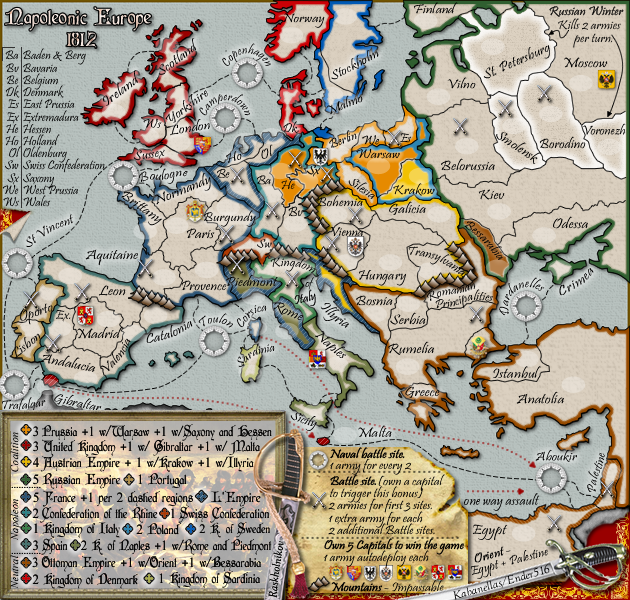
Napoleonic Europe 1812 - Ver 41/44 [Quenched]
Moderator: Cartographers
Forum rules
Please read the Community Guidelines before posting.
Please read the Community Guidelines before posting.
-
Evil DIMwit

- Posts: 1616
- Joined: Thu Mar 22, 2007 1:47 pm
- Gender: Male
- Location: Philadelphia, NJ
Re: Napoleonic Europe 1812 - Version33 [Gp] waiting for GR stamp
I like the cleaner version of the small map, but now that you have more room, take advantage of it. Territories like Bavaria, Hungary, and Paris look weird with their name and number all scrunched up to one side.


-
Kabanellas
- Posts: 1482
- Joined: Fri Feb 27, 2009 12:21 pm
- Gender: Male
- Location: Porto, Portugal
Re: Napoleonic Europe 1812 - Version33 [Gp] waiting for GR stamp
Indeed. If we're gonna stick to the clean version, then I'll definitely have to rearrange things a bitEvil DIMwit wrote:I like the cleaner version of the small map, but now that you have more room, take advantage of it. Territories like Bavaria, Hungary, and Paris look weird with their name and number all scrunched up to one side.


-
Kabanellas
- Posts: 1482
- Joined: Fri Feb 27, 2009 12:21 pm
- Gender: Male
- Location: Porto, Portugal
Re: Napoleonic Europe 1812 - Version33 [Gp] waiting for GR stamp
Yeti, I've tried other fonts for the center legend
(also rearranged things for the cleaner version)
does any one work better than the previous one?
Option 1#
Option 2#
(also rearranged things for the cleaner version)
does any one work better than the previous one?
Option 1#
- Click image to enlarge.

- Click image to enlarge.
-
natty dread

- Posts: 12876
- Joined: Fri Feb 08, 2008 8:58 pm
- Location: just plain fucked
Re: Napoleonic Europe 1812 - Version33 [Gp] waiting for GR stamp
#1 looks really cool but #2 is more legible.


Re: Napoleonic Europe 1812 - Version33 [Gp] waiting for GR stamp
holy shit, this just exploded my eyeballs
I wish there was a way to toggle the territory names on and off and maybe some extra space for a legend somewhere, then this would be a playable map.
- Click image to enlarge.
I wish there was a way to toggle the territory names on and off and maybe some extra space for a legend somewhere, then this would be a playable map.
-
Kabanellas
- Posts: 1482
- Joined: Fri Feb 27, 2009 12:21 pm
- Gender: Male
- Location: Porto, Portugal
Re: Napoleonic Europe 1812 - Version33 [Gp] waiting for GR stamp
still not sure if those are better options than this first one....natty_dread wrote:#1 looks really cool but #2 is more legible.
- Click image to enlarge.

Re: Napoleonic Europe 1812 - Version33 [Gp] waiting for GR stamp
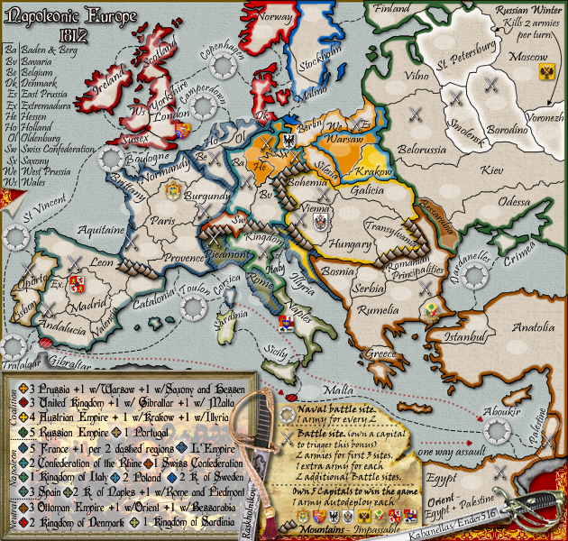
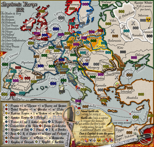
I have to say that at first I was surprised at how far off some of these were. Then I realised that you were working from V.35 of the small map, where you had moved a few things. Is there a V.35 of the large map? I have produced a new version of the XML: Napoleonic_Europe_V1.2.xml, which includes precisely the shifts you have specified above. Based on the way you organized the list, I did wonder if you meant for Paris to be 1 up and 2 left, but I have stuck to the letter of your instructions for now, and nothing is final yet, obviously. If you could make sure the first post has the current images linked to it, I can double check this stuff and maybe post some 88 and 888 tests. I know I spent a long time trying to put those numbers in the centre of those nice opaque white ovals, and it may seem a little proud, but I am surprised that there were any fixes to be made, especially more than a pixel in any direction. If you have time, a set of the latest versions of the maps with those opaque ovals again would be helpful to me. Maybe if you sent them by PM, we can avoid confusing people like natty again, since he thought that we intended to use the maps with those "holes punched in them". He would surely figure it out this time, but no doubt someone new will drop by and wonder.Kabanellas wrote:Ender there are a ‘couple’of numbers that need to be changed.
Changes
Large map:
1 left
• Oporto
• Valencia
2 left
• Yorkshire
3 left and 1 down
• London
Small map:
1 left
• Extremadura
• Valencia
• Sussex
• Denmark
• Naples
• Warsaw
• Serbia
• Krakow
2 left
• Silesia
4 left
• Berlin
5 left
• Switzerland
1 up
• Scotland
• Stockholm
• Malmo
2 up
• West Prussia
1 up and 1 left
• Moscow
• East Prussia
1 up and 1 left
• Paris
1 up and 3 left
• Madrid
1 up and 1 right
• Yorkshire
4 up and 1 left
• Egypt
8 down and 1 right
• Aquitaine

Re: Napoleonic Europe 1812 - Version33 [Gp] waiting for GR stamp
Are you gonna leave the bonus region names off? Hope not. It helps to have em on the map.
Just noticed something. Worth a look at for historical and game play purposes.
A connection between Sardinia and Rome.
Just noticed something. Worth a look at for historical and game play purposes.
A connection between Sardinia and Rome.
This post was made by jefjef who should be on your ignore list.

drunkmonkey wrote:I'm filing a C&A report right now. Its nice because they have a drop-down for "jefjef".
-
army of nobunaga

- Posts: 1989
- Joined: Sat Oct 13, 2007 10:06 pm
- Gender: Male
- Location: www.facebook.com/armyofnobu and Houston.
- Contact:
Re: Napoleonic Europe 1812 - Version33 [Gp] waiting for GR stamp
these guys may have enough names.... this map may be like a really really great movie that the director is forced to cut to get under 2 and a half hours in length.
Maps Maps Maps!
Take part in this survey and possibly win an upgrade -->
https://docs.google.com/spreadsheet/emb ... OHRFZnc6MQ
Take part in this survey and possibly win an upgrade -->
https://docs.google.com/spreadsheet/emb ... OHRFZnc6MQ

Re: Napoleonic Europe 1812 - Version33 [Gp] waiting for GR stamp
this one is more legibleKabanellas wrote:still not sure if those are better options than this first one....natty_dread wrote:#1 looks really cool but #2 is more legible.
- Click image to enlarge.
maybe adding a bit of white glow ?!
De gueules à la tour d'argent ouverte, crénelée de trois pièces, sommée d'un donjon ajouré, crénelé de deux pièces
Gules an open tower silver, crenellated three parts, topped by a apertured turret, crenellated two parts
Gules an open tower silver, crenellated three parts, topped by a apertured turret, crenellated two parts

Re: Napoleonic Europe 1812 - Version33 [Gp] waiting for GR stamp
Yeah - I'm with Pamoa - that one is "easier" to read - not sure it's easy enough though... the other ones just fuzz...
I'm thinking that it's the Italics that are not helping.
C.
I'm thinking that it's the Italics that are not helping.
C.

Highest score : 2297
-
Kabanellas
- Posts: 1482
- Joined: Fri Feb 27, 2009 12:21 pm
- Gender: Male
- Location: Porto, Portugal
Re: Napoleonic Europe 1812 - Version33 [Gp] waiting for GR stamp
That Pristina font is like that... it's not in italic mode. I could try that glow suggestion from Pamoa and see how it looks.....yeti_c wrote:Yeah - I'm with Pamoa - that one is "easier" to read - not sure it's easy enough though... the other ones just fuzz...
I'm thinking that it's the Italics that are not helping.
C.
-
Kabanellas
- Posts: 1482
- Joined: Fri Feb 27, 2009 12:21 pm
- Gender: Male
- Location: Porto, Portugal
Re: Napoleonic Europe 1812 - Version33 [Gp] waiting for GR stamp
updated version - I've added a bit of glow to the pristina font also changed some levels there
I think its quite readable now
I think its quite readable now
- Click image to enlarge.

-
Industrial Helix

- Posts: 3462
- Joined: Mon Jul 14, 2008 6:49 pm
- Gender: Female
- Location: Ohio
Re: Napoleonic Europe 1812 - Version33 [Gp] waiting for GR stamp
You know, i used the font in Option 1 on the small version of 13 Colonies, someone complained they couldn't read it once it was in Beta testing so that might be a good sign.
Sketchblog [Update 07/25/11]: http://indyhelixsketch.blogspot.com/
Living in Japan [Update 07/17/11]: http://mirrorcountryih.blogspot.com/
Russian Revolution map for ConquerClub [07/20/11]: http://www.conquerclub.com/forum/viewto ... 1&t=116575
Living in Japan [Update 07/17/11]: http://mirrorcountryih.blogspot.com/
Russian Revolution map for ConquerClub [07/20/11]: http://www.conquerclub.com/forum/viewto ... 1&t=116575
-
Kabanellas
- Posts: 1482
- Joined: Fri Feb 27, 2009 12:21 pm
- Gender: Male
- Location: Porto, Portugal
Re: Napoleonic Europe 1812 - Version33 [Gp] waiting for GR stamp
Yes I'm dropping that option as well and keeping the Pristina font - I think its cool now.Industrial Helix wrote:You know, i used the font in Option 1 on the small version of 13 Colonies, someone complained they couldn't read it once it was in Beta testing so that might be a good sign.
- Click image to enlarge.
-
porkenbeans

- Posts: 2546
- Joined: Mon Sep 10, 2007 4:06 pm
Re: Napoleonic Europe 1812 - Version33 [Gp] waiting for GR stamp
Kab,
About the legend problem, I really think that it is more the background image rather than the font. With the text over the image, the image is not really legeble anyway, so, why don't you just try using a simple texture instead, like the other legend next to it ?
About the legend problem, I really think that it is more the background image rather than the font. With the text over the image, the image is not really legeble anyway, so, why don't you just try using a simple texture instead, like the other legend next to it ?

Re: Napoleonic Europe 1812 - Version33 [Gp] waiting for GR stamp
I think the lower left legend is fairly legible, even with the image, which admittedly is mostly obscured. Of course, I have been looking at this a long time, so I may be a poor judge.
-
porkenbeans
- Posts: 2546
- Joined: Mon Sep 10, 2007 4:06 pm
Re: Napoleonic Europe 1812 - Version33 [Gp] waiting for GR stamp
I have not, so I can honestly tell you that I can not make out the picture at all.ender516 wrote:I think the lower left legend is fairly legible, even with the image, which admittedly is mostly obscured. Of course, I have been looking at this a long time, so I may be a poor judge.
Re: Napoleonic Europe 1812 - Version33 [Gp] waiting for GR stamp
Oh, I thought the concern was about the legibility of the text. You're right, the picture is almost a lost cause, but I do recognize it as a reproduction of a fairly famous painting of Napoleon and his troops. If you aren't familiar with that, it might be impossible to make out.porkenbeans wrote:I have not, so I can honestly tell you that I can not make out the picture at all.ender516 wrote:I think the lower left legend is fairly legible, even with the image, which admittedly is mostly obscured. Of course, I have been looking at this a long time, so I may be a poor judge.
-
porkenbeans
- Posts: 2546
- Joined: Mon Sep 10, 2007 4:06 pm
Re: Napoleonic Europe 1812 - Version33 [Gp] waiting for GR stamp
The picture is faded out in an attempt to make the text legible. Which it does not quite do, because the text is still not very legible. And now the picture is also unrecognizable. Just nix the picture, and replace it with something that you can see the text over. It might be a nice image, but what good is it if you can't see it ?ender516 wrote:Oh, I thought the concern was about the legibility of the text. You're right, the picture is almost a lost cause, but I do recognize it as a reproduction of a fairly famous painting of Napoleon and his troops. If you aren't familiar with that, it might be impossible to make out.porkenbeans wrote:I have not, so I can honestly tell you that I can not make out the picture at all.ender516 wrote:I think the lower left legend is fairly legible, even with the image, which admittedly is mostly obscured. Of course, I have been looking at this a long time, so I may be a poor judge.
Kab,
If you are stuck on using the picture, You may try this.- Bring the picture back into focus. Make it dark, and use white text over it.
-
natty dread
- Posts: 12876
- Joined: Fri Feb 08, 2008 8:58 pm
- Location: just plain fucked
-
Kabanellas
- Posts: 1482
- Joined: Fri Feb 27, 2009 12:21 pm
- Gender: Male
- Location: Porto, Portugal
Re: Napoleonic Europe 1812 - Version33 [Gp] waiting for GR stamp
ok, I'll try something there.... 
-
Raskholnikov

- Posts: 638
- Joined: Fri Sep 11, 2009 3:40 pm
Re: Napoleonic Europe 1812 - Version33 [Gp] waiting for GR stamp
Kab,
I LIKE the picture. I think the text is quite clear. There MUST be a limit to all this bull. I DO NOT want the pic changed!
R.
I LIKE the picture. I think the text is quite clear. There MUST be a limit to all this bull. I DO NOT want the pic changed!
R.
Re: Napoleonic Europe 1812 - Version33 [Gp] waiting for GR stamp
Frankly, I agree with every statement here, but I'm not as upset. That's probably because I do not have as much invested in this.Raskholnikov wrote:Kab,
I LIKE the picture. I think the text is quite clear. There MUST be a limit to all this bull. I DO NOT want the pic changed!
R.
-
Raskholnikov
- Posts: 638
- Joined: Fri Sep 11, 2009 3:40 pm
Re: Napoleonic Europe 1812 - Version33 [Gp] waiting for GR stamp
Thanks ender. I'm glad I'm not the only one who is of this opinion. And thanks again for all your work on coding. You deserve one of the two map medals for sticking with us on this (the other one goes to Kab, of course. I'll just be happy to see this out of the foundry before it gets totally demolished...)