
Perhaps you could swap out the war tax space with the C. Club space between park place and board walk. That way you would have to go through a -1 army space just to get the zone that gives the most. Plus it would even out the bottom since it isn't worth much to begin with.
I also agree with swapping out one of the warchests on the left side with one of the chances on the top of the board. Another idea is to throw two bills across the top that would connect red and yellow directly plus give them extra spaces to hold. You also might want to consider removing the bills from the orange and pink zones.
Just a thought.
Riskopoly (Board Game) [Abandoned]
Moderator: Cartographers
Forum rules
Please read the Community Guidelines before posting.
Please read the Community Guidelines before posting.


-
AndyDufresne

- Posts: 24919
- Joined: Fri Mar 03, 2006 8:22 pm
- Location: A Banana Palm in Zihuatanejo
- Contact:

Not sure if this has been suggested yet...
when i play monolopy (excuse the english version street names) there are 'chance' and 'community chest' cards which state "Advance token to Pall Mall" or "... to Trafalgar Square" or "... to Mayfair".
perhaps you could link the chance and warchest territories to the equivalent red, blue and pink territories on riskopoly as a way to scale the continent bonuses?

I considered adding some cards "turned up" so you could read the directions on them ("advance to go", for example, or "pay CClub dues")... this would be in place of some of the money (as we aren't looking for more territories so much now).demigod wrote:when i play monolopy (excuse the english version street names) there are 'chance' and 'community chest' cards which state "Advance token to Pall Mall" or "... to Trafalgar Square" or "... to Mayfair".
But, this would be another confusing jump between two non-touching spaces; in play testing the map just didn't need more ways to get around the board. It would also require a bit more work (I don't want to steal the little monopoly man image, so I'd have to design more graphics).
There are already so few protected spaces... only place I could see using it would be "advance to park place" or "move to north carolina"... which seem redundant as both are right next to chance/chest spaces.

-
Sargentgeneral

- Posts: 379
- Joined: Thu Nov 16, 2006 11:55 pm
- Location: On Conquerclub, duh!

Sorry for the long delay... real life happens!
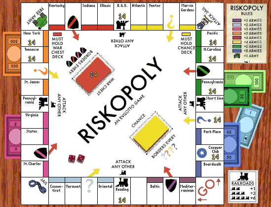
Changes in this version:
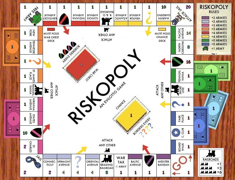
-War Chest deck changed to red and part of red continent.
-Chest/Chance spaces swapped btw. Red/Orange.
-Free Army tank colored green so it is clearly not required for the red continent.
-Arrows clarifying that Chance spaces can attack Chance deck, War Chest spaces can attack War Chest deck... any ideas to improve these?
I realize that the army numbers got all dark on this image (jpg compression), which I'll fix next time... been working on the small map which is taking a long time trying to fit the text into the smaller spaces and keep readable.
-
spinwizard
- Posts: 5016
- Joined: Sun Dec 10, 2006 9:52 am


Bottom left arrow needs to be more accurate I think - it seems to be missing...
Other than that I think the changes you've brought in have pretty much completed the map... this is looking ace.
Are the Chest and ? squares aren't actually needed for the continents that they are in? (You could make this clearer by perhaps putting a number in the "Rules" square signifying number of territories?! - Although having written that I don't like it either!!!)
C.

Highest score : 2297

Can I just suggest you make the title a bit more interesting. It looks a bit boring at the moment. A different font perhaps? The CC star in the middle O?
I haven't really paid this thread much attention, because a Monopoly map doesn't hold much interest for me. I like what you've done with it though, and while you can't do much with the graphics, maybe just tidying them up a bit would improve the look of the map. For instance the colours of the notes, not sure how well they're going to show up some numbers. Would you consider putting army shadows on things like the notes and the Chance/War Chest card decks?
I haven't really paid this thread much attention, because a Monopoly map doesn't hold much interest for me. I like what you've done with it though, and while you can't do much with the graphics, maybe just tidying them up a bit would improve the look of the map. For instance the colours of the notes, not sure how well they're going to show up some numbers. Would you consider putting army shadows on things like the notes and the Chance/War Chest card decks?
shaping up nicely...
what about some 3d dice on the board?
what about some 3d dice on the board?
my new site - http://www.spritestitch.com/ - A video game craft weblog...
The notes/bills already have huge army shadows in the middle! I'll try lightening those center areas of each bill. But the army numbers came out dark in this image, the army colors are usually more readable.KEYOGI wrote:For instance the colours of the notes, not sure how well they're going to show up some numbers. Would you consider putting army shadows on things like the notes and the Chance/War Chest card decks?
Army shadows might be OK on the card decks...
We are going to do a poll for the name as soon as I get the old poll cleared. If we decide to keep "Riskopoly" I can play with the logo (like adding CC stars in the "O"s). Any last minute name suggestions? Get them in now.
Current Name Options: Riskopoly, Conqueropoly, Hostile Takeover, Pwnopoly, Monopolonquer (Club)...

i'd say no army shadows on the spaces, but perhaps something to make them stand out on the bills/cards... the counts kinda get lost there.
Good idea putting an arrow from the chance/com chest spaces to direct them to the stacks. They're big and they might start to bug me the more I look at them, but something is necessary.
Are you saving the jpegs with the least possible compression? Some areas come out looking a bit grainy.
Good idea putting an arrow from the chance/com chest spaces to direct them to the stacks. They're big and they might start to bug me the more I look at them, but something is necessary.
Are you saving the jpegs with the least possible compression? Some areas come out looking a bit grainy.

-
AndyDufresne
- Posts: 24919
- Joined: Fri Mar 03, 2006 8:22 pm
- Location: A Banana Palm in Zihuatanejo
- Contact:
Per cartographer request, old poll results:
How should the continent bonuses be assigned?
Increasing clockwise (like the rents in Monopoly), Blue worth the most (Park Place & Boardwalk).
64% [ 33 ]
Based on number of territories and borders, Orange being worth the most.
35% [ 18 ]
Total Votes : 51
--Andy
How should the continent bonuses be assigned?
Increasing clockwise (like the rents in Monopoly), Blue worth the most (Park Place & Boardwalk).
64% [ 33 ]
Based on number of territories and borders, Orange being worth the most.
35% [ 18 ]
Total Votes : 51
--Andy
Here is the current state of the small map:
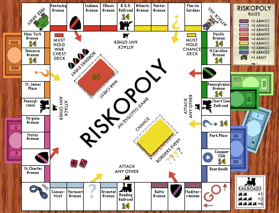
I haven't fixed the font under the "rules" yet or in the corner spaces... and I think I can still clean up the rest a bit more. Maybe drop all of the "Avenues" just to simplify?
Also added the dice, which I mentioned at the top of the thread (thanks for the reminder, johloh!). I also lightened the center of the bills/notes (which I'll do on the large map too); I think the center of the green $20 could go even lighter.
I'll wait a day or two before starting the "name" poll in case anyone has any last minute suggestions.
-
Guiscard

- Posts: 4103
- Joined: Fri Dec 08, 2006 7:27 pm
- Location: In the bar... With my head on the bar
I see what you mean about the small text. Could you not try using an abbreviation (e.g. Indiana Av.) to free up space? Might help a bit...
qwert wrote:Can i ask you something?What is porpose for you to open these Political topic in ConquerClub? Why you mix politic with Risk? Why you not open topic like HOT AND SEXY,or something like that.
The "Avenues" aren't the constraint (but like I said, maybe just drop them all together to clean it up)... it is names like "Kentucky" and "Vermont" and "Pennsylvania" that are forcing the font width. I'd hate to have to split "Kent-ucky" to two lines.Guiscard wrote:I see what you mean about the small text. Could you not try using an abbreviation (e.g. Indiana Av.) to free up space? Might help a bit...
This is the absolute smallest the map can be, I think... but it is 550 wide, so if everyone thinks it is too small we could move it up to the 600pixel max.
What happens if you have Yellow Army on Chance - and Red Army on Chest... you might not be able to see the army amounts... You might have to put a hole in the decks so that they can be visible?
I like the small image - Font is just big enough and it's beautifully sharp...
C.
PS Prefer Riskopoly.
PPS Have you got XML yet? Can I give you a slight tip I've been given - name all of the Railroad bonuses the same name - that way you only get one log per bonus for them - instead of getting log bloat.
Highest score : 2297
