
ok.
anything else, or can this get stamped and moved to final forge?
I really want to start beta test the XML.
The CUBE
Forum rules
Please read the Community Guidelines before posting.
Please read the Community Guidelines before posting.
-
Industrial Helix

- Posts: 3462
- Joined: Mon Jul 14, 2008 6:49 pm
- Gender: Female
- Location: Ohio
Re: The CUBE - Attack in 3D - ready for graphics stamp?
Hmm... looking at this map for the first time in a while. I can finally see the cube! Major improvement!
The font, however, is a tad on the small side.
Also, do you have an updated small map somewhere?
The font, however, is a tad on the small side.
Also, do you have an updated small map somewhere?
Sketchblog [Update 07/25/11]: http://indyhelixsketch.blogspot.com/
Living in Japan [Update 07/17/11]: http://mirrorcountryih.blogspot.com/
Russian Revolution map for ConquerClub [07/20/11]: http://www.conquerclub.com/forum/viewto ... 1&t=116575
Living in Japan [Update 07/17/11]: http://mirrorcountryih.blogspot.com/
Russian Revolution map for ConquerClub [07/20/11]: http://www.conquerclub.com/forum/viewto ... 1&t=116575
Re: The CUBE - Attack in 3D - ready for graphics stamp?
I'm glad you like it! I owe natty a lot.
I'll fix the updates for the version 50 small map next. (I made one for version 40 on page 37.)
The region font is small but you also have the region name system explained in the map legend so I think it should be ok.
I'll fix the updates for the version 50 small map next. (I made one for version 40 on page 37.)
The region font is small but you also have the region name system explained in the map legend so I think it should be ok.
-
porkenbeans

- Posts: 2546
- Joined: Mon Sep 10, 2007 4:06 pm
Re: The CUBE - Attack in 3D - ready for graphics stamp?
I have not looked in on this map in quite some time. I am happy to see that it has improved greatly. I am kinda liking it. -I suggest that you enlarge the font. 

-
natty dread

- Posts: 12876
- Joined: Fri Feb 08, 2008 8:58 pm
- Location: just plain fucked
Re: The CUBE - Attack in 3D - ready for graphics stamp?
meh, I didn't really do that much... btw sorry I couldn't be of more help recently, but then again it seems you've got this well in hand. Let's hope this goes to FF soon.paulk wrote:I'm glad you like it! I owe natty a lot.


Re: The CUBE - Attack in 3D - ready for graphics stamp?
There does seem to be a movement toward enlarging that font on the orbs. I think its legibility may vary with differing display settings, and I don't see the need to push the envelope on size here: there is room for a larger font, perhaps even the legend font.
Re: The CUBE - Attack in 3D - ready for graphics stamp?
I really don't want to do that because It makes the map very cluttered. Especially on the smaller map.
But of course I will do it if that is the common wish.
But of course I will do it if that is the common wish.
Re: The CUBE - Attack in 3D - ready for graphics stamp?
drool....request for invite to 1st game

There is no fog rule and I am no gentleman.
Robinette wrote:Depends on what metric you use...Kaskavel wrote:Seriously. Who is the female conqueror of CC?
The coolest is squishyg
Re: The CUBE - Attack in 3D - ready for graphics stamp?
- Click image to enlarge.

- Click image to enlarge.

Re: The CUBE - Attack in 3D - ready for graphics stamp?
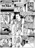
compare above with older version:
- Click image to enlarge.

-
MarshalNey

- Posts: 781
- Joined: Mon Sep 28, 2009 9:02 pm
- Gender: Male
- Location: St. Louis, MO
Re: The CUBE - Attack in 3D - ready for graphics stamp?
I think that some aesthetic will probably have to be sacrificed on the altar of visual health.
What Ender said is reasonable, there really is room on the map for a larger font. I see what you're saying Paulk about clutter, but I don't really get that vibe from the larger font you demonstrated... which is still too small to comfortably see on the small map, unfortunately.
If I had to anticipate complaints about this map from the 'everyday' player, it won't be about graphics but rather confusion about regions. A legible font will help avoid this problem.
True, there is the guide to region names on the side, but in my experience there is no such thing as a superfulously redundant instruction. Say it once, say it again, say it three times- if a player gets it the first time, he/she will be happy... but if a player doesn't get it right away, you'll want those 'extra' tidbits.
Re: The CUBE - Attack in 3D - ready for graphics stamp?
Changed the region font (from 10) to 14 and gave it 66% opacity so it wouldn't be to much in your face.
- Click image to enlarge.

Last edited by paulk on Mon Jul 12, 2010 12:25 am, edited 1 time in total.
Re: The CUBE - Attack in 3D - ready for graphics stamp?
- Click image to enlarge.

Last edited by paulk on Mon Jul 12, 2010 12:26 am, edited 1 time in total.
Re: The CUBE - Attack in 3D - ready for graphics stamp?
I think the best compromise is using the legend font in 10 points size (like on the big map on top of this page) on both the bigger and smaller map, i.e. making the font stay 10 points on the smaller map while the rest of the map is smaller, just like I did with the pixel font (see page 37). 
Nobody else than me that thinks that the pixel font is the way to go? Am I totally alone of preferring it?
Nobody else than me that thinks that the pixel font is the way to go? Am I totally alone of preferring it?
Re: The CUBE - Attack in 3D - ready for graphics stamp?
or even bigger? 
- Click image to enlarge.

Re: The CUBE - Attack in 3D - ready for graphics stamp?
The last version may be a bit too far. You might try upper case letters, but I'm not sure what they look like in this font. I would be okay with the 14 point font at 66% opacity, in upper or lower case. Legible, but, as you say, paulk, not in your face. It may look a little weak and smudgy on the small map.
-
natty dread
- Posts: 12876
- Joined: Fri Feb 08, 2008 8:58 pm
- Location: just plain fucked
Re: The CUBE - Attack in 3D - ready for graphics stamp?
The pixel font looks nice, but you have to remember there are people of all ages playing CC and not everyone has perfect vision - particularly the older folk may have trouble seeing text that small.paulk wrote:Nobody else than me that thinks that the pixel font is the way to go? Am I totally alone of preferring it?
I have to agree with ender, I like the 14px font best.

Re: The CUBE - Attack in 3D - ready for graphics stamp?
I kinda like the font bigger, but the 14 pt font is more than sufficient.
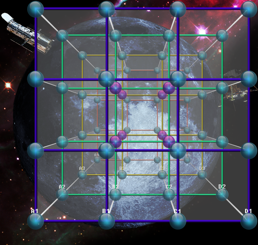
Lets see some numbers on the map, make sure there's no color conflicts and make sure there isn't any problem with color blindness.(I know no colored region/bonuses, so just a formality, I hope)
The little "kill!" in the corner is annoying and pointless. Maybe a little more spacyness added for thematic consistency. Maybe a space shuttle docked off one of the corners? Especially if its off one of the back corners to further show the depth of the third dimension.


-
porkenbeans
- Posts: 2546
- Joined: Mon Sep 10, 2007 4:06 pm
Re: The CUBE - Attack in 3D - ready for graphics stamp?
As promised, here is my illustrated suggestion.
With the moon, Hubble telescope and the Lunar Lander.
- Click image to enlarge.
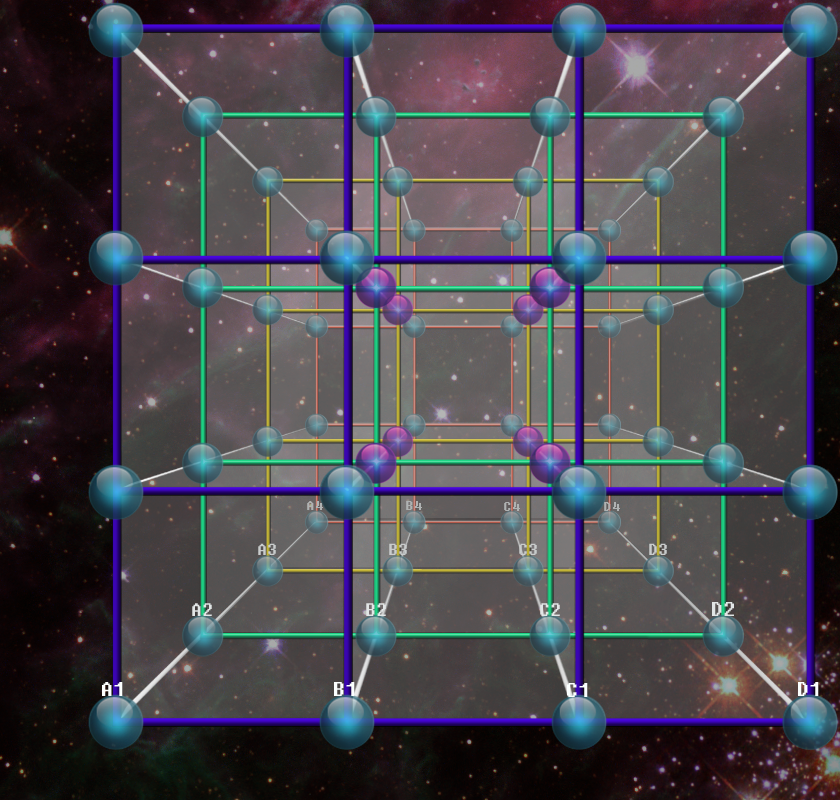
- Click image to enlarge.
-
Industrial Helix
- Posts: 3462
- Joined: Mon Jul 14, 2008 6:49 pm
- Gender: Female
- Location: Ohio
Re: The CUBE - Attack in 3D - ready for graphics stamp?
Because the Moon Lander just floats in space like that...
Pork's is neat in the sense of extreme perspective but its a little conjested in the middle. If you could prove it worked with army numbers and all, then i might sign on.
Pork's is neat in the sense of extreme perspective but its a little conjested in the middle. If you could prove it worked with army numbers and all, then i might sign on.
Sketchblog [Update 07/25/11]: http://indyhelixsketch.blogspot.com/
Living in Japan [Update 07/17/11]: http://mirrorcountryih.blogspot.com/
Russian Revolution map for ConquerClub [07/20/11]: http://www.conquerclub.com/forum/viewto ... 1&t=116575
Living in Japan [Update 07/17/11]: http://mirrorcountryih.blogspot.com/
Russian Revolution map for ConquerClub [07/20/11]: http://www.conquerclub.com/forum/viewto ... 1&t=116575
Re: The CUBE - Attack in 3D - ready for graphics stamp?
Well, during the descent phase, I think the LM did float in space like that.
http://en.wikipedia.org/wiki/File:Apoll ... lumbia.jpg
http://en.wikipedia.org/wiki/File:Apoll ... lumbia.jpg
-
natty dread
- Posts: 12876
- Joined: Fri Feb 08, 2008 8:58 pm
- Location: just plain fucked
Re: The CUBE - Attack in 3D - ready for graphics stamp?
Graphically pork's version looks really nice, but in terms of gameplay clarity paulk's version is way ahead...
-
porkenbeans
- Posts: 2546
- Joined: Mon Sep 10, 2007 4:06 pm
-
porkenbeans
- Posts: 2546
- Joined: Mon Sep 10, 2007 4:06 pm
Re: The CUBE - Attack in 3D - ready for graphics stamp?
I could say the same of Chess and Checkers.natty_dread wrote:Graphically pork's version looks really nice, but in terms of gameplay clarity paulk's version is way ahead...
BTW- If you cover one eye, you can get the full 3-D effect. It may take a moment or two. Try it.
-
natty dread
- Posts: 12876
- Joined: Fri Feb 08, 2008 8:58 pm
- Location: just plain fucked
Re: The CUBE - Attack in 3D - ready for graphics stamp?
Hmm, I don't quite get the analogy... chess isn't that complicated really. Anyway, just to elaborate... your version looks really great visually, and as a work of art it's great. Especially since you didn't use comic sans anywhere this timeporkenbeans wrote:I could say the same of Chess and Checkers.
But I'm afraid the angle/perspective you chose just doesn't lend itself well for the map. It makes the central orbs kinda bunch up together and the connections between them are hard to grasp. Also the lack of layers is a step backward.
You know, I think you should try to develop a good background for paulk's graphics. Paulk's version already has a good and functional playable area so if you would concentrate on making a background to match it... you know, take the strong points of both designs and blend them together, something great could come of it...