- Click image to enlarge.

[Abandoned] - Secesh Heresy: Gettysburg, Day 2
Moderator: Cartographers
Forum rules
Please read the Community Guidelines before posting.
Please read the Community Guidelines before posting.
-
porkenbeans

- Posts: 2546
- Joined: Mon Sep 10, 2007 4:06 pm
Re: Secesh Heresy: Gettysburg, Day 2
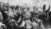
Here is an example of what I mean by toning down the "neon". Also, a possible way to do the battle flags.

-
MarshalNey
- Posts: 781
- Joined: Mon Sep 28, 2009 9:02 pm
- Gender: Male
- Location: St. Louis, MO
Re: Secesh Heresy: Gettysburg, Day 2
Well, as everyone can tell my availability to work on this map took a bit of a plunge, so I apologize for the long delay in responding. The school year has begun...
I still plan on spending a few hours every weekend working on this map, but please don't think me rude if I take a several days to respond. I am *extremely* appreciative of all of your feedback.
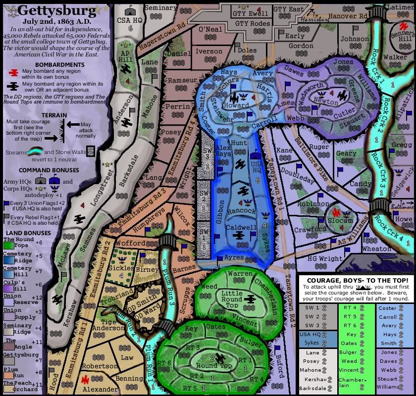
I've done some rather significant shifting of some names and gameplay icons, some for better accuracy, others to help out the gameplay.
I've added several regions, which has allowed me to make more of Round Top neutral like I'd originally planned. I also added several more Union division flags, bringing the total to 22 I believe, vs. 7 Rebel.
I also started doing some of the graphical things suggested, but those will take a back burner to the gameplay until I get that sorted out to my satisfaction.
I took out the elevation marks in the previous versions and put in some more rudimentary marking to indicate elevation more clearly, even if it is less pretty.
Here's the latest, with roads and woods included as sort of 'background' right now. If anyone can come up with relatively simple gameplay for them, I'm all ears of course.
I still plan on spending a few hours every weekend working on this map, but please don't think me rude if I take a several days to respond. I am *extremely* appreciative of all of your feedback.
I've done some rather significant shifting of some names and gameplay icons, some for better accuracy, others to help out the gameplay.
I've added several regions, which has allowed me to make more of Round Top neutral like I'd originally planned. I also added several more Union division flags, bringing the total to 22 I believe, vs. 7 Rebel.
I also started doing some of the graphical things suggested, but those will take a back burner to the gameplay until I get that sorted out to my satisfaction.
I took out the elevation marks in the previous versions and put in some more rudimentary marking to indicate elevation more clearly, even if it is less pretty.
Here's the latest, with roads and woods included as sort of 'background' right now. If anyone can come up with relatively simple gameplay for them, I'm all ears of course.
- Click image to enlarge.
-
MarshalNey
- Posts: 781
- Joined: Mon Sep 28, 2009 9:02 pm
- Gender: Male
- Location: St. Louis, MO
Re: Secesh Heresy: Gettysburg, Day 2
theBastard wrote:my notice is that the colours of Union side of map are not fit with Confederate part (for me). the green one looks as neon and also blue ones and purple one looks peliculiar. maybe play with hue/saturation could helps?
Well, the colors are not going to get settled for a bit, I think... I want to keep them distinct, and I'm working with 12 different colors that need to be non-dark. So a lot of messing with hue. As Ender says, colorblind tests will be an issue here. Function is going to triumph over making it pretty a bit, unfortunately.ender516 wrote:Porkenbeans has brought up a lot of interesting points, so I will use his post to organize my own thoughts...
porkenbeans wrote:
My thoughts to head it in the right direction, are as follows.
1.) The change in colors are an improvement, but I still do not get the right feel of the subject. Loose any, and all of the "neon". Gradients as well, seem out of place.
Some of the colours do seem bright, but they may help the colourblind issue which will arise eventually. Gradients, however, do give the sense of elevation in some places. Seminary Ridge confuses me, though. The shading suggests a downhill run to the boundary with the Peach Orchard, Plum Run and the Angle which are then marked as uphill. Was that actually the case?
As for the gradients, I think they will stay, although in what form is debatable. I got rid of the old gradients for the moment to give people a more 'bare-bones' look (although the slope is still roughly indicated).
Ender, Seminary Ridge did indeed run downhill to the "valley" of Plum Run/The Angle/The Peach Orchard which laid between Seminary and Cemetery Ridges. The other downhill half of Seminary Ridge is clipped by the map/legend boundary.
Fonts are not a huge concern for me at the moment, but yes it apparently is my way (from my experience with Zombie Invasion) to experiment and showcase different fonts until I settle on one. I'm very partial so far to the type used for the region names.ender516 wrote: porkenbeans wrote:
2.) the font is not the best choice.
I like the territory font, but I think there are far too many font changes in the legend.
Looking at what you posted, pork, the flags are very clear and nice but they are too big and not very indicative of a command bonus. I like the 'pennant' style I used for the icon at the moment, although I might spend some spare time (ha!) making it look better. I'll admit that the flags are simple right now, but they serve their purpose without being particularly ugly or distracting.ender516 wrote: porkenbeans wrote:
3.) The flags can be stylized (with the proper colors) to make them seem a little more authentic.
Fancier flags is a great idea, but I think it's a pipe dream. There is very little room for any of these flags now, so I think you are stuck with the current size. Given that, and looking at Lunar Wars as an example of tiny flags, what are the chances of making two flags which use the same red-white-and-blue which will be distinguishable? You won't get thirteen stripes in the Union flag, meaning you run the risk of making something that looks like the Confederate Stars and Bars. I suggest that you focus on your efforts on other issues.
Nice catchender516 wrote: porkenbeans wrote:
4.) all of the icons are side view except the cannons. make them side view, to maintain cohesion in this respect.
Good point, agreed.
However, while I hear you guys on this one but it's not going to get any attention for a while as it's a minor issue and graphical and it will take a bit of time to fix. It'll go on my first post under the 'To Do' list.
Jackson was shot in several places by a volley from nervous rebel pickets during an ongoing night attack at Chancellorsville several months before the battle of Gettysburg. Jackson's death has been often attributed as a leading cause in the lack of iniative and passive-aggressive behavior among the Confederate high command during the fighting at Gettysburg.ender516 wrote: porkenbeans wrote:
5.) I do not see Stonewall Jackson at Little Round Top. Isn't that the place where he was mortally wounded, by friendly fire ?
No comment from me here, it wasn't in my curriculum.
I've actually done some rather thorough research on this battle that I will happily share on my first post, but as any good historian will tell you there is always more to know. So, if anyone sees something wrong (like Hanover Road) please speak up.
I'll tone down the colors a bit more, but I can't make the shades too similar or the colorblind issue will become insoluble.ender516 wrote: porkenbeans wrote:
6.) Once you get the right colors, Make them a washed out hue, the opposite of neon.
Maps in those days no doubt lacked bright colours, but function over form rules here.
Yes, I had considered that but was a little too lazy to put in the wreath when I drew the icon. I'll probably add it in soon though.jefjef wrote:Love the federal eagle concept for the union corps command.
For the confederate a brighter gold would really show up and perhaps a closer rendition of the CSA stars and wreath insignia would complement the graphics better.

Re: Secesh Heresy: Gettysburg, Day 2
Think you could get a good feel for contour if you incorporate actual map elevation lines or incorporate this style into it.
Be nice if you could make Gettysburg feel more like a town too.
In re of the flag pennants your using blue obviously works well for the Union. For the Confeds how about using red instead of gray. It would be color appropriate, be more noticeable and would liven it up.
Be nice if you could make Gettysburg feel more like a town too.
In re of the flag pennants your using blue obviously works well for the Union. For the Confeds how about using red instead of gray. It would be color appropriate, be more noticeable and would liven it up.
- Click image to enlarge.

This post was made by jefjef who should be on your ignore list.

drunkmonkey wrote:I'm filing a C&A report right now. Its nice because they have a drop-down for "jefjef".
Re: Secesh Heresy: Gettysburg, Day 2
It's coming along quite nicely, though I think the colors need to get a Ye Olden fade to them, to look a little more like a battle map of the Civil War and a little less like the Hippie Reinterpretation of that Horrible War.
-
wisemanpsemc
- Posts: 1362
- Joined: Thu Dec 31, 2009 8:59 pm
Re: Secesh Heresy: Gettysburg, Day 2
This map looks like it will be a lot of fun. I am looking forward to playing on it. At first glance the cannons look like abstract arrows. Not sure if some sort of detail would help that out or not.
-
MarshalNey
- Posts: 781
- Joined: Mon Sep 28, 2009 9:02 pm
- Gender: Male
- Location: St. Louis, MO
Re: Secesh Heresy: Gettysburg, Day 2
well, it's already been pointed out that maybe the cannons should be from a side-view anyway... that would solve the problem if I did choose to go that route.wisemanpsemc wrote:This map looks like it will be a lot of fun. I am looking forward to playing on it. At first glance the cannons look like abstract arrows. Not sure if some sort of detail would help that out or not.
hee, love the HRTH War, it was waaaay better than that stupid Civil War thing. Anyway, yes, yes, the colors. Everyone hates them (except maybe Ender) but they're going to stay dramatically different from each other if possible for colorblind issues and gameplay analysis, so this might wait until graphics.TaCktiX wrote:It's coming along quite nicely, though I think the colors need to get a Ye Olden fade to them, to look a little more like a battle map of the Civil War and a little less like the Hippie Reinterpretation of that Horrible War.
jefjef wrote:Think you could get a good feel for contour if you incorporate actual map elevation lines or incorporate this style into it.
Be nice if you could make Gettysburg feel more like a town too.
In re of the flag pennants your using blue obviously works well for the Union. For the Confeds how about using red instead of gray. It would be color appropriate, be more noticeable and would liven it up.
Regarding the contour lines, those are my favorite lines to look at in Civil War maps, too, jefjef. I was hoping to mimic them when I started the map, then realized that they would make the borders really really hard to distinguish and I'd better go simple. I might revisit the idea in graphics, or maybe earlier if I have some luck and spare time....
Gettysburg: yes, agree, have no fear I was planning on adding some buildings/streets or other urban-esque qualities. Might be a while, might be soon, who can say
As for the flags, great suggestion! Simple and effective, it will be a definite improvement.
Thanks again everyone for the encouragement and advice.
-
Industrial Helix

- Posts: 3462
- Joined: Mon Jul 14, 2008 6:49 pm
- Gender: Female
- Location: Ohio
Re: Secesh Heresy: Gettysburg, Day 2
This one is ready for a little more in depth gameplay analysis I think.
Sketchblog [Update 07/25/11]: http://indyhelixsketch.blogspot.com/
Living in Japan [Update 07/17/11]: http://mirrorcountryih.blogspot.com/
Russian Revolution map for ConquerClub [07/20/11]: http://www.conquerclub.com/forum/viewto ... 1&t=116575
Living in Japan [Update 07/17/11]: http://mirrorcountryih.blogspot.com/
Russian Revolution map for ConquerClub [07/20/11]: http://www.conquerclub.com/forum/viewto ... 1&t=116575
Re: Secesh Heresy: Gettysburg, Day 2
Congrats on the move to game play Marshal! Lets get er rolling.Industrial Helix wrote:This one is ready for a little more in depth gameplay analysis I think.
The "courage" is an extremely novel and great idea. My only problem with it is I think the strength should be 1 and not 2. Even ones can be quite an obstacle at times with my random and could make some bonuses awkwardly strong.
This post was made by jefjef who should be on your ignore list.
drunkmonkey wrote:I'm filing a C&A report right now. Its nice because they have a drop-down for "jefjef".
-
Frito Bandito
- Posts: 660
- Joined: Thu Nov 27, 2008 3:55 am
- Gender: Male
- Location: Orygone
Re: Secesh Heresy: Gettysburg, Day 2
Looks awesome Marshall!!
-
Evil DIMwit

- Posts: 1616
- Joined: Thu Mar 22, 2007 1:47 pm
- Gender: Male
- Location: Philadelphia, NJ
Re: Secesh Heresy: Gettysburg, Day 2
Just to be clear about courage: Player at SW1 assaults SW1 Courage, and from SW1 Courage can assault either Wilcox or Barnes?
I think 2 neutrals is good for Courage. Don't want to make it too trivial.
I think 2 neutrals is good for Courage. Don't want to make it too trivial.


-
MarshalNey
- Posts: 781
- Joined: Mon Sep 28, 2009 9:02 pm
- Gender: Male
- Location: St. Louis, MO
Re: Secesh Heresy: Gettysburg, Day 2
Sorry for the awful delay everyone; I'm currently contemplating a scheme to destroy the vampiric livelihoods of all 'education experts' (i.e. state and federal bureaucrats). Life has gotten even more stressful than anticipated, so bear with me over the next several months as I'll likely be slow in my responses.
I'm not sure that I feel that 1 neutral would be enough of a barrier, as there are no impassibles. If some bonuses seem to strong right now, best to just lower them and leave the courage at 2, I think... the hills were all very difficult to assault in the actual event, and I think 2 is more consistent with the history of the battle than 1. That's not set in stone, of course, but that's the way I'm leaning unless there is another reason I'm not seeing.
 Any ideas? What do you like the most about the map?
One only needs to assault the 'Courage' territory when coming 'uphill' past the pointy end; so, to assault SW1 from Wilcox or Barnes, one needs to assault SW1 Courage, and then can proceed to SW1; once on SW1, however, one can attack back 'downhill' to Wilcox or Barnes directly, or assault SW2, Gibbon or Ayres.
The Stone Wall (SW terts) is a particularly nasty barrier, since it involves a series of two killer neutrals, but that's intentional as it was arguably the strongest part of the Union line and ultimately proved its worth in the debacle of Pickett's charge on Day 3 of the battle.
Thanks for the support and advice, jefjef, seriously you've stuck with this despite my slowness; but I promise this map will get done, even if it takes a year.jefjef wrote: The "courage" is an extremely novel and great idea. My only problem with it is I think the strength should be 1 and not 2. Even ones can be quite an obstacle at times with my random and could make some bonuses awkwardly strong.
I'm not sure that I feel that 1 neutral would be enough of a barrier, as there are no impassibles. If some bonuses seem to strong right now, best to just lower them and leave the courage at 2, I think... the hills were all very difficult to assault in the actual event, and I think 2 is more consistent with the history of the battle than 1. That's not set in stone, of course, but that's the way I'm leaning unless there is another reason I'm not seeing.
Thanks FritoFrito Bandito wrote:Looks awesome Marshall!!
er, not so much. Picture the Courage killer neutrals as one-way obstacles.Evil DIMwit wrote:Just to be clear about courage: Player at SW1 assaults SW1 Courage, and from SW1 Courage can assault either Wilcox or Barnes?
One only needs to assault the 'Courage' territory when coming 'uphill' past the pointy end; so, to assault SW1 from Wilcox or Barnes, one needs to assault SW1 Courage, and then can proceed to SW1; once on SW1, however, one can attack back 'downhill' to Wilcox or Barnes directly, or assault SW2, Gibbon or Ayres.
The Stone Wall (SW terts) is a particularly nasty barrier, since it involves a series of two killer neutrals, but that's intentional as it was arguably the strongest part of the Union line and ultimately proved its worth in the debacle of Pickett's charge on Day 3 of the battle.
Agreed. Although, now that I think about it, it might be worthwhile to lower a few of the courage neutrals to 1, just to indicate the steepness/entrenchment present. For instance, there was little entrenchment on Seminary Ridge, and none at all along the 'back' of Cemetery Ridge... hmmmmEvil DIMwit wrote:I think 2 neutrals is good for Courage. Don't want to make it too trivial.
-
Evil DIMwit
- Posts: 1616
- Joined: Thu Mar 22, 2007 1:47 pm
- Gender: Male
- Location: Philadelphia, NJ
Re: Secesh Heresy: Gettysburg, Day 2
Oh, silly me, it seems I had read the hill direction backwards.
Graduated courage sounds like a fine way to add strategic nuance without more instructional complexity; it seems you're at the limit already. Once again, please try to reduce this map to small size just to make sure you can fit all the instructions in. It may be necessary for you to cut out the historic background text on the small version. Likewise, make sure the army numbers all comfortably fit the courage section in the small map.
Graduated courage sounds like a fine way to add strategic nuance without more instructional complexity; it seems you're at the limit already. Once again, please try to reduce this map to small size just to make sure you can fit all the instructions in. It may be necessary for you to cut out the historic background text on the small version. Likewise, make sure the army numbers all comfortably fit the courage section in the small map.
-
Frito Bandito
- Posts: 660
- Joined: Thu Nov 27, 2008 3:55 am
- Gender: Male
- Location: Orygone
Re: Secesh Heresy: Gettysburg, Day 2
I really like the straightforward bombardment rules, totally make sense, unlike waterloo-- which I can never quite understand:)
plus, as a history buff, just finished Shiloh by Shelby Foote, I always enjoy something that touches the civil war.
fwiw, there is a great book, called "the nation of Jones?" I think, about a part of Mississipi that seceded from the South. Cool stuff!
plus, as a history buff, just finished Shiloh by Shelby Foote, I always enjoy something that touches the civil war.
fwiw, there is a great book, called "the nation of Jones?" I think, about a part of Mississipi that seceded from the South. Cool stuff!
-
MarshalNey
- Posts: 781
- Joined: Mon Sep 28, 2009 9:02 pm
- Gender: Male
- Location: St. Louis, MO
Re: Secesh Heresy: Gettysburg, Day 2
Thanks Frito! I'm glad you like the bombardment rules- I was hoping to keep them simple yet not overpowered.Frito Bandito wrote:I really like the straightforward bombardment rules, totally make sense, unlike waterloo-- which I can never quite understand:)
plus, as a history buff, just finished Shiloh by Shelby Foote, I always enjoy something that touches the civil war.
fwiw, there is a great book, called "the nation of Jones?" I think, about a part of Mississipi that seceded from the South. Cool stuff!
This map isn't perhaps quite "on vacation" since I'm not specifically ignoring this map- I'm just pretty much ignoring everthing equally, as my real life is quite hectic at the moment. However this was partly expected and should change dramatically in December.
Anyway, Shelby Foote is indeed an excellent writer and a fairer, more extensive and more scrupulous historian than most (cough, cough Bruce Catton et. al.). His 3-volume work on the Civil War, considering both its breadth and depth, could remain the definitive overview of the conflict for decades if not for centuries. That's saying a lot I know- but considering that he took something like 30 years to complete it, perhaps not a surprise.
"The Nation of Jones" is a book I've noticed. Obviously I don't have the time currently to read it, but I might pick it up given your recommendation. Reading the minutiae of the Civil War is far more instructive than in some conflicts, as it really was not solely a national conflict as it is often portrayed but also a war between states. The Thirty Years' War actually has some striking political similarities, although it of course occured centuries earlier and had much heavier foreign involvement which caused a stalemate in the end.

Re: Secesh Heresy: Gettysburg, Day 2
I like it. one question though; any spaces for cavalry units?MarshalNey wrote:Final Rough Draft (Updated 8/20/10)The map has no impassibles, technically, but I use some low-level killer neutrals for the same purpose. In the case of the hills, I made a poor-man's one-way attack, where someone wishing to go uphill must first attack a killer neutral 2- which I call 'courage', while someone attack out from a hill may proceed normally. For stone walls and streams, I used a killer neutral 1, to indicate the impossibility of staying on such a place for long- the creeks are meant to be crossed quickly since any troops stationed there would be extremely vulnerable.
- Click image to enlarge.
The cannon bombardments are the other major setpiece of the map. Any cannon can bombard any region within its own bonus area. In addition, the big black cannons can bombard any region in adjacent bonus areas. This is a bit like Waterloo, where a lot of the map is vulnerable to bombardment. However, about 1/3 of the map is immune- the Round Tops bonus area, Gettysburg, Devil's Den and the Federal Supply bonus area. For region names, I used the commanders of the relevant regiment, brigade or Corps; or I used an abbreviation for a piece of terrain with a number.
"Sir, I have cavalry moving on my flank. Request permission to deploy along the ridge to repel them."
-
MarshalNey
- Posts: 781
- Joined: Mon Sep 28, 2009 9:02 pm
- Gender: Male
- Location: St. Louis, MO
Re: Secesh Heresy: Gettysburg, Day 2
Brig. Generals Kilpatrick, Gregg and Buford represent the Union cavalry on this map.
Kilpatrick and Gregg are in the upper right in the Union Reserve; they saw limited action skirmishing against Confederate troopers well east of Rock Creek. Their main contribution to the battle was to keep Walker's rather strong brigade- the Stonewall Brigade of fame- tied up so that it did not participate effectively in the evening/night attack on Culp's Hill, which nearly carried the Union position and might have succeeded with Walker's help. Only after the Union had rushed reinforcements and re-occupied and strengthened their breastworks did Walker's brigade arrive, too late to do anything but vainly sacrifice some hundreds in a pre-dawn attack on the 3rd day.
Buford did not accomplish much on the second day and in fact got whipped on the third day. His command screened the left flank of the Union Army rather poorly.
As for the Confederate side, J.E.B. Stuart notoriously took off with most of the army's cavalry early on during the march into Pennsylvania, with a somewhat deceiving assurance to General Lee that he would stay in touch. He broke contact and Lee was certain that Stuart's entire force had been destroyed- otherwise Lee would have heard something back... but as it turned out Stuart was merely pursuing fame and glory by making another massive supply raid deep into enemy territory.
In short, the Confederates had almost no cavalry for the entire battle; Stuart's worn and tired cavalrymen arrived in time to do battle on the third day.
Given these facts, I'm not sure a whole new unit is justified, and I don't want people to think that this map is a cheap knock-off of Waterloo
On the other hand, the regions will be noted as cavalry in the name, and they are represented with a division flag. I could add a graphic there as well...
-
Evil DIMwit
- Posts: 1616
- Joined: Thu Mar 22, 2007 1:47 pm
- Gender: Male
- Location: Philadelphia, NJ
Re: Secesh Heresy: Gettysburg, Day 2
[Moved]
Alas! Two fortnightly review periods have passed without any updates or meaningful engagement from the mapmaker(s),therefore the map is considered stalled. If the mapmaker wants to continue with the map, then one of the Foundry Moderators will be able to help put the thread back into the Foundry system, after an update has been made.
Alas! Two fortnightly review periods have passed without any updates or meaningful engagement from the mapmaker(s),therefore the map is considered stalled. If the mapmaker wants to continue with the map, then one of the Foundry Moderators will be able to help put the thread back into the Foundry system, after an update has been made.