Cairns Coral Coast [Quenched] - Loaded!
Moderator: Cartographers
Forum rules
Please read the Community Guidelines before posting.
Please read the Community Guidelines before posting.


Thanks Teya, I'd like to give it a couple more weeks, and see if circumstances change.
I do think however, that 7 people have had input so far, not just one; and 26 people have voted. No HOT HOT stats, but a start is a start.
Perhaps if people are interested in good game play as indicated in the map preferences poll, Samus may have provided good advice to get thing rolling.
May I ask if there are any enhancements that you would like to see?

* Pearl Harbour * Waterloo * Forbidden City * Jamaica * Pot Mosbi
-
Bad Speler
- Posts: 1027
- Joined: Fri Jun 02, 2006 8:16 pm
- Gender: Male
- Location: Ottawa
- Contact:
What are the table land rises? if they are impassible objects some of them are a bit misplaced, if not they should just be removed, they are confusing. Try to make the title area look a bit better, the writting looks squished, and the background is a bit off
Highest Score: 2532
Highest Position: 69 (a long time ago)
Highest Position: 69 (a long time ago)
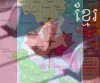
Bad Speler, hi...no they are not impassable objects. they simply indicate the boundary of the Tablelands in height as compared with the coast. I was trying to create some 3D effect.Bad Speler wrote:What are the table land rises? if they are impassible objects some of them are a bit misplaced, if not they should just be removed, they are confusing. Try to make the title area look a bit better, the writting looks squished, and the background is a bit off
Perhaps they do not need to be indicated in the Legend, rather than removing them.
* Pearl Harbour * Waterloo * Forbidden City * Jamaica * Pot Mosbi

-
Bad Speler
- Posts: 1027
- Joined: Fri Jun 02, 2006 8:16 pm
- Gender: Male
- Location: Ottawa
- Contact:
Yes, that new passable/unpassable legend helps.
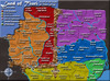
Title Area looks much better but im not sure about the font. For me, i dont like the radial gradian on every territory, but perhaps im a minority. With the tableland rises between Julatten and Port Douglas, it is a bit hard to tell wether Daintree and Julatten border or not, consider putting anoher mountain there to make sure no one gets confused if it is indeed unpassable. Also, if those are mountains try giving it a brown or grey colour, not forest green.
Title Area looks much better but im not sure about the font. For me, i dont like the radial gradian on every territory, but perhaps im a minority. With the tableland rises between Julatten and Port Douglas, it is a bit hard to tell wether Daintree and Julatten border or not, consider putting anoher mountain there to make sure no one gets confused if it is indeed unpassable. Also, if those are mountains try giving it a brown or grey colour, not forest green.
Highest Score: 2532
Highest Position: 69 (a long time ago)
Highest Position: 69 (a long time ago)
Cairns Coral Coast 11Mar V7 Update
Bad Speler....thanks for you input. I have changed the total feel of the map in the V7 update below.

* Pearl Harbour * Waterloo * Forbidden City * Jamaica * Pot Mosbi
-
Bad Speler
- Posts: 1027
- Joined: Fri Jun 02, 2006 8:16 pm
- Gender: Male
- Location: Ottawa
- Contact:

Teya....thank you for responding. This is the small map at 600 x 526...at present. Certainly I would not want it to become any wider for the small map. And the large map would be no larger than 800px.
Samus had assisted to devise this map at 60 territories for a large game...they are realistic, and to give you an idea of real distances....Cairns to Innisfail is only 1 hour drive; Cairns to Daintree is just over 1 hour drive; Cairns to Mareeba is 1 hour drive; and Cairns to Atherton via the Gillies is 1 hour drive.
It is a very compact area, and as you correctly pointed out before this applies because it is a regional map. I think if there was any less territories, the game play wouldn't be as great. Perhaps if I extended the map length-ways, this might not be an issue for you. What do you think? Should I give it a go?
* Pearl Harbour * Waterloo * Forbidden City * Jamaica * Pot Mosbi
No, this is just the nature of a large (60 territory) map. The small version looks cluttered and it's pretty much just unavoidable. If you messed with the length it would cause problems with needing to scroll down to attack, and possibly wouldn't be able to see part of the map as you click to attack there. People can just use the large version.cairnswk wrote:It is a very compact area, and as you correctly pointed out before this applies because it is a regional map. I think if there was any less territories, the game play wouldn't be as great. Perhaps if I extended the map length-ways, this might not be an issue for you. What do you think? Should I give it a go?
Not everyone can use the large version. This is why I think large maps should be made first, it avoids the guessing factor.Samus wrote:If you messed with the length it would cause problems with needing to scroll down to attack, and possibly wouldn't be able to see part of the map as you click to attack there. People can just use the large version.


I personally think the small map is very crowded with the numbers on the map. The number in emerald creek barely fits. And that is only a single number. If it was a 10 it wouldnt fit. I also dont think the lakes has enough room. And they are only the territories that I can be bothered typing.
I think this map may benifit from having army shadows. Yellow and grey numbers arent easy to read in the yellow continent and I dont think grey numbers would be easy to see in the grey continent. Army shadows will help with that.
I think this map may benifit from having army shadows. Yellow and grey numbers arent easy to read in the yellow continent and I dont think grey numbers would be easy to see in the grey continent. Army shadows will help with that.