
Also, bear in mind this is a photograph and not an actual scan.
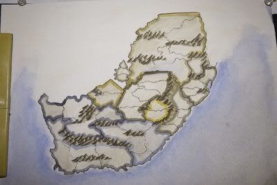
So here's what I'm looking for. Basically, should I continue with this version idea or should I just stick to computer graphics and grunge up the original map? Or perhaps, should I start over on watercolors?
- Click image to enlarge.
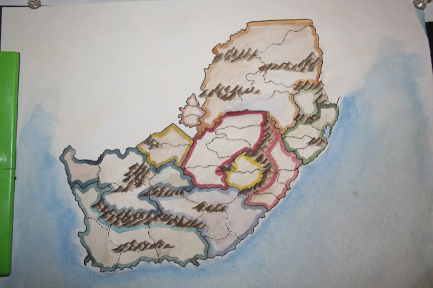
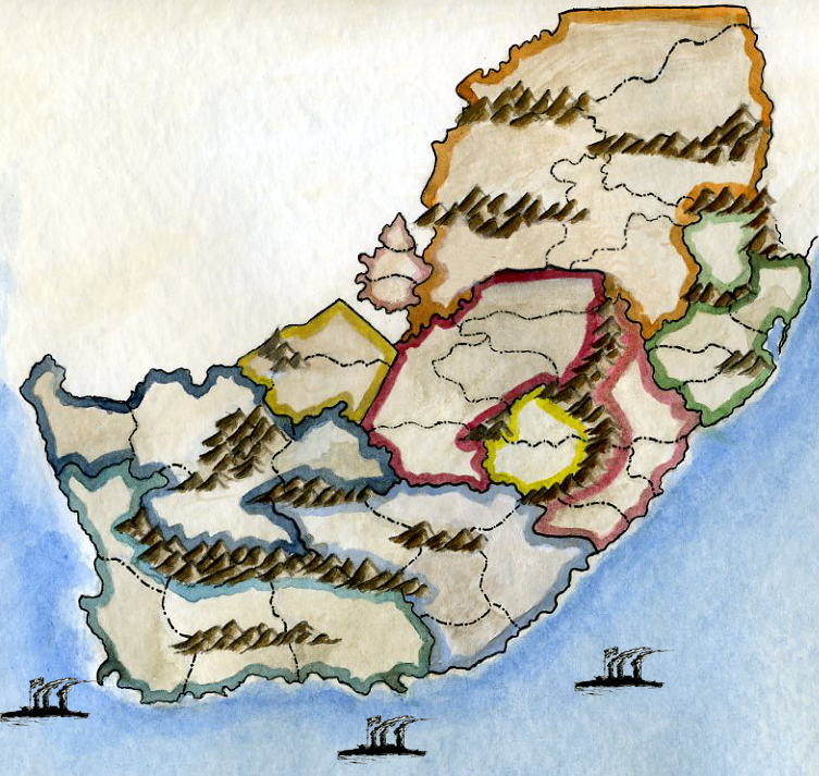
The mountains are not so nice but somewhat satisfactory.
Natal's color (pink to the right of the map)
The colors aren't different enough. Basically, I'm going to photoshop clone stamp a section from the map and use that for the legend... alternatively, I may use a minimap.
The numbers are going to look strange on this map.
And lastly, the avatar image is Tsarina Alexandra who is both a fascinating woman and somewhat related to the Russian Revolution map.


