The sub is fine, I don't think it'll confuse anyone.
A few things though... the stations could use territory labels. There's several stations that connect to multiple land areas, so people might get confused about their names.
Same thing with the bike routes.
The grey territory borders could maybe be slightly darker.
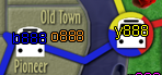
Also, the Nob hill <> Overlook bridge is still unclear. You should make it so that the bridge doesn't touch the Pearl territory. To do this you may need to fiddle with the borders of Pearl slightly.
Portland [Quenched]
Moderator: Cartographers
Forum rules
Please read the Community Guidelines before posting.
Please read the Community Guidelines before posting.
-
natty dread

- Posts: 12876
- Joined: Fri Feb 08, 2008 8:58 pm
- Location: just plain fucked
-
ironsij0287

- Posts: 379
- Joined: Tue Nov 09, 2010 2:30 pm
- Gender: Male
- Location: Dubuque
Re: Rose City: Portland [D, GP] 27th draft - bridge tweaks
What about arching the bridge so it goes up and over touching down in Nob Hill? Not sure if that'll look weird with the rest of the bridges though.natty_dread wrote: Also, the Nob hill <> Overlook bridge is still unclear. You should make it so that the bridge doesn't touch the Pearl territory. To do this you may need to fiddle with the borders of Pearl slightly.
Re: Rose City: Portland [D, GP] 27th draft - bridge tweaks
Here's my suggestion to make it clearer:

Don't know how hard it would be for you to do this or not. Or you could just redraw the Pearl Nob Hill border so that the border parallels the bottom side of the bridge.
Don't know how hard it would be for you to do this or not. Or you could just redraw the Pearl Nob Hill border so that the border parallels the bottom side of the bridge.
-
lostatlimbo

- Posts: 1386
- Joined: Wed Mar 28, 2007 3:56 pm
- Location: Portland, OR
Re: Rose City: Portland [D, GP] 27th draft - bridge tweaks
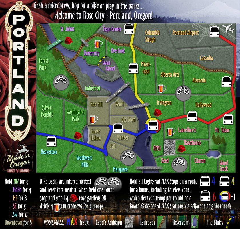
The MAX stations are named by the neighborhoods they connect with:natty_dread wrote:
A few things though... the stations could use territory labels. There's several stations that connect to multiple land areas, so people might get confused about their names.
Same thing with the bike routes.
Blue MAX - Beaverton
Red MAX - Hollywood/Laurelhurst
Yellow MAX - Overlook/Mississippi
The exception being Fareless Zone.
The bike paths will be named for their respective continents:
NW Bike Path
SE Bike Path
-
lostatlimbo
- Posts: 1386
- Joined: Wed Mar 28, 2007 3:56 pm
- Location: Portland, OR
Re: Rose City: Portland [D, GP] 28th draft - new bridges
28th Draft
Redesigned bridges
Clarified The Pearl border
Darkened all borders
Redesigned bridges
Clarified The Pearl border
Darkened all borders
- Click image to enlarge.
-
natty dread
- Posts: 12876
- Joined: Fri Feb 08, 2008 8:58 pm
- Location: just plain fucked
Re: Rose City: Portland [D, GP] 27th draft - bridge tweaks
Ok, the train stations will do, but the bike routes being named by the bonus areas seems really counter-intuitive to me... Especially when the SW bike route also borders Downtown territories.
Can you just add labels for the bike routes? You have plenty of space to do this, so it shouldn't be a problem.
Can you just add labels for the bike routes? You have plenty of space to do this, so it shouldn't be a problem.


 Re: Rose City: Portland [D, GP] 27th draft - bridge tweaks
why is the forest park bridge green? is it just for visual effect, with no gameplay significance?
ian.
ian.

-
lostatlimbo
- Posts: 1386
- Joined: Wed Mar 28, 2007 3:56 pm
- Location: Portland, OR
Re: Rose City: Portland (D, GP) v.28 - new bridges, pg 14
Visual only - no gameplay change
St John's Bridge is green
http://relocationtoportland.com/files/2 ... rtland.jpg
http://rpsnw.com/web_images/st_johns_br ... t_2006.jpg
St John's Bridge is green
http://relocationtoportland.com/files/2 ... rtland.jpg
http://rpsnw.com/web_images/st_johns_br ... t_2006.jpg
-
lostatlimbo
- Posts: 1386
- Joined: Wed Mar 28, 2007 3:56 pm
- Location: Portland, OR
Re: Rose City: Portland (D, GP) v.29 - Troop numbers big & s
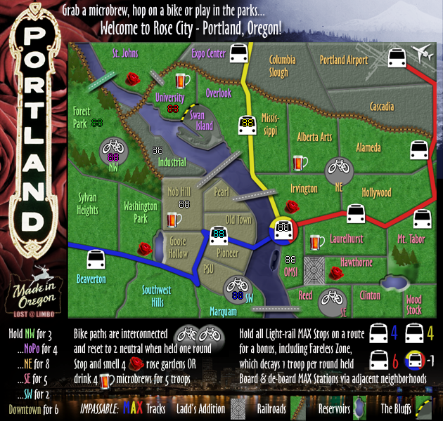
I added the names to Bike Paths. I think they are unnecessary and add clutter. Thoughts?
29th Draft
Added labels to Bike Paths
Added troop number examples
29th Draft
Added labels to Bike Paths
Added troop number examples
- Click image to enlarge.
- Click image to enlarge.

Re: Rose City: Portland (D, GP) v.29 - Troop numbers big & s
This is looking better!
As for the bike path names, no they don't add clutter, they actually help to clarify what names they have. Can you switch the SW and SE names to the left side of the bike? This will be necessary on the small so the numbers don't obscure the territory name if and when you get the color code +888 on them. Also please put the 888's on every territory so we can make sure that they will fit (which I'm thinking they will, but would like to see). Without going through the whole thread, so please forgive me if you have already done it, can you also post the colorblind tests as well?
As for the bike path names, no they don't add clutter, they actually help to clarify what names they have. Can you switch the SW and SE names to the left side of the bike? This will be necessary on the small so the numbers don't obscure the territory name if and when you get the color code +888 on them. Also please put the 888's on every territory so we can make sure that they will fit (which I'm thinking they will, but would like to see). Without going through the whole thread, so please forgive me if you have already done it, can you also post the colorblind tests as well?
-
natty dread
- Posts: 12876
- Joined: Fri Feb 08, 2008 8:58 pm
- Location: just plain fucked
Re: Rose City: Portland (D, GP) v.29 - Troop numbers big & s
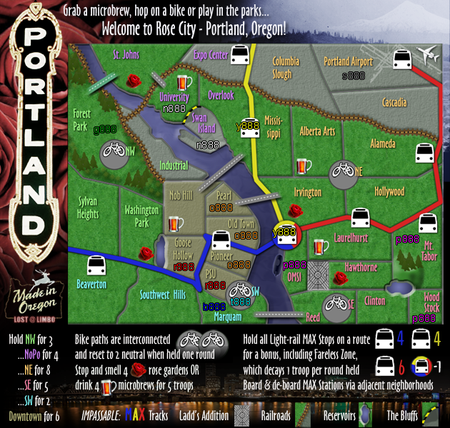
I checked the map with colourblind filters, and the only thing I can see a possible problem with is Downtown vs. NW - making the Downtown territory labels slightly darker would solve this.
(this is deuteranopia, protanopia had no problems)
- Click image to enlarge.


Re: Rose City: Portland (D, GP) v.29 - Troop numbers big & s
this map is looking really nice. A clean easy to follow flow, with a lot going on. My only suggestion would be to work on the shadows of the forest trees. They look blurred - espeically the ones on the right side.


-
lostatlimbo
- Posts: 1386
- Joined: Wed Mar 28, 2007 3:56 pm
- Location: Portland, OR
Re: Rose City: Portland (D, GP) v.29 - Troop numbers big & s
Thanks for doing that. I will try to make this update (and others mentioned) this week.natty_dread wrote:I checked the map with colourblind filters, and the only thing I can see a possible problem with is Downtown vs. NW - making the Downtown territory labels slightly darker would solve this.
(this is deuteranopia, protanopia had no problems)
(PS - Can't help but notice the roses look more like turds with that filter. Hope thats not really how they look to colorblind folk. :)
-
lostatlimbo
- Posts: 1386
- Joined: Wed Mar 28, 2007 3:56 pm
- Location: Portland, OR
Re: Rose City: Portland (D, GP) v.29 - Troop numbers big & s
Will do. Thanks!RjBeals wrote:this map is looking really nice. A clean easy to follow flow, with a lot going on. My only suggestion would be to work on the shadows of the forest trees. They look blurred - espeically the ones on the right side.
-
natty dread
- Posts: 12876
- Joined: Fri Feb 08, 2008 8:58 pm
- Location: just plain fucked
Re: Rose City: Portland (D, GP) v.29 - Troop numbers big & s
LOL! I'm sorry, but the filters are supposedly pretty accurate... take comfort in the fact that there's different types of colourblindness, and that image just shows one of themlostatlimbo wrote: (PS - Can't help but notice the roses look more like turds with that filter. Hope thats not really how they look to colorblind folk.
-
ManBungalow
- Posts: 3431
- Joined: Sun Jan 13, 2008 7:02 am
- Location: On a giant rock orbiting a star somewhere
Re: Rose City: Portland (D, GP) v.29 - Troop numbers big & s
Looks fun!
Though some of the max tracks boarding points are a little vague. For instance, the stop on the yellow line at the centre-top. Does that border Columbia Slough or not? The same applies to Mt. Tabor and Beaverton.
Though some of the max tracks boarding points are a little vague. For instance, the stop on the yellow line at the centre-top. Does that border Columbia Slough or not? The same applies to Mt. Tabor and Beaverton.

-
lostatlimbo
- Posts: 1386
- Joined: Wed Mar 28, 2007 3:56 pm
- Location: Portland, OR
Re: Rose City: Portland (D, GP) v.29 - Troop numbers big & s
I looked at this more closely. I think what you are seeing is the underbrush. I removed it in the Mt Tabor area and toned down the shadow in Forest Park. Looks a bit cleaner to me.RjBeals wrote:this map is looking really nice. A clean easy to follow flow, with a lot going on. My only suggestion would be to work on the shadows of the forest trees. They look blurred - espeically the ones on the right side.
-
lostatlimbo
- Posts: 1386
- Joined: Wed Mar 28, 2007 3:56 pm
- Location: Portland, OR
Re: Rose City: Portland (D, GP) v.29 - Troop numbers big & s
Well, the MAX track is listed as an impassable and most of them are clearly on one side of it, but I nudged these a bit to make that space a little clearer.ManBungalow wrote:Looks fun!
Though some of the max tracks boarding points are a little vague. For instance, the stop on the yellow line at the centre-top. Does that border Columbia Slough or not? The same applies to Mt. Tabor and Beaverton.
-
lostatlimbo
- Posts: 1386
- Joined: Wed Mar 28, 2007 3:56 pm
- Location: Portland, OR
Re: Rose City: Portland (D, GP) v.30 - Graphic tweaks, troop
I focused on the tightest areas - if those fit, the rest should be fine. SW/Downtown area seems to be the tightest, but even with color codes & 3 digits, it seems to fit ok.
I was having trouble seeing the gray in NE areas, so I lightened those up. Seems better to me now.
The 3 digit+color code overhangs a little on the MAX stops, but that seems to be common on some maps. 3 digits alone seems just right.
Any other comments/concerns on these?
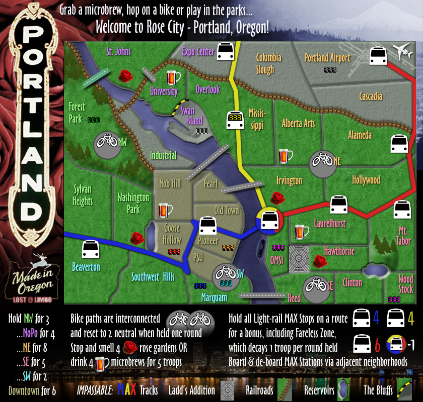
30th Draft
Some minor graphic tweaks to allow for better fit with troop numbers
I was having trouble seeing the gray in NE areas, so I lightened those up. Seems better to me now.
The 3 digit+color code overhangs a little on the MAX stops, but that seems to be common on some maps. 3 digits alone seems just right.
Any other comments/concerns on these?
30th Draft
Some minor graphic tweaks to allow for better fit with troop numbers
- Click image to enlarge.
- Click image to enlarge.
-
natty dread
- Posts: 12876
- Joined: Fri Feb 08, 2008 8:58 pm
- Location: just plain fucked
Re: Rose City: Portland (D, GP) v.30 - Graphic tweaks, troop
Just so you know... if you center the numbers according to 88:s, then 888:s won't be centered, and vice versa...
-
lostatlimbo
- Posts: 1386
- Joined: Wed Mar 28, 2007 3:56 pm
- Location: Portland, OR
Re: Rose City: Portland (D, GP) v.30 - Graphic tweaks, troop
Hmmm... I am seeing a problem with the MAX stops on the smaller map - especially Blue on the Black Max window.
Going to have to play around with those a bit.
Going to have to play around with those a bit.
-
lostatlimbo
- Posts: 1386
- Joined: Wed Mar 28, 2007 3:56 pm
- Location: Portland, OR
Re: Rose City: Portland (D, GP) v.30 - Graphic tweaks, troop
Ok - I tweaked the MAX stops a bit so the numbers fit better.
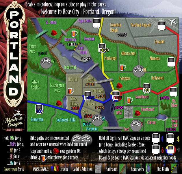
I can still see some potential issues with the Old Town/Pioneer stop, but this is a 'worst case scenario' right? I mean, I think they work great, but for that one player with 100+ troops and the color code, they might have trouble seeing the last digit of their many troops if they happen to be blue and have that territory. But is that really an issue? "Oh no! I thought I had 168 troops, but its actually 163!!!"
I can still see some potential issues with the Old Town/Pioneer stop, but this is a 'worst case scenario' right? I mean, I think they work great, but for that one player with 100+ troops and the color code, they might have trouble seeing the last digit of their many troops if they happen to be blue and have that territory. But is that really an issue? "Oh no! I thought I had 168 troops, but its actually 163!!!"
Re: Rose City: Portland (D, GP) v.31 - Troop #s, new MAX sto
Okay here are a couple of concerns I have:
1) I think the previous icons for the stations will work better with the numbers,
2) The Portland sign is taking some of the focal off the playing area, can you please reduce the opacity say be about 15%,
3) The background is also taking some of the focal off the playing area, reducing the opacity by about 25% should do the trick.
After you do these three things I'll take another look and then maybe we can get this bumped along!
-
natty dread
- Posts: 12876
- Joined: Fri Feb 08, 2008 8:58 pm
- Location: just plain fucked
Re: Rose City: Portland (D, GP) v.31 - Troop #s, new MAX sto
As in california thread, I think you meant to say something else in place of "opacity"...
-
Victor Sullivan

- Posts: 6010
- Joined: Mon Feb 08, 2010 8:17 pm
- Gender: Male
- Location: Columbus, OH
- Contact:
Re: Rose City: Portland (D, GP) v.31 - Troop #s, new MAX sto
Try thatisaiah40 wrote:Okay here are a couple of concerns I have:
1) I think the previous icons for the stations will work better with the numbers,
2) The Portland sign is taking some of the focal off the playing area, can you please increase the opacity say be about 15%,
3) The background is also taking some of the focal off the playing area, increase the opacity by about 25% should do the trick.
After you do these three things I'll take another look and then maybe we can get this bumped along!
Beckytheblondie: "Don't give us the dispatch, give us a mustache ride."
Scaling back on my CC involvement...
Scaling back on my CC involvement...