
Mmmm, MrBenn. I know there is one person who would support this.
I'm wondering if there would others who'd support this to get it finished?
Salem's Switch V36 [Quenched]
Moderator: Cartographers
Forum rules
Please read the Community Guidelines before posting.
Please read the Community Guidelines before posting.
Re: Salem's Switch (V5) (P5) Buggy Stops

* Pearl Harbour * Waterloo * Forbidden City * Jamaica * Pot Mosbi
-
Industrial Helix

- Posts: 3462
- Joined: Mon Jul 14, 2008 6:49 pm
- Gender: Female
- Location: Ohio
Re: Salem's Switch (V5) (P5) Buggy Stops
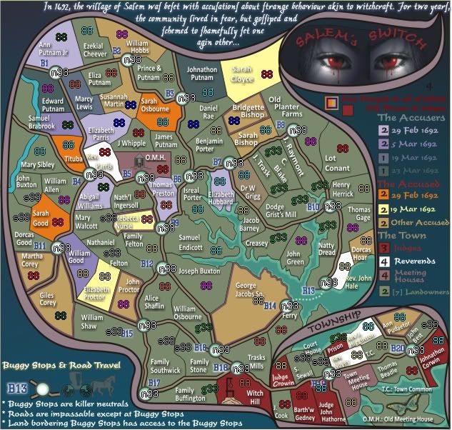
I'd support it but I think there needs to be a reduction in the complexity of the map. For example, why have different years for the accusers and why not group them all into simply "the accusers."
Sketchblog [Update 07/25/11]: http://indyhelixsketch.blogspot.com/
Living in Japan [Update 07/17/11]: http://mirrorcountryih.blogspot.com/
Russian Revolution map for ConquerClub [07/20/11]: http://www.conquerclub.com/forum/viewto ... 1&t=116575
Living in Japan [Update 07/17/11]: http://mirrorcountryih.blogspot.com/
Russian Revolution map for ConquerClub [07/20/11]: http://www.conquerclub.com/forum/viewto ... 1&t=116575
Re: Salem's Switch (V5) (P5) Buggy Stops
Because that would decrease the number of "continents" on the map. And since this is an historical map, i'd like to retain that aspect and sense of history. I'm sorry if it is confusing for you.Industrial Helix wrote:I'd support it but I think there needs to be a reduction in the complexity of the map. For example, why have different years for the accusers and why not group them all into simply "the accusers."
* Pearl Harbour * Waterloo * Forbidden City * Jamaica * Pot Mosbi
-
natty dread

- Posts: 12876
- Joined: Fri Feb 08, 2008 8:58 pm
- Location: just plain fucked
Re: Salem's Switch (V5) (P5) Buggy Stops
You know, I think you should get rid of most of the army circles. The territories are light enough to do without, and it would simplify the visual composition of this map significantly, I think.

Re: Salem's Switch (V5) (P5) Buggy Stops
Yes netty. I was experimenting with lowering their opacity, but removal althogether is a good option.natty_dread wrote:You know, I think you should get rid of most of the army circles. The territories are light enough to do without, and it would simplify the visual composition of this map significantly, I think.
But i'm not also happy with the overall colour scheme. so i will be adjusting that.
The test will come when numbers are on the regions.
* Pearl Harbour * Waterloo * Forbidden City * Jamaica * Pot Mosbi
Re: Salem's Switch (V6)
Version 6 with some new colours and army digits to see how it would look without army circles.
Also a guest star.
Also a guest star.
* Pearl Harbour * Waterloo * Forbidden City * Jamaica * Pot Mosbi
-
army of nobunaga

- Posts: 1989
- Joined: Sat Oct 13, 2007 10:06 pm
- Gender: Male
- Location: www.facebook.com/armyofnobu and Houston.
- Contact:
Re: Salem's Switch (V6) (P6) with army numbers
excited about this one. thanx for the work man
Maps Maps Maps!
Take part in this survey and possibly win an upgrade -->
https://docs.google.com/spreadsheet/emb ... OHRFZnc6MQ
Take part in this survey and possibly win an upgrade -->
https://docs.google.com/spreadsheet/emb ... OHRFZnc6MQ
Re: Salem's Switch (V6) (P6) with army numbers
thanks aon. i've got to try to figure out a way to work "gossip" in to the gameplay coz that is what all this was about...vicious gossip and tall tales and fear.army of nobunaga wrote:excited about this one. thanx for the work man
* Pearl Harbour * Waterloo * Forbidden City * Jamaica * Pot Mosbi
-
army of nobunaga
- Posts: 1989
- Joined: Sat Oct 13, 2007 10:06 pm
- Gender: Male
- Location: www.facebook.com/armyofnobu and Houston.
- Contact:
Re: Salem's Switch (V6) (P6) with army numbers
some sort of inset called "Gossips Corner" where a lot of the known gossips can attack too?... In saleem there are a few kids and women that are known to bad mouth and gossip agains witches... control of gossip corner could be some cool bonus... too bad we (you) are limited by the xml structure here, you could do some really really cool stuff with this.
There is a movie that is new called... hmm i cant think of the name but it was about the plague in europe and witches... hmm maybe it was called "Plague" or "Black Plague".. GREAT witch movie.. reminds me of this map.. Also Ive read a lot o the diaries and town logs you can get online from your maps period.. cool stuff. anyway im rambling... thanx again.
ps I read so much I bought a nook.. thopught I would hate it, but love it! I have a book on demonology that has a lot of the witch stuf from salaam.. so pretty excited about this.
thanx again
Maps Maps Maps!
Take part in this survey and possibly win an upgrade -->
https://docs.google.com/spreadsheet/emb ... OHRFZnc6MQ
Take part in this survey and possibly win an upgrade -->
https://docs.google.com/spreadsheet/emb ... OHRFZnc6MQ
-
natty dread
- Posts: 12876
- Joined: Fri Feb 08, 2008 8:58 pm
- Location: just plain fucked
Re: Salem's Switch (V6) (P6) with army numbers
Sorry but the red text just below the bleeding eyes is totally illegible...
But, the removing of army circles & the colour scheme change is a huge improvement. +2 internets for that!
But, the removing of army circles & the colour scheme change is a huge improvement. +2 internets for that!
Re: Salem's Switch (V6) (P6) with army numbers
Yes i saw that before, it occurs in the translation from .cdr to .jpg, so i just gotta find another colour .natty_dread wrote:Sorry but the red text just below the bleeding eyes is totally illegible...
But, the removing of army circles & the colour scheme change is a huge improvement. +2 internets for that!
* Pearl Harbour * Waterloo * Forbidden City * Jamaica * Pot Mosbi
Re: Salem's Switch (V7) (P6)
Well, i've experimented with various options all day, and can't go past this basic idea for the Buggy Stops.
I've moved the colours around and come up with something resembling where i want this to go.
But more importantly, i started developing the "gossip" concept.
The bonus needs refining so some suggestions for that would be apprecatied.
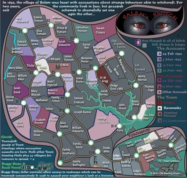
I've moved the colours around and come up with something resembling where i want this to go.
But more importantly, i started developing the "gossip" concept.
The bonus needs refining so some suggestions for that would be apprecatied.
* Pearl Harbour * Waterloo * Forbidden City * Jamaica * Pot Mosbi
Re: Salem's Switch (V7) (P6) Gossip Gameplay
I've decided i should get this back into devlopment... so will submit
* Pearl Harbour * Waterloo * Forbidden City * Jamaica * Pot Mosbi
-
Nola_Lifer

- Posts: 819
- Joined: Mon Oct 13, 2008 4:46 pm
- Location: 雪山
- Contact:
Re: Salem's Switch (V7) (P6) Gossip Gameplay
I think I like the colors better on version 6. Of all the maps to work on next you pick this one. 

-
natty dread
- Posts: 12876
- Joined: Fri Feb 08, 2008 8:58 pm
- Location: just plain fucked
Re: Salem's Switch (V7) (P6) Gossip Gameplay
Yay!cairnswk wrote:I've decided i should get this back into devlopment... so will submit
Re: Salem's Switch (V7) (P6) Gossip Gameplay
I thought this would please you.natty_dread wrote:Yay!cairnswk wrote:I've decided i should get this back into devlopment... so will submit
Colours...OK i understand.Nola_Lifer wrote:I think I like the colors better on version 6. Of all the maps to work on next you pick this one.
You are not happy with this map ? May i ask why?
* Pearl Harbour * Waterloo * Forbidden City * Jamaica * Pot Mosbi
-
Nola_Lifer
- Posts: 819
- Joined: Mon Oct 13, 2008 4:46 pm
- Location: 雪山
- Contact:
Re: Salem's Switch (V7) (P6) Gossip Gameplay
Of course this is all personal, but I think the subject matter is ok. You have some other maps that I'd much rather see go through and will be played a bit more. Your WWI map comes to mind or even the Sydney map.cairnswk wrote:I thought this would please you.natty_dread wrote:Yay!cairnswk wrote:I've decided i should get this back into devlopment... so will submit
Colours...OK i understand.Nola_Lifer wrote:I think I like the colors better on version 6. Of all the maps to work on next you pick this one.
You are not happy with this map ? May i ask why?
-
natty dread
- Posts: 12876
- Joined: Fri Feb 08, 2008 8:58 pm
- Location: just plain fucked
Re: Salem's Switch (V7) (P6) Gossip Gameplay
As for colours, I think V6 is clearer, probably because of all the contrast. On the other hand I think the cold colour scheme on V7 fits the theme of the map better. Although you could add some bloody red to it, sort of like the judges on V6.
Re: Salem's Switch (V7) (P6) Gossip Gameplay
Thanks Nola_Lifer for replyingNola_Lifer wrote:...
Of course this is all personal, but I think the subject matter is ok. You have some other maps that I'd much rather see go through and will be played a bit more. Your WWI map comes to mind or even the Sydney map.
The only WW1 map i think hanging around is Gallipoli, and IH has taken that over...i understand he has that on his radar, but is quite busy with other stuff at present.
I will put the Sydney map up as i indicated in that thread, but there has to be support for it.
i think there is more interest in this map simply because it is US history, even though at present i think the Sydney map looks better graphically.
As for other maps, the only other i can think of is the Snowfight map and even after i started that, i'm not sure i have the skills to do the people on it successfully.
* Pearl Harbour * Waterloo * Forbidden City * Jamaica * Pot Mosbi
Re: Salem's Switch (V7) (P6) Gossip Gameplay
Yes i agree, but i recall that those colours gave me greif with the CB test and that's why i changed them.natty_dread wrote:As for colours, I think V6 is clearer, probably because of all the contrast...
Red added to Judges next version...that must have slipped...On the other hand I think the cold colour scheme on V7 fits the theme of the map better. Although you could add some bloody red to it, sort of like the judges on V6.
* Pearl Harbour * Waterloo * Forbidden City * Jamaica * Pot Mosbi
-
ironsij0287

- Posts: 379
- Joined: Tue Nov 09, 2010 2:30 pm
- Gender: Male
- Location: Dubuque
Re: Salem's Switch (V7) (P6) Gossip Gameplay
I went ahead and moved this over to the Drafting Room.
Re: Salem's Switch (V7) (P6) Gossip Gameplay
Oh, OK. Thank-you ironsij0287ironsij0287 wrote:I went ahead and moved this over to the Drafting Room.
* Pearl Harbour * Waterloo * Forbidden City * Jamaica * Pot Mosbi
-
natty dread
- Posts: 12876
- Joined: Fri Feb 08, 2008 8:58 pm
- Location: just plain fucked
Re: Salem's Switch (V7) (P6) Gossip Gameplay
Yes... I just wonder if you could take the best from both versions... the coldness of V7 but with the increased contrast of V6.cairnswk wrote:Yes i agree, but i recall that those colours gave me greif with the CB test and that's why i changed them.natty_dread wrote:As for colours, I think V6 is clearer, probably because of all the contrast...
Re: Salem's Switch (V7) (P6) Gossip Gameplay
Yes i think some more experimentation could occur, but for just now, i'll stick with V7, as it kind of gels.natty_dread wrote:Yes... I just wonder if you could take the best from both versions... the coldness of V7 but with the increased contrast of V6.cairnswk wrote:Yes i agree, but i recall that those colours gave me greif with the CB test and that's why i changed them.natty_dread wrote:As for colours, I think V6 is clearer, probably because of all the contrast...
for now though, i have to ask the question re the bonuses....i presently have them as dates. Any suggestion as to an alternative nonemclature for the bonuses?
* Pearl Harbour * Waterloo * Forbidden City * Jamaica * Pot Mosbi
-
Victor Sullivan

- Posts: 6010
- Joined: Mon Feb 08, 2010 8:17 pm
- Gender: Male
- Location: Columbus, OH
- Contact:
Re: Salem's Switch (V7) (P6) Bonus Nomenclature Discussion
*Has a flashback to The Crucible* Lol @ "Natty Dread"...
I'll catch up on what I've missed and see if I can't provide a critique or two.
-Sully
I'll catch up on what I've missed and see if I can't provide a critique or two.
-Sully
Beckytheblondie: "Don't give us the dispatch, give us a mustache ride."
Scaling back on my CC involvement...
Scaling back on my CC involvement...