Changes include:
1. Natty's request for red on the judges etc.
2. reworking of some aspects in the legend
3. addition of some army circles so i can starting writing the xml to see how this is all going to look.

Moderator: Cartographers


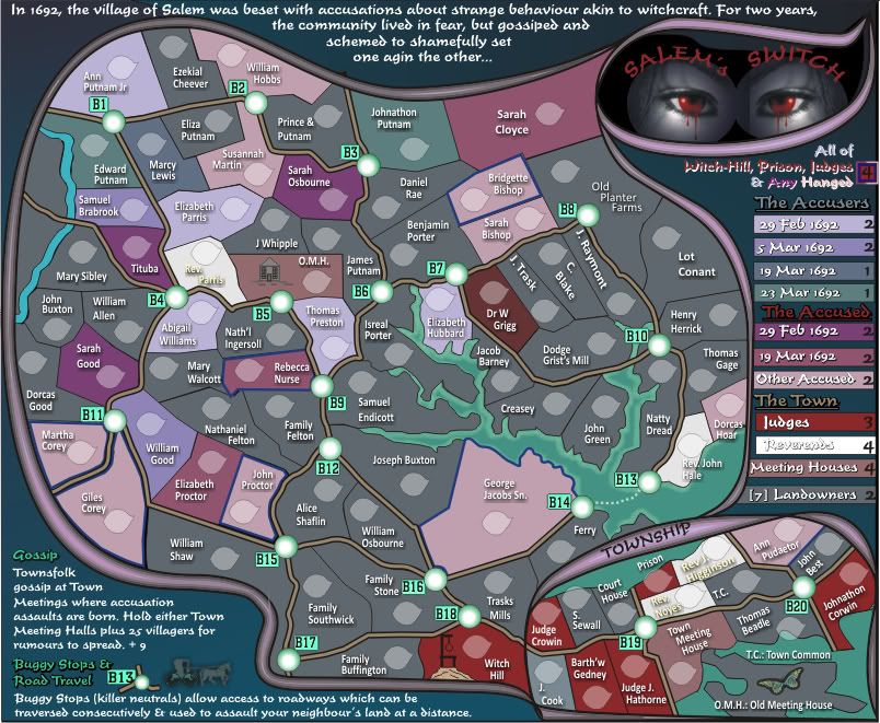
Hehe, you've been on there since last version.natty_dread wrote:I have one idea... how about making the Accusers & Accused into sort of resource pairs? Ie. each pair of Accuser + Accused gives a bonus... not sure how the dates would play into it, though. Maybe they pairs need to be on the same date... if you can make the dates for both groups match.
Also, more on the colours... Nice that you added the red, it complements the other colours well. The water colour could be made either lighter or darker, to stand out better from the land...
Oh and I'm on the map now? Awesome
Ah, i don't have a large at present except for if i scale the small image up. I wasn't going to do the large until i get the small sorted out.isaiah40 wrote:On the supersize, can you post the large as it stands now please. I would to get an idea on space for it. The small will have to be supersized a bit, but the large we may not need to go as big as you have requested.
isaiah40...here are the supersized versions. The large is 10% scaled up on the small. Please forgive if the graphics are a little shoddy as this is all vector stuff which had to be re-arranged somewhat.isaiah40 wrote:I know you are busy, so when you can upscale the small, that'll be fine. I just want to be sure, though now that I think about it, it may need to be to keep it at a visible size difference between the two.

You think so?natty_dread wrote:Those sizes look pretty good... although you could still go to 840 with the large one while staying within regular sizes... there'd be more of a size difference.
Well, a 33% difference is recommended from small to large. Even though 9% is the minimum, I've always figured it's best to have at least a 25% difference - if the sizes are too close together, there's not much point in having large and small versions...cairnswk wrote:You think so?natty_dread wrote:Those sizes look pretty good... although you could still go to 840 with the large one while staying within regular sizes... there'd be more of a size difference.
Yes both look good, if you make the large the standard 840x800 (or whatever this comes out to) then we can have a little more wiggle room on the small if need be. The only place on the small I see a problem with for the 888's and the name, is Rebecca Nurse. I think the number place holder and the name can be switched around with no problem. So for now (Sully don't wait for the image please) I give thee the Witches Invisible Supersize Approved Stamp!!natty_dread wrote:Those sizes look pretty good... although you could still go to 840 with the large one while staying within regular sizes... there'd be more of a size difference.
840 would be about 15% larger than 730... it's still not a huge difference, but I think it would be appropriate... at least better than 10%.
Thank you.isaiah40 wrote:...
....So for now (Sully don't wait for the image please) I give thee the Witches Invisible Supersize Approved Stamp!!


Suggestions for your colours? Nola_lifer...Nola_Lifer wrote:Would be interesting to have a conditional win on this one. The bonus with the white on white is hard to read. I like the map but I still don't dig on the colors all that much.
Ooooo TaCktiX, that one's straight over the top of my headTaCktiX wrote:I swear, he's using black magic! That soul is damned to Hell for profaning God in such a vile manner!

Witch! There will be no having of this "fun" in this thread! Hang him! Hang him high!TaCktiX wrote:It was a double jab at isaiah's invisible stamps and your map theme. Sorry if I'm having TOO much fun.
But Reverend, the Lord can provide !Victor Sullivan wrote:...the town meeting halls are out of tea leaves...
-Rev. Sully