First of all, Dette ser meget bedre! (Hope its close to This looks much better!)
A few things:
1. Swap the colors of Ost jylland and the non playable areas around. Make all the non playable area a darker gray with no inner glow.
2. I don't think the sailing ship fits with the theme, so I think you can remove it.
3. For the territory names a size 12 or 13 font will work the best for readability.
4. For the city banners, do what I showed you on the Coat of arms and the flag, that very slight drop shadow I think will do wonders for them.
5. While we are on drop shadows, I think the bridges need to utilize the drop shadow as well.
6. IMHO, I think the compass can do with the drop shadow. Maybe find a different compass to put in it's place.
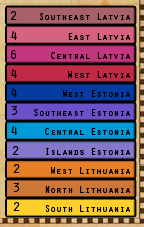
7. I think remove that guy in the legend and do something like
Bruceswar is doing on
Baltic States, here:
You can even copy over the blending from the bonus region so it will be consistent and easy to tell what bonuses are what.
I think this is a long enough list of to-do items to last you the night!

SO we'll be looking forward to your next update.