
then make the color a bit less dark?KEYOGI wrote:In each continent, the colour starts darker at one end and gradually gets lighter across the continent. I have a feeling you have some colour blindness, is this correct Ruben? Do you have a preference between the three?Ruben Cassar wrote:I cannot see any difference between #1 and #2. What are these gradients exactly?
Hmm... the original borders are drawn with a 1 pixel pen and the thicker ones are drawn with a 2 pixel pen. Pretty sure there aren't any 1.5 pixel pen options.Wisse wrote:#3 but if you can make the border a bit less thick it will be perfect
[Official] Middle East REVAMP [Quenched]
Moderator: Cartographers
Forum rules
Please read the Community Guidelines before posting.
Please read the Community Guidelines before posting.


-
Guiscard
- Posts: 4103
- Joined: Fri Dec 08, 2006 7:27 pm
- Location: In the bar... With my head on the bar
Gradient and thicker cont borders is subtle, but a good change. It makes the map seem less 'flat', more a real map (evokes a bit of light and shade I suppose). Plus the thicker cont borders should stop some of the confusion over where they lie.
qwert wrote:Can i ask you something?What is porpose for you to open these Political topic in ConquerClub? Why you mix politic with Risk? Why you not open topic like HOT AND SEXY,or something like that.


April 10
- Ligther continent borders
- Removed gradient
- Fine edge border
Comments
Ok, my attempts at coming up with any sort of decent border were fruitless. There's simply not enough room to make a border that does the rest of the map justice. So, here it is with just a fine 1 pixel border around the edge so the board has and edge to it. Thoughts and opinions?

 highest score: 2157 (Major) / Verd ori'shya beskar'gam

-
reverend_kyle

- Posts: 9250
- Joined: Tue Mar 21, 2006 4:08 pm
- Location: 1000 post club
- Contact:
-
Guiscard
- Posts: 4103
- Joined: Fri Dec 08, 2006 7:27 pm
- Location: In the bar... With my head on the bar
Can't see any real issues here. Lovely map.
Only a minor thing in that would it be possible to move the Iran title upwards and east slightly so its more in the middle of the for territory names around it? Its a little too close to Khuzestan at the moment in my opinion. Turkey could also be moved slightly west so it doesn't touch taurus and Bactria every so slightly north.
Only a minor thing in that would it be possible to move the Iran title upwards and east slightly so its more in the middle of the for territory names around it? Its a little too close to Khuzestan at the moment in my opinion. Turkey could also be moved slightly west so it doesn't touch taurus and Bactria every so slightly north.
qwert wrote:Can i ask you something?What is porpose for you to open these Political topic in ConquerClub? Why you mix politic with Risk? Why you not open topic like HOT AND SEXY,or something like that.

love the redone border
the borders around Euphrates look a little pixely- can those be smoothed? might be others too.
and the label Near East seems a little to far to the left. can it be more centered without it crowding the mountains?
the borders around Euphrates look a little pixely- can those be smoothed? might be others too.
and the label Near East seems a little to far to the left. can it be more centered without it crowding the mountains?
Do you need an excuse to have a war? I mean, who for? Can't you just say "You got lots of cash and land, but I've got a big sword, so divy up right now, chop chop."
Terry Pratchet
Terry Pratchet

The Luxor-Darfur line is so thin and straight that it's really not very obvious at first glance, especially since it overlaps the word EGYPT. I'd move the word Egypt up and make the luxor-darfur line a bit crooked (like the yemen-oman line) if it's at all accurate.
I find it kind of odd how some of your capital letters are different sizes than others- L in Lebanon vs P in Palestine vs B in Baghdad. I'm aware this is partly due to the font you're using, but you may be able to fix it anyway.
The text for Kurdistan should probably be moved up, and Euphrates down, Iran right.
This is all fairly minor stuff, the point being to get rid of some of the overlap.
It may be better to reduce the font size for all the country labels by 2 points instead, though, as turkey (and iran, and egypt) are kind of awful being basically bisected by the line, and Near East is crowded.
My 24 cents or so.
I see a few things that look a tad off...
-should the jordan text be moved up a little so it fits in the borders? I think theres enough room...
-azerbaijan text a little to the right, it doesnt look centered...
looking good...ill have to start playing this map again!
-should the jordan text be moved up a little so it fits in the borders? I think theres enough room...
-azerbaijan text a little to the right, it doesnt look centered...
looking good...ill have to start playing this map again!
my new site - http://www.spritestitch.com/ - A video game craft weblog...


April 12
- Smoothed territory borders
- Some continent labels moved
- Some territory names moved
- XML adjusted
Comments
I took into consideration all of the recent suggestions and implemented most of them. The Luxor/Darfur border remains unchanged because this is a real border, as are a lot of the borders for the map. I think the font is fine as it is, but if it is a problem for others I will look into adjusting it.

font is awesome in the large version, but kinda hard to read in the small...maybe try and make it larger (i know its hard) or switch it up...
my new site - http://www.spritestitch.com/ - A video game craft weblog...
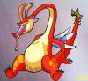
agreed- the territory fonthulmey wrote:i agree with mibi the man does look like he is holding a snake...Could you add a dtring to it sumthing?
Do you need an excuse to have a war? I mean, who for? Can't you just say "You got lots of cash and land, but I've got a big sword, so divy up right now, chop chop."
Terry Pratchet
Terry Pratchet

April 13
- Slight increase in font size for small map
Comments
The large version of the map remains unchanged so I'm just posting the small version with its change. Does anybody besides mibi have a problem with the archer? Perhaps I can look into altering the image slightly or replace it. I have yet to come across a suitable image to replace it with though, so any suggestions are welcome.
-
Contrickster
- Posts: 261
- Joined: Tue Jan 23, 2007 7:24 pm
Looking at that map, I'm a bit concerned about the neutral army numbers on the background color of the "grayer" regions (like Iran).
On the other hand, army shadows typically make either the dark blue or the light blue hard to see, and making the neutral army look a bit weird is a much better solution.
I'd vote for no army shadows whatsoever.
On the other hand, army shadows typically make either the dark blue or the light blue hard to see, and making the neutral army look a bit weird is a much better solution.
I'd vote for no army shadows whatsoever.