
lighter tones of red would be pink. no.
maybe a stroke around the title letters in black.
Cuban Missile Crisis [Quenched]
Moderator: Cartographers
Forum rules
Please read the Community Guidelines before posting.
Please read the Community Guidelines before posting.
-
natty dread

- Posts: 12876
- Joined: Fri Feb 08, 2008 8:58 pm
- Location: just plain fucked
Re: Cuban Missile Crisis [17 Aug 2011] (v36 page 5)
The impassables that look like lots of small X:s... maybe you could change them to something more resembling barbed wire?
As for title, a black stroke would be fine.
As for title, a black stroke would be fine.

-
DiM

- Posts: 10415
- Joined: Wed Feb 14, 2007 6:20 pm
- Gender: Male
- Location: making maps for scooby snacks
Re: Cuban Missile Crisis [17 Aug 2011] (v36 page 5)
why should it look like barbed wire when it's not barbed wire?natty_dread wrote:The impassables that look like lots of small X:s... maybe you could change them to something more resembling barbed wire?
those are hedgehogs. or at least i think that's what they're called.
here's an image:

“In the beginning God said, the four-dimensional divergence of an antisymmetric, second rank tensor equals zero, and there was light, and it was good. And on the seventh day he rested.”- Michio Kaku
Re: Cuban Missile Crisis [17 Aug 2011] (v36 page 5)
I like them how they are also.. I assumed the same as DiM.DiM wrote:why should it look like barbed wire when it's not barbed wire?natty_dread wrote:The impassables that look like lots of small X:s... maybe you could change them to something more resembling barbed wire?
those are hedgehogs. or at least i think that's what they're called.
here's an image:
-
natty dread
- Posts: 12876
- Joined: Fri Feb 08, 2008 8:58 pm
- Location: just plain fucked

Re: Cuban Missile Crisis [17 Aug 2011] (v36 page 5)
Which is exactly what they would look like from the air, no?natty_dread wrote:Yeah, but they look like small X:s.

PB: 2661 | He's blue... If he were green he would die | No mod would be stupid enough to do that
-
natty dread
- Posts: 12876
- Joined: Fri Feb 08, 2008 8:58 pm
- Location: just plain fucked
Re: Cuban Missile Crisis [17 Aug 2011] (v36 page 5)
Maybe you could try making the dotted sea routes into straight dotted lines instead of bezier curves. Not sure if it'd work, but it might create a more appropriate feel for the map... you know, with the cold war theme and all, straight, hard lines would somehow seem to fit better than round, smooth curves...
I also have a suggestion for the colours. The current colour scheme has a sort of bright, sugary feel to it, again not very well conveying the feel of cold war. What I would do is make it a bit more dark and gritty, like this:
This is just a mock-up, but it shows how I would change the land and sea colour. Maybe the sea shouldn't be quite that dark, but in that direction... there's a better contrast between the land and sea there, and you can always add slight glows to the objects on the sea.
Note also the complementary colour contrast between the land and sea: land being more yellowish in hue, with sea being more blue. Yellow and blue are complementary colours, forming a good contrast with each other.
I also have a suggestion for the colours. The current colour scheme has a sort of bright, sugary feel to it, again not very well conveying the feel of cold war. What I would do is make it a bit more dark and gritty, like this:
- Click image to enlarge.

Note also the complementary colour contrast between the land and sea: land being more yellowish in hue, with sea being more blue. Yellow and blue are complementary colours, forming a good contrast with each other.
Re: Cuban Missile Crisis [17 Aug 2011] (v36 page 5)
I like the shades that things were before.. for the area the map is in. Maybe bring down the saturation a tiny bit..
-
Ace Rimmer

- Posts: 1911
- Joined: Mon Dec 01, 2008 1:22 pm
- Gender: Male
Re: Cuban Missile Crisis [17 Aug 2011] (v36 page 5)
Version 39:
Changes:
- Changed color of land and sea
- Changed text color in top right
- Changed CMC logo
- Added shadows to ships
- Changed arrow between Arbonite and Guantanamo Bay
- Click image to enlarge.
- Changed color of land and sea
- Changed text color in top right
- Changed CMC logo
- Added shadows to ships
- Changed arrow between Arbonite and Guantanamo Bay
-
gimil

- Posts: 8599
- Joined: Sat Mar 03, 2007 12:42 pm
- Gender: Male
- Location: United Kingdom (Scotland)
Re: Cuban Missile Crisis [31 Aug 2011] (v39 page 6)
Hi ace,
I am not feeling the title. I think it is because the colours sort of cut up the typography. Although, if you use the same kind of effect on the title that has be used on boht the White House/Kremlin text at the top right then I think it may fit better. By doing this I think you will gain some graphical consistency as well as defining the outline of the letters in the title. Does this make sense?
Also the crosshairs you use across the map to identify jet/submarine targets arn't as immediately obviously as I think they should be. I think they need a little something to make them stand out from the map, like a stroke, or drop shadow.
This is looking very good though, keep it up!
gimil
What do you know about map making, bitch?
Top Score:2403natty_dread wrote:I was wrong
-
Ace Rimmer
- Posts: 1911
- Joined: Mon Dec 01, 2008 1:22 pm
- Gender: Male
Re: Cuban Missile Crisis [31 Aug 2011] (v39 page 6)
It wouldn't make sense to do the same kind of graphics touch to the White House/Kremlin as those are not titles, but part of the map itself. The title is different to stand out. The logo may look a little different/better in the supersized version.
No comments for a week, so it's time to use this as the baseline and start working on supersizing this. More updates to come eventually.
No comments for a week, so it's time to use this as the baseline and start working on supersizing this. More updates to come eventually.
-
gimil
- Posts: 8599
- Joined: Sat Mar 03, 2007 12:42 pm
- Gender: Male
- Location: United Kingdom (Scotland)
Re: Cuban Missile Crisis [31 Aug 2011] (v39 page 6)
I ment at the same light bevel and black stroke to the title as the Kremlin/White House have. This would make title my nicer to look at in my opinion.Ace Rimmer wrote:It wouldn't make sense to do the same kind of graphics touch to the White House/Kremlin as those are not titles, but part of the map itself. The title is different to stand out. The logo may look a little different/better in the supersized version.
No comments for a week, so it's time to use this as the baseline and start working on supersizing this. More updates to come eventually.
What do you know about map making, bitch?
Top Score:2403natty_dread wrote:I was wrong

Re: Cuban Missile Crisis [31 Aug 2011] (v39 page 6)
This is in my mind one of the best maps in the foundry. Great map ace!!
-
DiM
- Posts: 10415
- Joined: Wed Feb 14, 2007 6:20 pm
- Gender: Male
- Location: making maps for scooby snacks
Re: Cuban Missile Crisis [31 Aug 2011] (v39 page 6)
Gillipig wrote:This is in my mind one of the best maps in the foundry. Great map ace!!
i concur.
ace should hurry up making both small and large images so this can get the graphics stamp and be moved to final forge.
“In the beginning God said, the four-dimensional divergence of an antisymmetric, second rank tensor equals zero, and there was light, and it was good. And on the seventh day he rested.”- Michio Kaku
-
Nola_Lifer

- Posts: 819
- Joined: Mon Oct 13, 2008 4:46 pm
- Location: 雪山
- Contact:
Re: Cuban Missile Crisis [31 Aug 2011] (v39 page 6)
Let us make that three.DiM wrote:Gillipig wrote:This is in my mind one of the best maps in the foundry. Great map ace!!
i concur.
ace should hurry up making both small and large images so this can get the graphics stamp and be moved to final forge.

-
lostatlimbo

- Posts: 1386
- Joined: Wed Mar 28, 2007 3:56 pm
- Location: Portland, OR
Re: Cuban Missile Crisis [31 Aug 2011] (v39 page 6)
Fourth'dNola_Lifer wrote:Let us make that three. :D Hope ace rimjob can find time for it. :)DiM wrote:Gillipig wrote:This is in my mind one of the best maps in the foundry. Great map ace!!
i concur.
ace should hurry up making both small and large images so this can get the graphics stamp and be moved to final forge.
-
Ace Rimmer
- Posts: 1911
- Joined: Mon Dec 01, 2008 1:22 pm
- Gender: Male
Re: Cuban Missile Crisis [31 Aug 2011] (v39 page 6)
The large is close to finished. I am not on cc much right now but this will be finished do not worry.
-
Ace Rimmer
- Posts: 1911
- Joined: Mon Dec 01, 2008 1:22 pm
- Gender: Male
Re: Cuban Missile Crisis [31 Aug 2011] (v39 page 6)
Hi guys
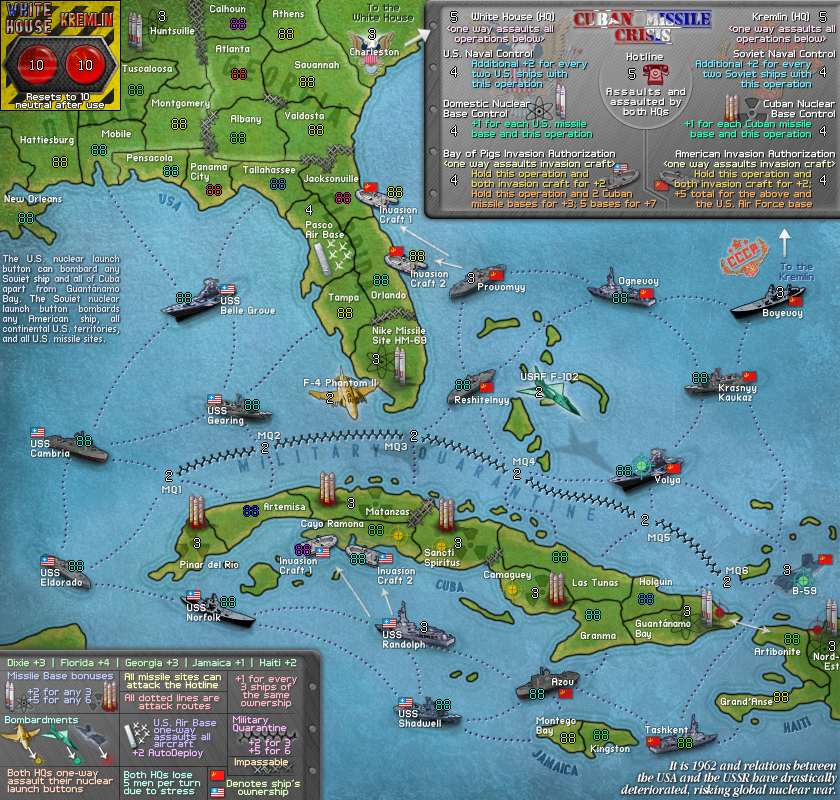
Here is the Supersize version of the map in its current state - please post any feedback, criticisms or concerns.
And here is the current small map (no changes, just brought over to this page):
Here is the Supersize version of the map in its current state - please post any feedback, criticisms or concerns.
- Click image to enlarge.

And here is the current small map (no changes, just brought over to this page):
- Click image to enlarge.

-
trinicardinal

- Posts: 2911
- Joined: Wed Nov 05, 2008 7:59 am
- Location: On a Tropical Island - Coconut anyone?
Re: Cuban Missile Crisis [22 Sept 2011] (supersize p7)
looking good Ace. I'm looking forward to trying this in Beta
10:16:35 ‹Ace Rimmer› haven't looked at work in ages
10:42:43 ‹Sackett58› fine, I'll take my panties elsewhere
10:42:43 ‹Sackett58› fine, I'll take my panties elsewhere
Re: Cuban Missile Crisis [22 Sept 2011] (supersize p7)
It's amazing how much better this map looks when the communist ships are gray instead of red. That little detail somehow really bugged my eye. Great map both visually and gameplay wise!
-
firsal901

- Posts: 193
- Joined: Thu Jul 17, 2008 3:33 am
- Gender: Male
- Location: Laguna, Philippines (Google it)
Re: Cuban Missile Crisis [22 Sept 2011] (supersize p7)
sorry if i missed something, but what the heck does the 2 big red buttons on the upper-left corner do???
i dont see what it does in the legend.
i dont see what it does in the legend.
-
Ace Rimmer
- Posts: 1911
- Joined: Mon Dec 01, 2008 1:22 pm
- Gender: Male
Re: Cuban Missile Crisis [22 Sept 2011] (supersize p7)
Description is to the left of the Belle Grove.Elmo9199 wrote:sorry if i missed something, but what the heck does the 2 big red buttons on the upper-left corner do???
i dont see what it does in the legend.

Re: Cuban Missile Crisis [22 Sept 2011] (supersize p7)
Agreed on the color for the ships, but since they look exactly the same, how about changing the orientation of the Soviet ships, just to help distinguish them from the American ships?


-
firsal901
- Posts: 193
- Joined: Thu Jul 17, 2008 3:33 am
- Gender: Male
- Location: Laguna, Philippines (Google it)
Re: Cuban Missile Crisis [22 Sept 2011] (supersize p7)
RedBaron0 wrote:Agreed on the color for the ships, but since they look exactly the same, how about changing the orientation of the Soviet ships, just to help distinguish them from the American ships?
Honestly, i think the flags are enough to distinguish the US and Soviet ships apart
-
AndyDufresne

- Posts: 24919
- Joined: Fri Mar 03, 2006 8:22 pm
- Location: A Banana Palm in Zihuatanejo
- Contact:
Re: Cuban Missile Crisis [22 Sept 2011] (supersize p7)
I'd probably agree with Elmo9199.Elmo9199 wrote:RedBaron0 wrote:Agreed on the color for the ships, but since they look exactly the same, how about changing the orientation of the Soviet ships, just to help distinguish them from the American ships?
Honestly, i think the flags are enough to distinguish the US and Soviet ships apart
--Andy