Definitely one of my favorites graphically. The legend is well organized, the map has a nice crisp, cleanness about it, and I really like how you used colored territory names to distinguish the bonus areas, and how the territory colorings/textures are more reflective of what the surface legitimately is. Not to mention the badass sign, signature, mountain, and skyline. Love it, love it, love it!
-Sully
Portland [Quenched]
Moderator: Cartographers
Forum rules
Please read the Community Guidelines before posting.
Please read the Community Guidelines before posting.
-
Victor Sullivan

- Posts: 6010
- Joined: Mon Feb 08, 2010 8:17 pm
- Gender: Male
- Location: Columbus, OH
- Contact:
Re: Portland [19 SEP 2011] v.42 - XML & Graphics updated
Beckytheblondie: "Don't give us the dispatch, give us a mustache ride."
Scaling back on my CC involvement...
Scaling back on my CC involvement...
-
thenobodies80

- Posts: 5401
- Joined: Wed Sep 05, 2007 4:30 am
- Gender: Male
- Location: Milan
Re: Portland [19 SEP 2011] v.42 - XML & Graphics updated
The Map is now available for Beta playing. 
-
lostatlimbo

- Posts: 1386
- Joined: Wed Mar 28, 2007 3:56 pm
- Location: Portland, OR
Re: Portland [19 SEP 2011] v.42 - XML & Graphics updated
I'm not normally a poster who uses smilies, but this is cause for celebration. 
I've created a slew of 1-3 player games. Anyone may join. The password is: portland.
I've created a slew of 1-3 player games. Anyone may join. The password is: portland.
-
lostatlimbo
- Posts: 1386
- Joined: Wed Mar 28, 2007 3:56 pm
- Location: Portland, OR
Re: Portland [19 SEP 2011] v.42 - XML & Graphics updated
I've also created a tournament to mark the occasion. Standard double elimination format.
http://www.conquerclub.com/forum/viewto ... 66&start=0
Automatic
Sequential
Escalating
Chained
Sunny
No limit
Casual
http://www.conquerclub.com/forum/viewto ... 66&start=0
Automatic
Sequential
Escalating
Chained
Sunny
No limit
Casual
Last edited by lostatlimbo on Thu Sep 22, 2011 9:33 pm, edited 1 time in total.
Re: Portland [19 SEP 2011] v.42 - XML & Graphics updated
i gotta tell ya even though they busted your chops for over two years ... This a clear and crisp map , HD LIKE , Very Very Nice and Finally Congrats 


Re: Portland [19 SEP 2011] v.42 - XML & Graphics updated
I have to say, this is a damn good map. There's so much stuff going on here, but it's balanced.
High Score: 2906
Re: Portland [19 SEP 2011] v.42 - XML & Graphics updated
Actually, one thing.mviola wrote:I have to say, this is a damn good map. There's so much stuff going on here, but it's balanced.
Can you change "Rose gardens" to "Rose Gardens" in the XML? As soon as I realized it, my eye was drawn to it and I couldn't even pay attention to the map anymore.
High Score: 2906
-
lostatlimbo
- Posts: 1386
- Joined: Wed Mar 28, 2007 3:56 pm
- Location: Portland, OR
Re: Portland [19 SEP 2011] v.42 - XML & Graphics updated
Haha. I will make a note to change that.mviola wrote:Actually, one thing.mviola wrote:I have to say, this is a damn good map. There's so much stuff going on here, but it's balanced.
Can you change "Rose gardens" to "Rose Gardens" in the XML? As soon as I realized it, my eye was drawn to it and I couldn't even pay attention to the map anymore. :lol:
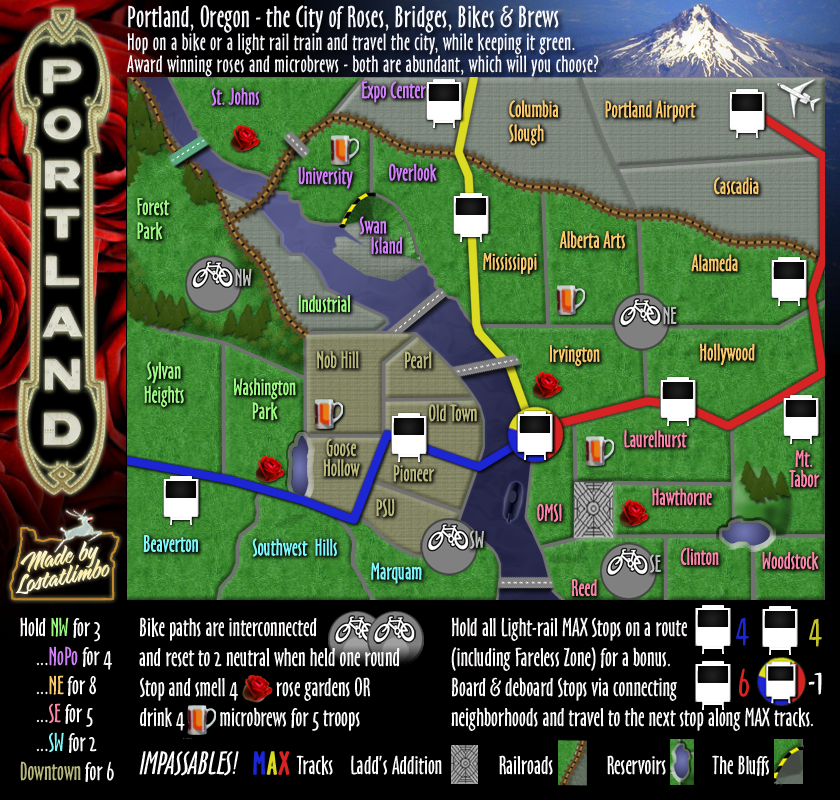
I'm also considering dropping each MAX bonus down by one. The stops are vulnerable in large games, but in smaller games, they can be easily blocked by neutrals and too easy to capture for such a large bonus.
Thoughts on this? Keep in mind that Fareless Zone is -1 per turn, so that should be factored in.

Re: Portland [19 SEP 2011] v.42 - XML & Graphics updated
I'm really sorry to say this but this is one of the ugliest map I've ever seen on CC 
I know you put a lot of effort on this but it seems it took you just 30 min to do it
who the hell was CC graphic reviewer for this map
but apart my aesthetic judgement which very relative and just a point of view
the link between train station and adjacent territories is not very clear
it is always hard to tell if a station is a crossing point or just one sided
plus the connection between forest park and the two territories below is not clear
as the forest border may seems to be impassable
De gueules à la tour d'argent ouverte, crénelée de trois pièces, sommée d'un donjon ajouré, crénelé de deux pièces
Gules an open tower silver, crenellated three parts, topped by a apertured turret, crenellated two parts
Gules an open tower silver, crenellated three parts, topped by a apertured turret, crenellated two parts
-
lostatlimbo
- Posts: 1386
- Joined: Wed Mar 28, 2007 3:56 pm
- Location: Portland, OR
Re: Portland [19 SEP 2011] v.42 - XML & Graphics updated
You are more than welcome not to play it. I certainly don't play any of your maps.pamoa wrote:I'm really sorry to say this but this is one of the ugliest map I've ever seen on CC :cry:
I know you put a lot of effort on this but it seems it took you just 30 min to do it :shock:
who the hell was CC graphic reviewer for this map :x
but apart my aesthetic judgement which very relative and just a point of view
the link between train station and adjacent territories is not very clear
it is always hard to tell if a station is a crossing point or just one sided
plus the connection between forest park and the two territories below is not clear
as the forest border may seems to be impassable
-
lostatlimbo
- Posts: 1386
- Joined: Wed Mar 28, 2007 3:56 pm
- Location: Portland, OR
Re: Portland [19 SEP 2011] v.42 - XML & Graphics updated
I can't help but find some irony in your comment, after some of your own maps have been widely panned and your response to their criticisms was:
There are currently 53 games in play on Portland and 76 finished. You are the first to come here and complain about its aesthetics.
Yet, you have no problem taking a giant dump on my work.pamoa wrote: It is personal
I spent 100 hours of my life on this
so it is very personal
There are currently 53 games in play on Portland and 76 finished. You are the first to come here and complain about its aesthetics.
Re: Portland [19 SEP 2011] v.42 - XML & Graphics updated
I'm not saying you can't be hurt by what I say
nor saying you have to change it or it shouldn't be published
if so I would have commented long ago about it
but I knew it would have been sterile
as I couldn't find a helpful positive judgement about it
but I have also the right to say what I feel about it
and this was to close the debate about aesthetics
but I think you may try to answer the second part about playability
which can be improved to my point of view
De gueules à la tour d'argent ouverte, crénelée de trois pièces, sommée d'un donjon ajouré, crénelé de deux pièces
Gules an open tower silver, crenellated three parts, topped by a apertured turret, crenellated two parts
Gules an open tower silver, crenellated three parts, topped by a apertured turret, crenellated two parts
-
Victor Sullivan
- Posts: 6010
- Joined: Mon Feb 08, 2010 8:17 pm
- Gender: Male
- Location: Columbus, OH
- Contact:
Re: Portland [19 SEP 2011] v.42 - XML & Graphics updated
I've honestly have had no problems with the items you presented, pamoa.
-Sully
-Sully
Beckytheblondie: "Don't give us the dispatch, give us a mustache ride."
Scaling back on my CC involvement...
Scaling back on my CC involvement...
-
lostatlimbo
- Posts: 1386
- Joined: Wed Mar 28, 2007 3:56 pm
- Location: Portland, OR
Re: Portland [19 SEP 2011] v.42 - XML & Graphics updated
I think there is a learning curve to playing on any new map, but a good one you will pick up on those things quickly.
That said, I don't mind nudging some Forest Park trees out of the way for the sake of clarity. I'll play around with the MAX stops too, but I don't see either of these as needing urgent attention. I have lurked through several random finished game chats and didn't see much in the way of confusion there.
I am still waiting for some feedback on the proposal to lower the MAX bonuses. If/when that is implemented, I'll make these other minor graphic edits.
-
Victor Sullivan
- Posts: 6010
- Joined: Mon Feb 08, 2010 8:17 pm
- Gender: Male
- Location: Columbus, OH
- Contact:
Re: Portland [19 SEP 2011] v.42 - XML & Graphics updated
As far as the MAX bonuses go, I think you could reduce yellow and blue by 1, making them each +3. The red could stand to go down to +5, but it's not quite as necessary IMO.
-Sully
-Sully
Beckytheblondie: "Don't give us the dispatch, give us a mustache ride."
Scaling back on my CC involvement...
Scaling back on my CC involvement...
Re: Portland [19 SEP 2011] v.42 - XML & Graphics updated
my main concern is about the train stations
as when you play speed game or freestyle
you can't have an hesitation
my suggestion is that you double the train symbol
one above the other
in the stations where you have a double access
as when you play speed game or freestyle
you can't have an hesitation
my suggestion is that you double the train symbol
one above the other
in the stations where you have a double access
De gueules à la tour d'argent ouverte, crénelée de trois pièces, sommée d'un donjon ajouré, crénelé de deux pièces
Gules an open tower silver, crenellated three parts, topped by a apertured turret, crenellated two parts
Gules an open tower silver, crenellated three parts, topped by a apertured turret, crenellated two parts
Re: Portland [19 SEP 2011] v.42 - XML & Graphics updated
Sorry to be the second to dump on the graphics, and I know I have no artistic talent, but I find this map to be pretty poor graphically as well. Here are my specific issues:
The bridges are pretty weak.
The color scheme of green for the regions is exactly the same as the green player, so BOB is next to useless for seeing a region.
The legend compared to the map is huge, it just seems like a lot more room could have been used for map real estate.
The gameplay is actually pretty good here, somewhat reminiscent of Chicago, which is a top notch map.
Compared to the other maps coming out of the foundry lately, this just doesn't seem polished graphically. Again, I know this is probably going to hurt your feelings but I think there's potential here if the graphics were up to the gameplay's standard.
-
lostatlimbo
- Posts: 1386
- Joined: Wed Mar 28, 2007 3:56 pm
- Location: Portland, OR
Re: Portland [19 SEP 2011] v.42 - XML & Graphics updated
Negative or not, I appreciate that your feedback is at least somewhat constructive.
That said, I'm beginning to think there are just some very different tastes for what quantifies a good graphical map on CC. There's plenty I think look like sh!t that others love and vice versa. Some seem to think anything not hand-drawn is crap, whereas I crave sharp, crips, bold maps.
Obviously I am biased, but I've received a lot more positive kudos on the map graphics than negative. With 176 games finished and 91 in progress, only two have disliked it enough to comment. Perhaps it will fall to the wayside over time, but I'm certainly not going to do a graphic reboot at this point.
PS - I feel obligated to note that this gameplay and layout was in place for almost a year before Chicago was even started. Its also sort of funny you say my legend is too big. Have you seen Chicago recently? More than half of it is legend space.
-
lostatlimbo
- Posts: 1386
- Joined: Wed Mar 28, 2007 3:56 pm
- Location: Portland, OR
Re: Portland [19 SEP 2011] v.42 - XML & Graphics updated
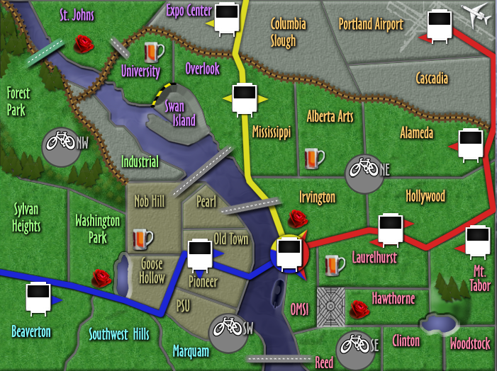
I've been playing around with the max issue and came up with a version with arrows. I don't love it, but if it provides clarity, I'll update.
After having played more with the MAX bonuses, I think they are fine as is. Too hard to hold in most formats to make them any less.
After having played more with the MAX bonuses, I think they are fine as is. Too hard to hold in most formats to make them any less.
Re: Portland [19 SEP 2011] v.42 - MAX arrows?
No, the arrows tell me that I can only attack FROM the max stops, not both ways. Looking at it how about deleting the text "... including the Fareless zone, which decays 1 troop per round held." Since you have the bonuses listed by color and you have the -1 beside the Fareless zone. In that text place you can expand on the Max Stops by saying "Board and de-board MAX Stops via the neighborhoods they touch" or something to that effect. Just my 2 cents worth. 
-
lostatlimbo
- Posts: 1386
- Joined: Wed Mar 28, 2007 3:56 pm
- Location: Portland, OR
Re: Portland [19 SEP 2011] v.42 - MAX arrows?
Good point. I like your idea. Will work on that when I have a free moment.
-
sannemanrobinson
- Posts: 255
- Joined: Mon Dec 20, 2010 6:35 am
- Gender: Male
Re: Portland [19 SEP 2011] v.42
The army numbers on the black MAX windows have not the best readability. Could they be placed on the white parts?
Also the legend is very big in the large map. My screen resolution is 1400x900 but the text is really coming towards me so I prefer the small map to play on.
Also the legend is very big in the large map. My screen resolution is 1400x900 but the text is really coming towards me so I prefer the small map to play on.
-
lostatlimbo
- Posts: 1386
- Joined: Wed Mar 28, 2007 3:56 pm
- Location: Portland, OR
Re: Portland [19 SEP 2011] v.42
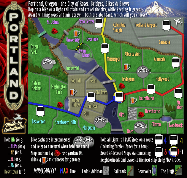
Forgot to upload this, but I updated the legend per isaiah's suggestion does this work for everyone? Or is it still too thematic and unclear?
I'll make the small version too if there are no changes.
On other issues:
Thanks
I'll make the small version too if there are no changes.
- Click image to enlarge.
I could move the MAX numbers, but this is the first complaint I've heard about it, so I'll need to hear some others to make the change. I think most like it as is.sannemanrobinson wrote:The army numbers on the black MAX windows have not the best readability. Could they be placed on the white parts?
Also the legend is very big in the large map. My screen resolution is 1400x900 but the text is really coming towards me so I prefer the small map to play on.
Thanks
-
thenobodies80
- Posts: 5401
- Joined: Wed Sep 05, 2007 4:30 am
- Gender: Male
- Location: Milan
Re: Portland [19 SEP 2011] v.42 - small edit to MAX legend t
The new MAX lines explanation in the legend looks good to me.
About MAX numbers, I think he is referring to blue troops. They are visible and clear on my screen, but I know that some people has issues with them on dark background. Actually I agree with you and I would wait for more feedbacks on this "issue" before pushing you to change the coordinates.
About MAX numbers, I think he is referring to blue troops. They are visible and clear on my screen, but I know that some people has issues with them on dark background. Actually I agree with you and I would wait for more feedbacks on this "issue" before pushing you to change the coordinates.
-
lostatlimbo
- Posts: 1386
- Joined: Wed Mar 28, 2007 3:56 pm
- Location: Portland, OR
Re: Portland [9 NOV 2011] v.43 - graphic improvements?
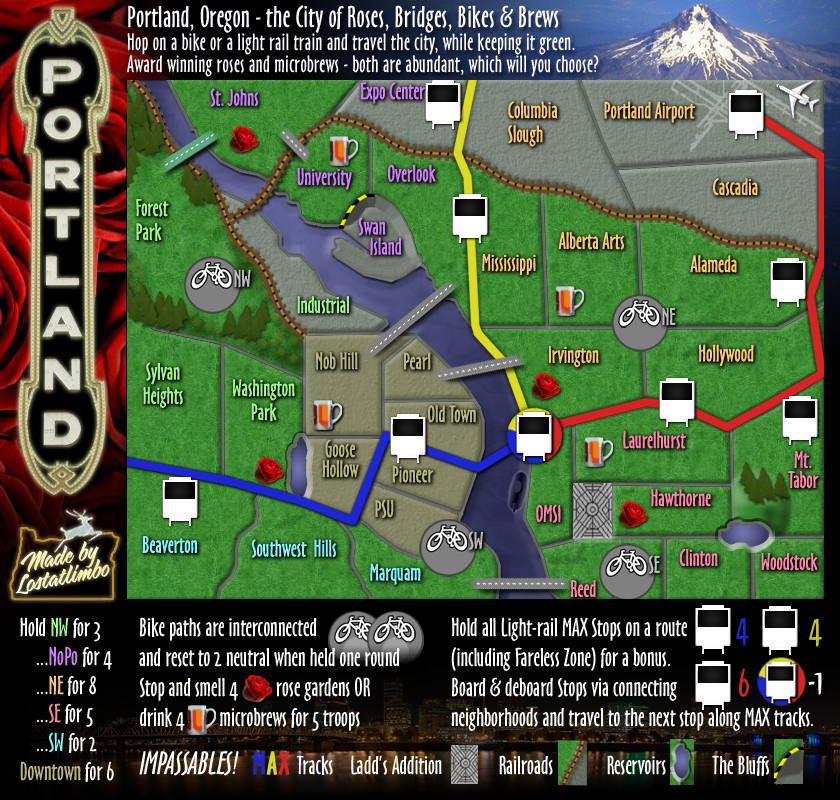
I made a few, mostly minor, graphic changes to clean things up and improve the overall look. Thoughts?
- Click image to enlarge.