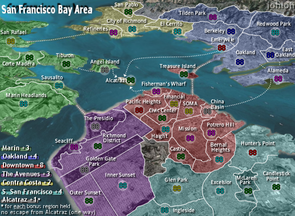
Firstly, I really, really like this map.
I would like to echo someone's earlier point about the colors though. The colors on the key and on the regions for Contra Costa, and to a lesser extent, S. San Francisco don't match up as well as they could and should. Perhaps a bit of a tweak there would be in order?
San Francisco [Quenched]
Moderator: Cartographers
Forum rules
Please read the Community Guidelines before posting.
Please read the Community Guidelines before posting.


I agree...and the prize goes to...GUISCARD!the no escape from alcatraz is brilliant. who ever thought of that deserves a prize.
on my to do list...in the small map the army circles are barely big enough to hold the numbers, no point in having them in there then since you can barely see them.
those are waves from the satellite photo...they only show up on the borders that are close to the pacific ocean (SW)also, whats with that blury stuff on the south west coast line?
the ones that have a whitish look underneath them are bridges that showed up in the satellite photos...golden gate bridge and bay bridge...and why do some water routes have glow nad others dont?
I agree. i havent been quite happy with it yet...i think the title could use more character too.
my new site - http://www.spritestitch.com/ - A video game craft weblog...
-fix fonts in small version
-enlarge army circles in small version
-move and fix signature
-add 'no escape from alcatraz' or something similar to legend
-check colors in legend again...specifically contra costa / s. san fran
-try and work on title
my new site - http://www.spritestitch.com/ - A video game craft weblog...

changes...
-bigger army shadows in small version
-cleared up text in small version (though i did not make it bigger, i dont believe the downtown area can handle bigger text)
-moved sig to top right and faded it
-added more alcatraz stuff to legend
-slightly changed legend colors of 'contra costa' and 's. san francisco'
ill gladly take suggestions on how to improve the title...i couldnt really think of anything different...so i didnt update it.
also, i realize the alcatraz description text in the small version looks a little funky...but if i bold it (as in large version) it takes over the outer sunset...so...
my new site - http://www.spritestitch.com/ - A video game craft weblog...
If you're working with Photoshop, try playing around with the font sharpness options next to font size. It may make a difference, it may not.johloh wrote:also, i realize the alcatraz description text in the small version looks a little funky...but if i bold it (as in large version) it takes over the outer sunset...so...

-changed alcatraz legend font
my new site - http://www.spritestitch.com/ - A video game craft weblog...
-
luckiekevin

- Posts: 272
- Joined: Fri Oct 13, 2006 10:08 pm
- Location: California
there are no more comments because....?
I know that theres no way I can be done...
I know that theres no way I can be done...
my new site - http://www.spritestitch.com/ - A video game craft weblog...

because my comments have been said before?johloh wrote:there are no more comments because....?
It (still) seems odd that the army shadow for Corte Madera is up in the corner when there is so much room under the name. I'd also like to see some graphic distinction between bridges and ferry routes, but don't have any new suggestions (different colors? different dot spacing? I guess those are new suggestions).
I'd like to get the Alcatraz text out of my backyard. Does it need the word "region"?
Could we change:
"no escape from Alcatraz (one way)"
to (slightly shorter):
"Alcatraz can't attack; No escape!"
or
"No attacks/escape from Alcatraz"
or something even shorter?
That's all I've got today.
evil - im going to play around some with the wording of alcatraz...i dont want it in my backyard either! (actually i live in a apt with no backyard, but i do live in the outer sunset)
im not ignoring the blurred text comments...I cleared it up from the previous first version of the small map...but they are vector text, and cant be cleared up anymore...I can either use a different font, or enlarge the font...ill try to enlarge and see if i can fit everything in still....
im not ignoring the blurred text comments...I cleared it up from the previous first version of the small map...but they are vector text, and cant be cleared up anymore...I can either use a different font, or enlarge the font...ill try to enlarge and see if i can fit everything in still....
my new site - http://www.spritestitch.com/ - A video game craft weblog...
-
luckiekevin
- Posts: 272
- Joined: Fri Oct 13, 2006 10:08 pm
- Location: California
-
luckiekevin
- Posts: 272
- Joined: Fri Oct 13, 2006 10:08 pm
- Location: California
ill play around with the shadows too...that might be contributing to why the text does not look as good on the smaller version...
my new site - http://www.spritestitch.com/ - A video game craft weblog...

-
luckiekevin
- Posts: 272
- Joined: Fri Oct 13, 2006 10:08 pm
- Location: California
I don't know if it would help but, what if the lines that represented bridges differed from those representing ferry routes? A more solid line for the bridges might make the dots representing ferry routes, look more like ferry routes. It could also be a mess.oaktown wrote:
Like Otto, my concerns have been raised. Play issues are largely resolved, the ferry attack lines still look weak, but I don't know what to do about it.
-
luckiekevin
- Posts: 272
- Joined: Fri Oct 13, 2006 10:08 pm
- Location: California

i think what keyogi was refering to is the anti-aliasing of the text. if you are using photo shop its either set at Sharp, Crisp, Smooth or Strong. if you can, test them out to see which works best.johloh wrote:evil - im going to play around some with the wording of alcatraz...i dont want it in my backyard either! (actually i live in a apt with no backyard, but i do live in the outer sunset)
im not ignoring the blurred text comments...I cleared it up from the previous first version of the small map...but they are vector text, and cant be cleared up anymore...I can either use a different font, or enlarge the font...ill try to enlarge and see if i can fit everything in still....
also if the tracking is set to 0 i would suggest increasing it to 10 or so.
im not using photoshop...so i cant use those suggestions...but I did increase the size and i think it looks much clearer...you guys be the judge...
my new site - http://www.spritestitch.com/ - A video game craft weblog...

I dont know...i think its better but im not sure...my eyes are starting to hurt from staring at it...I dunno what else to do...I cant make the font any bigger...
better? or not?
my new site - http://www.spritestitch.com/ - A video game craft weblog...
i have no problem with the font. seems fine to me, if people dont like it that small then play the big map! its not that small anyways.
the asterisk is a bit silly, since its about half an inch away from the 'footnote'. maybe you can lose the asterisk and put 'for each' on the line with the alcatraz bonus, and then the rest on the second line. keeping the 'held' off the beach.
the asterisk is a bit silly, since its about half an inch away from the 'footnote'. maybe you can lose the asterisk and put 'for each' on the line with the alcatraz bonus, and then the rest on the second line. keeping the 'held' off the beach.
interesting idea...ill try it.maybe you can lose the asterisk and put 'for each' on the line with the alcatraz bonus, and then the rest on the second line. keeping the 'held' off the beach.
my new site - http://www.spritestitch.com/ - A video game craft weblog...
-removed asterisk
-moved 'for each' up a line in alcatraz text
-replaced bridge 'dots' with 'dashes'
is the new text alignment better? or worse? (im on the fence)
are the bridges better now? or should I keep trying other things? (i know the dashes arent perfect, i just wanted to see if people liked them or not, i can straighten the pixels easily)
I thought about using a different color on the bridges too...but black/gray just disappear and you can hardly see them...with the dark colors of the map, white is really the only color that shows up...
my new site - http://www.spritestitch.com/ - A video game craft weblog...