[Abandoned] - Portugal Gfx Revamp
Moderator: Cartographers
Forum rules
Please read the Community Guidelines before posting.
Please read the Community Guidelines before posting.
-
The Bison King
- Posts: 1957
- Joined: Thu Aug 27, 2009 5:06 pm
- Location: the Mid-Westeros
Re: Portugal [REVAMP] v5, P.1&5
Maybe I'm missing something... I don't understand how this has a gameplay stamp when there is nothing connecting the island territories...?

-
DiM

- Posts: 10415
- Joined: Wed Feb 14, 2007 6:20 pm
- Gender: Male
- Location: making maps for scooby snacks
Re: Portugal [REVAMP] v5, P.1&5
The Bison King wrote:Maybe I'm missing something... I don't understand how this has a gameplay stamp when there is nothing connecting the island territories...?
all revamps start with the draft stamp and the gameplay stamp because only the graphics and the xml will change.
even if the lines aren't present in the last update they were in the previous one and they'll surely be in the final form of the map.
shouldn't you know all this stuff since your a CA deputy or something?
anyway even if the lines of the islands are gone you can still see the islands form a continent because all the terit names are colour coded.
and speaking of that, i don't like it at all. i liked V4 better. the colour coded names look messy and are an overkill.
“In the beginning God said, the four-dimensional divergence of an antisymmetric, second rank tensor equals zero, and there was light, and it was good. And on the seventh day he rested.”- Michio Kaku
-
Victor Sullivan

- Posts: 6010
- Joined: Mon Feb 08, 2010 8:17 pm
- Gender: Male
- Location: Columbus, OH
- Contact:
Re: Portugal [REVAMP] v5, P.1&5
Something more formal/professional. The current font is far too informal for a clean, crisp, professional-looking map. And, really, there's nothing that screams "Portugal" by any stretch of the imagination.gimil wrote:Well what would you suggest?natty_dread wrote:I also dislike the title font. It looks too comicsans-y.
-Sully
Beckytheblondie: "Don't give us the dispatch, give us a mustache ride."
Scaling back on my CC involvement...
Scaling back on my CC involvement...
-
natty dread

- Posts: 12876
- Joined: Fri Feb 08, 2008 8:58 pm
- Location: just plain fucked

-
natty dread
- Posts: 12876
- Joined: Fri Feb 08, 2008 8:58 pm
- Location: just plain fucked

Re: Portugal [REVAMP] v5, P.1&5
I am impressed! I did HUGE research but you found this!
-
natty dread
- Posts: 12876
- Joined: Fri Feb 08, 2008 8:58 pm
- Location: just plain fucked


-
Condestável
- Posts: 173
- Joined: Thu Feb 03, 2011 12:11 am
- Location: Portugal
Re: Portugal [REVAMP] v5, P.1&5
gimil wrote:
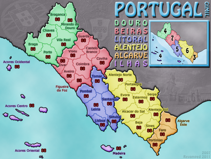
Hi foundry goers,
After a rather long map making hiatus. I have finally decided to get back into map making, deciding to REVAMP my very first map PORTUGAL in order to get my photoshopping muscles warmed up again. I decided to maintain the same theme and colouring with the aim of making an overall cleaner and fresher finished product. This is a graphical REVAMP only (with game play remaining unchanged). So without further ado, here is my first draft with a list of possible discussion areas and aspects I am as of yet not satisfied with. Any and all comments, feedback and general whinging is welcome!
Ver. 5
- Click image to enlarge.


Gimil, are you still going for this revamp?
I could help you. Many names are completely misplaced.
Where you read Viseu, you should read Lamego.
Where you read Ovar, you should read Feira.
Where you read Coimbra, you should read Viseu.
Where you read Figueira da Foz you should read Coimbra.
Covilhã (not Covilha - covilha is a "small grave") is swapped with Castelo Branco.
Where you read Alentejo Norte you should read Portalegre.
Where you read Portalegre you should enlarge a bit a put "Elvas"
It's not EsTERmoz, it's EsTREmoz, but in that place should be "Beja".
Where you have Beja it's precisely Sines.
Where you have Sines is "Ourique"
Where you have Alentejo Sul it's "Mértola"
Where you have Algarve Este, you should have the most important city "Tavira"
The region called Litoral also doesn't exist. We call "Estremadura".
Please, can I help you revamping names and territory shapes?
-
Condestável
- Posts: 173
- Joined: Thu Feb 03, 2011 12:11 am
- Location: Portugal
Re: Portugal [REVAMP] v5, P.1&5
Here you have a much more accurate base to work. Namewise and borderwise. 
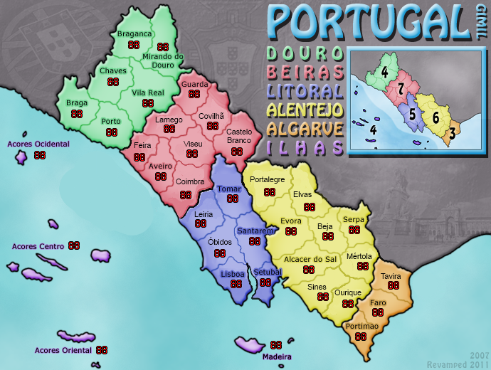
My portuguese fellow countrymen will certainly confirm how this looks tenfold more accurate. You must also use correct accents/signs, or else it looks weird.
Well, the biggest city where it reads now "Óbidos" is Caldas da Rainha... But the name is a bit too long. Hence Óbidos should suffice.
Same about Sines: most important city is Santiago do Cacém. But again a bit too long.
-
thenobodies80

- Posts: 5401
- Joined: Wed Sep 05, 2007 4:30 am
- Gender: Male
- Location: Milan
Re: Portugal [REVAMP] v5, P.1&5
It's passed a month without an update.
Moving this one into the Recycling Box for a [Vacation] period, if you want to continue with the map, then one of the Foundry Moderators (lol) will be able to help put the thread back into the Foundry system, after an update has been made.
Nobodies
Moving this one into the Recycling Box for a [Vacation] period, if you want to continue with the map, then one of the Foundry Moderators (lol) will be able to help put the thread back into the Foundry system, after an update has been made.
Nobodies
-
Armandolas

- Posts: 1761
- Joined: Fri Jun 06, 2008 6:32 am
- Gender: Male
- Location: Lisbon
Re: [Abandoned] - Portugal Gfx Revamp
I agree with Kabanellas....this map should not be layed down, and definitly needs a graphic revamp.
Also Condestável corrections are definitly worth the change , as the actual map is not accurate
Also Condestável corrections are definitly worth the change , as the actual map is not accurate