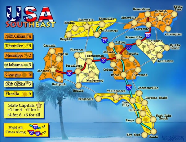
porkenbeans wrote:I think that nat and Co. are wrong. They are trying every way they can to change the style from "The Pack".
"They" aren't really trying to change the style from "the pack" per se, but to make the map less cluttered and easier to read. That would be accomplished by simplifying the style.
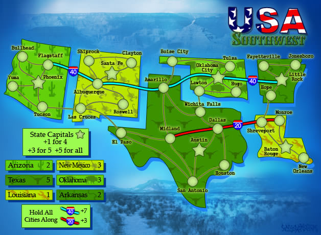
I mean, look at the current image, and add army numbers on that... lines criss-crossing everywhere, clutter...
The problem with the gaps between the states is that it doubles the amount of lines on the map, which just means more clutter. Without the gaps, there'd be only one black line between 2 states, whereas with them there is two.
Gameplay clarity is first priority, before any aesthetic/stylistic concerns. That's just the way it is. Now I'm not saying that the gaps have to be removed, it's just my suggestion for fixing the current situation. If there's another way to simplify the visual look of the map and reduce the clutter, that'd be good as well.
Also, look at the map images in "the pack"... there, the outlines of the states are very faint, not strong black lines like you have here. If you can do something like that here, it might help with the situation. The territory connections, and army circle outlines are also a less intense than the interstate lines, which creates a contrast, helps to tell them apart. Whereas on this map, all the lines are the same thickness and strength... which contributes to the clutter.
- Click image to enlarge.