[Vacation until Dec] Knights & Warlocks - V15 - page 1&12
Moderator: Cartographers
Forum rules
Please read the Community Guidelines before posting.
Please read the Community Guidelines before posting.
-
natty dread

- Posts: 12876
- Joined: Fri Feb 08, 2008 8:58 pm
- Location: just plain fucked
Re: Knights & Warlocks [23.Dec.11] - V10 - page 1&5
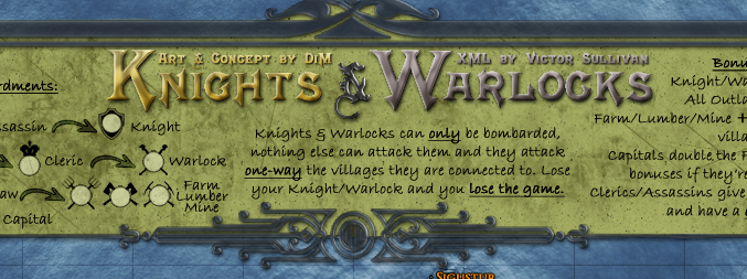
Also, the title text looks kinda rough around the edges... somewhat pixelated. The "XML by..." text is almost illegible. I think the texts need to be redone.

-
DiM

- Posts: 10415
- Joined: Wed Feb 14, 2007 6:20 pm
- Gender: Male
- Location: making maps for scooby snacks
Re: Knights & Warlocks [23.Dec.11] - V10 - page 1&5
i've uploaded a large version with no numbers in the previous post.Victor Sullivan wrote:AAAHHHH!!! I got you DiM!!! *sprays DiM with a fire extinguisher* Phew!AndyDufresne wrote:You are on fire, DiM!
Anywho, could you post the small and large versions without numbers? That XML is gonna take me awhile, so I might as well get a head start!
-Sully
the small is not don yet. i'll get started on it asap as there aren't any major graphic concerns.
“In the beginning God said, the four-dimensional divergence of an antisymmetric, second rank tensor equals zero, and there was light, and it was good. And on the seventh day he rested.”- Michio Kaku
-
Victor Sullivan

- Posts: 6010
- Joined: Mon Feb 08, 2010 8:17 pm
- Gender: Male
- Location: Columbus, OH
- Contact:
Re: Knights & Warlocks [23.Dec.11] - V10 - page 1&5
Thanks! Was I just blind or did you just do that?
-Sully
-Sully
Beckytheblondie: "Don't give us the dispatch, give us a mustache ride."
Scaling back on my CC involvement...
Scaling back on my CC involvement...
-
DiM
- Posts: 10415
- Joined: Wed Feb 14, 2007 6:20 pm
- Gender: Male
- Location: making maps for scooby snacks
Re: Knights & Warlocks [23.Dec.11] - V10 - page 1&5
yeah i was just looking at that now and figured it will get worse on the small version.natty_dread wrote:Also, the title text looks kinda rough around the edges... somewhat pixelated. The "XML by..." text is almost illegible. I think the texts need to be redone.
the sigs are too small to have bevel so i'll remove that but for the large i want to keep the bevel.
however i don't know why the edges are pixelated. the bevel is smooth and antialiased, the text is on smooth.
i'l tinker with it and see what i get.
“In the beginning God said, the four-dimensional divergence of an antisymmetric, second rank tensor equals zero, and there was light, and it was good. And on the seventh day he rested.”- Michio Kaku
-
DiM
- Posts: 10415
- Joined: Wed Feb 14, 2007 6:20 pm
- Gender: Male
- Location: making maps for scooby snacks
Re: Knights & Warlocks [23.Dec.11] - V10 - page 1&5
i got this:

better?
better?
“In the beginning God said, the four-dimensional divergence of an antisymmetric, second rank tensor equals zero, and there was light, and it was good. And on the seventh day he rested.”- Michio Kaku
-
natty dread
- Posts: 12876
- Joined: Fri Feb 08, 2008 8:58 pm
- Location: just plain fucked
Re: Knights & Warlocks [23.Dec.11] - V10 - page 1&5
It's better. There are some parts, like the sharp corners on the K and N and some other letters that have some slight pixelation left... perhaps you could rasterize the text and deal with it on a pixel level?
-
DiM
- Posts: 10415
- Joined: Wed Feb 14, 2007 6:20 pm
- Gender: Male
- Location: making maps for scooby snacks
Re: Knights & Warlocks [23.Dec.11] - V10 - page 1&5
rasterizing = losing all editing options.
i don't think it's such a big deal to go to such an extreme measure.
i don't think it's such a big deal to go to such an extreme measure.
“In the beginning God said, the four-dimensional divergence of an antisymmetric, second rank tensor equals zero, and there was light, and it was good. And on the seventh day he rested.”- Michio Kaku
-
natty dread
- Posts: 12876
- Joined: Fri Feb 08, 2008 8:58 pm
- Location: just plain fucked
Re: Knights & Warlocks [23.Dec.11] - V10 - page 1&5
Not if you keep a backup of the old text layer, which you just turn invisible...DiM wrote:rasterizing = losing all editing options.
i don't think it's such a big deal to go to such an extreme measure.
Join the dark side... embrance gonzo editing!
-
DiM
- Posts: 10415
- Joined: Wed Feb 14, 2007 6:20 pm
- Gender: Male
- Location: making maps for scooby snacks
Re: Knights & Warlocks [23.Dec.11] - V10 - page 1&5
lol, i already do that. that's why my psd files become little monsters.natty_dread wrote:Not if you keep a backup of the old text layer, which you just turn invisible...DiM wrote:rasterizing = losing all editing options.
i don't think it's such a big deal to go to such an extreme measure.
Join the dark side... embrance gonzo editing!
but let's say i rasterize and start tweaking at a pixel level and then somebody wants the text to be pink. i have to scrap my pixel work, go back to the back-up version, make it pink, rasterize again, work on the pixel level again. well, you get the idea
“In the beginning God said, the four-dimensional divergence of an antisymmetric, second rank tensor equals zero, and there was light, and it was good. And on the seventh day he rested.”- Michio Kaku
-
natty dread
- Posts: 12876
- Joined: Fri Feb 08, 2008 8:58 pm
- Location: just plain fucked
Re: Knights & Warlocks [23.Dec.11] - V10 - page 1&5
Sure, but you can always solve it by more gonzo editing!DiM wrote:lol, i already do that. that's why my psd files become little monsters.
but let's say i rasterize and start tweaking at a pixel level and then somebody wants the text to be pink. i have to scrap my pixel work, go back to the back-up version, make it pink, rasterize again, work on the pixel level again. well, you get the idea
Ok, so what about this: just create an empty layer on top of the text layer, and do the pixel tweaks on this empty layer so they're on top of the text.
-
DiM
- Posts: 10415
- Joined: Wed Feb 14, 2007 6:20 pm
- Gender: Male
- Location: making maps for scooby snacks
Re: Knights & Warlocks [23.Dec.11] - V10 - page 1&5
i'll see
“In the beginning God said, the four-dimensional divergence of an antisymmetric, second rank tensor equals zero, and there was light, and it was good. And on the seventh day he rested.”- Michio Kaku
-
gimil

- Posts: 8599
- Joined: Sat Mar 03, 2007 12:42 pm
- Gender: Male
- Location: United Kingdom (Scotland)
Re: Knights & Warlocks [23.Dec.11] - V10 - page 1&5
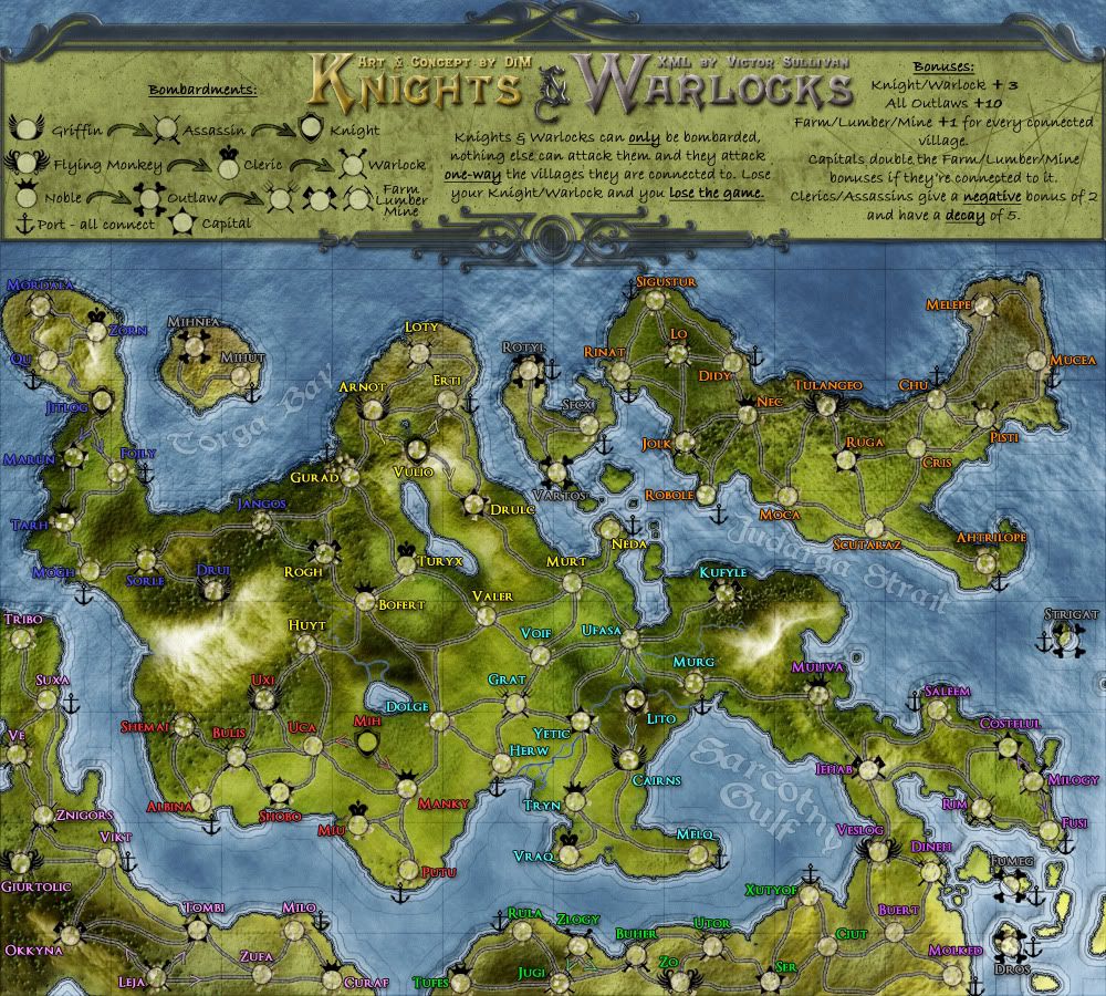
I am still not feeling the the blue, purple and red terr names. I think going with a light glow makes them feel washed out and inconsistent. I am convinced that you could keep the same dark outline layer styles on all the terr names...
I did a little tester myself and suggest the following colours would work nicely:
Red: #fc5353
Blue: #4f4fff
Purple: #da53fc
If you look at my test image below you will see examples on: Jehad (purple), Shemai (Red) and Sorle (Blue).
Let me know what you think...
Apart from that I am satisfied with the aesthetics of the main map. I do have some general issues with the legends/title area though. Both the silver outline and title are heavily pixelated with heavy white (seemingly random) pixels. Looks almost like you did a poor cut and paste job on them from somewhere else. The design themselves are good. But the pixelation really needs to be sorted.
Also everything of importance in the legends is black....black black black. It means that your major gameplay mechanics are not immediately noticeable. Why can't each symbol be unique and stand out in some way?
gimil
I did a little tester myself and suggest the following colours would work nicely:
Red: #fc5353
Blue: #4f4fff
Purple: #da53fc
If you look at my test image below you will see examples on: Jehad (purple), Shemai (Red) and Sorle (Blue).
- Click image to enlarge.
Apart from that I am satisfied with the aesthetics of the main map. I do have some general issues with the legends/title area though. Both the silver outline and title are heavily pixelated with heavy white (seemingly random) pixels. Looks almost like you did a poor cut and paste job on them from somewhere else. The design themselves are good. But the pixelation really needs to be sorted.
Also everything of importance in the legends is black....black black black. It means that your major gameplay mechanics are not immediately noticeable. Why can't each symbol be unique and stand out in some way?
gimil
What do you know about map making, bitch?
Top Score:2403natty_dread wrote:I was wrong
-
DiM
- Posts: 10415
- Joined: Wed Feb 14, 2007 6:20 pm
- Gender: Male
- Location: making maps for scooby snacks
Re: Knights & Warlocks [23.Dec.11] - V10 - page 1&5
cool colours. used them and it fits great. see bellow.gimil wrote:I am still not feeling the the blue, purple and red terr names. I think going with a light glow makes them feel washed out and inconsistent. I am convinced that you could keep the same dark outline layer styles on all the terr names...
I did a little tester myself and suggest the following colours would work nicely:
Red: #fc5353
Blue: #4f4fff
Purple: #da53fc
If you look at my test image below you will see examples on: Jehad (purple), Shemai (Red) and Sorle (Blue).
http://i25.photobucket.com/albums/c64/G ... Wdraft.png
Let me know what you think...
man it really pissed me off this title pixelation thing. i tried everything and then i noticed i hadn't ticked the "use global light" check box so i had some weird light from the wrong direction.gimil wrote:Apart from that I am satisfied with the aesthetics of the main map. I do have some general issues with the legends/title area though. Both the silver outline and title are heavily pixelated with heavy white (seemingly random) pixels. Looks almost like you did a poor cut and paste job on them from somewhere else. The design themselves are good. But the pixelation really needs to be sorted.
anyway, i also tweaked the colours a bit and decided to go for a dark glass kind of look.
well each symbol is unique. but i'm not going to colour code each and every symbol on the map because:gimil wrote:Also everything of importance in the legends is black....black black black. It means that your major gameplay mechanics are not immediately noticeable. Why can't each symbol be unique and stand out in some way?
1. it will look like a rainbow mess
2. i assume people aren't complete retards that need colour codes on top of different icons and clear words.
“In the beginning God said, the four-dimensional divergence of an antisymmetric, second rank tensor equals zero, and there was light, and it was good. And on the seventh day he rested.”- Michio Kaku
-
DiM
- Posts: 10415
- Joined: Wed Feb 14, 2007 6:20 pm
- Gender: Male
- Location: making maps for scooby snacks
Re: Knights & Warlocks [23.Dec.11] - V10 - page 1&5
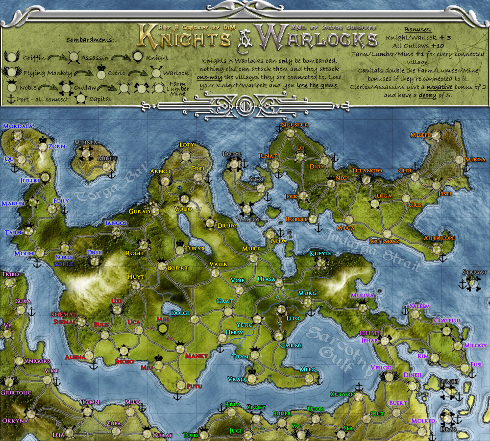
V11:
*changed title and legend border
*changed terit names colour
*changed title and legend border
*changed terit names colour
- Click image to enlarge.
“In the beginning God said, the four-dimensional divergence of an antisymmetric, second rank tensor equals zero, and there was light, and it was good. And on the seventh day he rested.”- Michio Kaku
-
gimil
- Posts: 8599
- Joined: Sat Mar 03, 2007 12:42 pm
- Gender: Male
- Location: United Kingdom (Scotland)
Re: Knights & Warlocks [24.Dec.11] - V11 - page 1&6
And like that...this map falls into place 
Well done mate.
Well done mate.
What do you know about map making, bitch?
Top Score:2403natty_dread wrote:I was wrong
-
DiM
- Posts: 10415
- Joined: Wed Feb 14, 2007 6:20 pm
- Gender: Male
- Location: making maps for scooby snacks
Re: Knights & Warlocks [24.Dec.11] - V11 - page 1&6
sweet 
“In the beginning God said, the four-dimensional divergence of an antisymmetric, second rank tensor equals zero, and there was light, and it was good. And on the seventh day he rested.”- Michio Kaku
-
gimil
- Posts: 8599
- Joined: Sat Mar 03, 2007 12:42 pm
- Gender: Male
- Location: United Kingdom (Scotland)
Re: Knights & Warlocks [24.Dec.11] - V11 - page 1&6
After waking up and having a fresh look at this map again. I think the fancy border around the legends is to dark. I suggest lightening it...but other than that I am struggling to find anything else wrong with this map.
What do you know about map making, bitch?
Top Score:2403natty_dread wrote:I was wrong
-
DiM
- Posts: 10415
- Joined: Wed Feb 14, 2007 6:20 pm
- Gender: Male
- Location: making maps for scooby snacks
Re: Knights & Warlocks [24.Dec.11] - V11 - page 1&6
gimil wrote:After waking up and having a fresh look at this map again. I think the fancy border around the legends is to dark. I suggest lightening it...but other than that I am struggling to find anything else wrong with this map.
nooooooooooo. my dark glass? i like it
“In the beginning God said, the four-dimensional divergence of an antisymmetric, second rank tensor equals zero, and there was light, and it was good. And on the seventh day he rested.”- Michio Kaku
-
natty dread
- Posts: 12876
- Joined: Fri Feb 08, 2008 8:58 pm
- Location: just plain fucked
-
DiM
- Posts: 10415
- Joined: Wed Feb 14, 2007 6:20 pm
- Gender: Male
- Location: making maps for scooby snacks
Re: Knights & Warlocks [24.Dec.11] - V11 - page 1&6
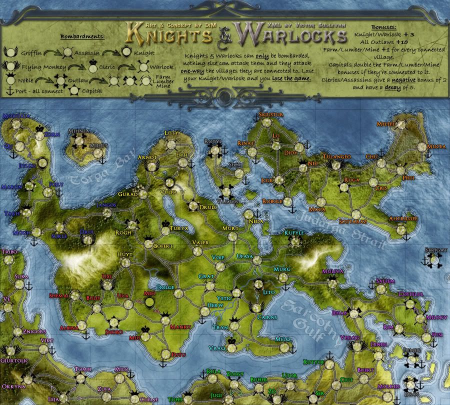
now:
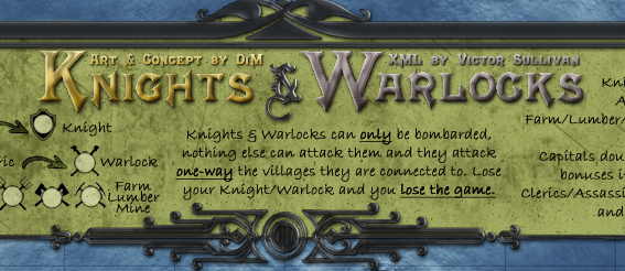
more transparent:
even more transparent:
more transparent:
even more transparent:
“In the beginning God said, the four-dimensional divergence of an antisymmetric, second rank tensor equals zero, and there was light, and it was good. And on the seventh day he rested.”- Michio Kaku
Re: Knights & Warlocks [24.Dec.11] - V11 - page 1&6
I think the last one looks the best. It also doesn't look as pixelated.
-
gimil
- Posts: 8599
- Joined: Sat Mar 03, 2007 12:42 pm
- Gender: Male
- Location: United Kingdom (Scotland)
Re: Knights & Warlocks [24.Dec.11] - V11 - page 1&6
I agree. Would like to see the last one on the full map.isaiah40 wrote:I think the last one looks the best. It also doesn't look as pixelated.
What do you know about map making, bitch?
Top Score:2403natty_dread wrote:I was wrong
-
DiM
- Posts: 10415
- Joined: Wed Feb 14, 2007 6:20 pm
- Gender: Male
- Location: making maps for scooby snacks
Re: Knights & Warlocks [24.Dec.11] - V11 - page 1&6
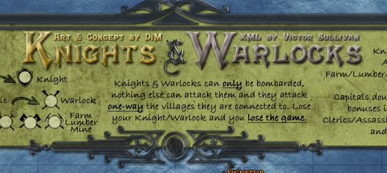
here you go:
- Click image to enlarge.
“In the beginning God said, the four-dimensional divergence of an antisymmetric, second rank tensor equals zero, and there was light, and it was good. And on the seventh day he rested.”- Michio Kaku
-
gimil
- Posts: 8599
- Joined: Sat Mar 03, 2007 12:42 pm
- Gender: Male
- Location: United Kingdom (Scotland)
Re: Knights & Warlocks [24.Dec.11] - V11 - page 1&6
Nah I have to be honest...I still don't feel it. I prefer it when it was much lighter. Sorry.
What do you know about map making, bitch?
Top Score:2403natty_dread wrote:I was wrong
-
DiM
- Posts: 10415
- Joined: Wed Feb 14, 2007 6:20 pm
- Gender: Male
- Location: making maps for scooby snacks
Re: Knights & Warlocks [24.Dec.11] - V11 - page 1&6
go watch this movie:gimil wrote:Nah I have to be honest...I still don't feel it. I prefer it when it was much lighter. Sorry.
http://www.wimp.com/designerlife/
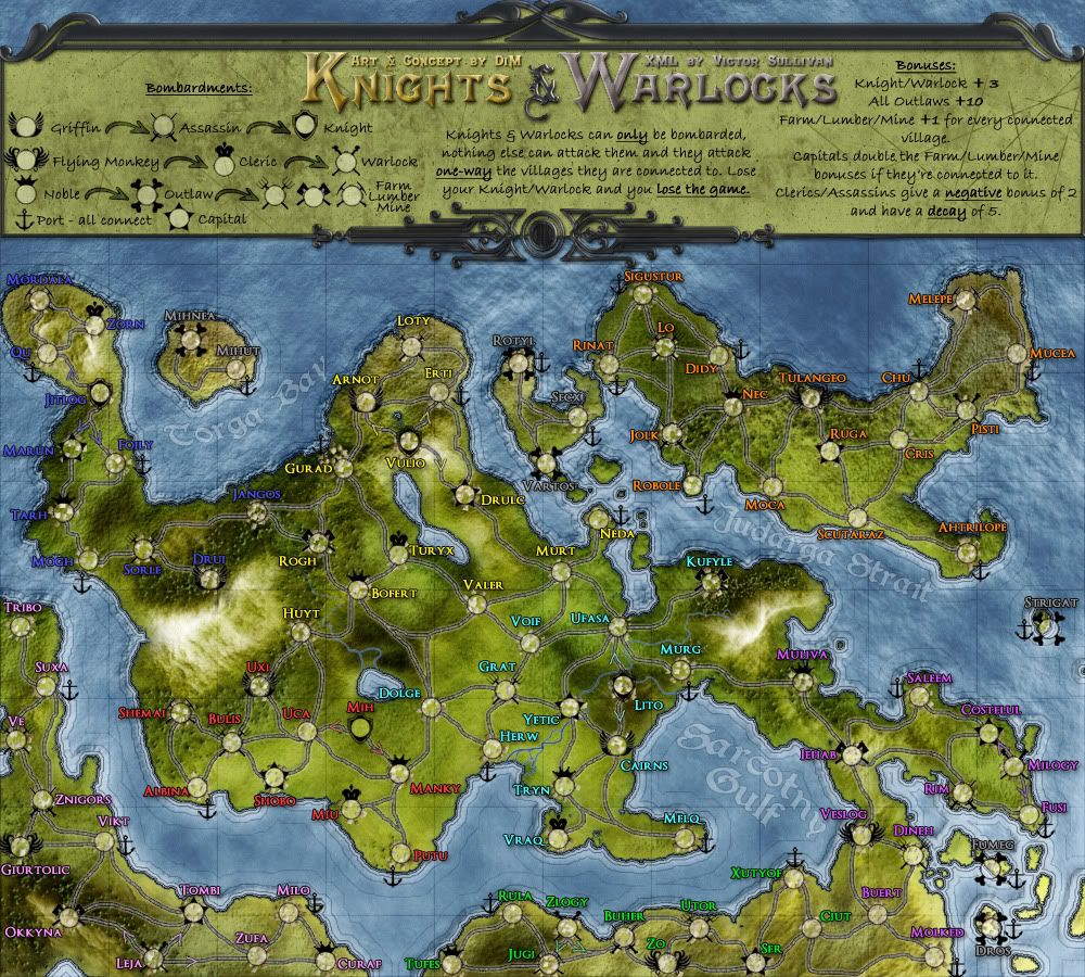
in the meantime i did the small version.
V12:
large:
- Click image to enlarge.
- Click image to enlarge.
“In the beginning God said, the four-dimensional divergence of an antisymmetric, second rank tensor equals zero, and there was light, and it was good. And on the seventh day he rested.”- Michio Kaku