Changes:
- tweaked the pipes a little
- Added in bends and 'T' 's to the pipes
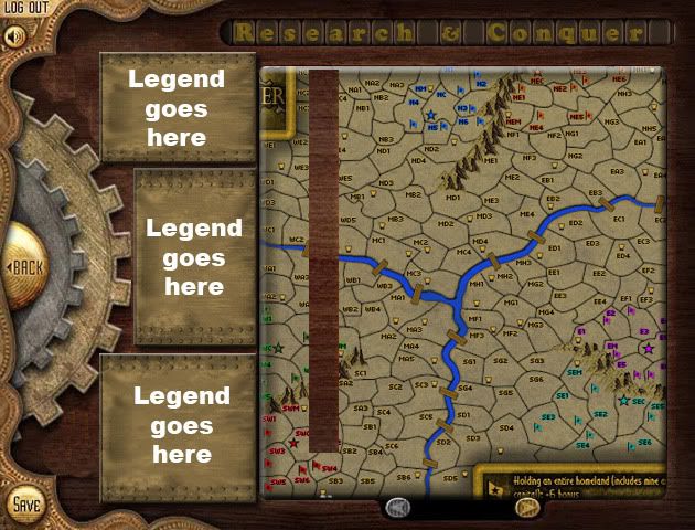
- Click image to enlarge.

Moderator: Cartographers


i agree. you can keep the layout as it seems pretty well ironed out but i think starting over might actually be easier than fixing bits and pieces.natty dread wrote:You know, I think it might be better to start over with entirely new graphics... If Tacktix isn't working on this anymore.
DiM wrote:i had no idea you wanted to go for an old display feel. and i'm afraid there's nothing to suggest me that.
first of all if the terits appear on a display then that display needs a margin of some sort. on the right side it just stops with no border or anything.
second, that display would have a clearly defined rectangular or rounded form not what you have now with protrusions.
so to give the feel of a display first you must fix the above.
however i have a graphic vision of what you should do.
imagine a wooden surface with an old crt display inside. and on the side you have pieces of metal riveted on the wood. and on those pieces of metal you have the legend.
i'll try and post a crude mock-up in a few minutes because an image would better reflect my idea.
Well, if you are okay with it either way (not that there's anything wrong with thatisaiah40 wrote:So what do others say? Start from scratch or continue with this one?? I'm okay with it either way.

I'm sorry to see you leave, TaCKtiX, and I do hope that you will return at some point to enjoy all of the hard work that you've put into the map. Thank you for all the work you've put into the map over the last two years, it's very much appreciated.TaCktiX wrote:I've done a lot of thinking about this map and my ability to do the necessary improvements over the past several days. I can't do it. My drive to do anything in Photoshop or on this site is essentially negative at this point. I go to work every day and get paid to do that, and I enjoy it. I do not get paid anything to be on this site and I'm not enjoying it at this point. So I am terminating my involvement with Research & Conquer at this point.
However, I still want to see the map reach play one day for the simple fact that Oliver had a great idea and it's one that deserves to see the light of day. I have given Industrial Helix the link to all of my source PSDs. Whoever is willing to take it forward can contact him for them.
As for me, I'm done. Once my final game on CC is concluded, I will not be logging back in. I wish I could say it was fun, but the past year has been anything but.
I just noticed that I failed to express my regrets over the departure of TaCktiX. Tanarri has said it very well.-=- Tanarri -=- wrote:I'm sorry to see you leave, TaCKtiX, and I do hope that you will return at some point to enjoy all of the hard work that you've put into the map. Thank you for all the work you've put into the map over the last two years, it's very much appreciated.TaCktiX wrote:I've done a lot of thinking about this map and my ability to do the necessary improvements over the past several days. I can't do it. My drive to do anything in Photoshop or on this site is essentially negative at this point. I go to work every day and get paid to do that, and I enjoy it. I do not get paid anything to be on this site and I'm not enjoying it at this point. So I am terminating my involvement with Research & Conquer at this point.
However, I still want to see the map reach play one day for the simple fact that Oliver had a great idea and it's one that deserves to see the light of day. I have given Industrial Helix the link to all of my source PSDs. Whoever is willing to take it forward can contact him for them.
As for me, I'm done. Once my final game on CC is concluded, I will not be logging back in. I wish I could say it was fun, but the past year has been anything but.


Thank you!-=- Tanarri -=- wrote:Hi Isaiah,
I don't have much time to properly respond, but thought I'd give a few first impressions.
As far as the map area goes, I think it's improved a fair bit. While I liked the theme that TaCKtiX had going and thought it fit a bit better with the steampunk concept, his map area graphics were limited because of it. So great work with that part
You are talking about the background correct? Yea I just threw the color there so people can still see the connection so it will be changed.For my own preferences, the grey and bronze texture could use some work. I think they appear rather pixelated and while I like the general concept, I think it could use a different texture. The bright purple / pink colour for conscriptions seems really out of place and I think it should be a different colour.
Actually I tried doing it at the original size and kept upsizing from there. My main concern/goal was to make the TV area clear and uncluttered which I believe I accomplished. The dials are at the smallest size possible to fit in the 888's - yes I shrunk them down to make sure. As for everything else, I think we can agree that the gauges can stay. I'm partial to the dials, but they can be changed. i could have the Laboratories as a dial instead and go back to the gauges for everything. Once I get the instructions finished then we can go from there on rearranging everything and get this smaller.The last major thing I think that needs to be rethought about this design is the size of the map. Even at a pretty decent screen resolution on a wide screen monitor the map runs nearly all the way to the right, making it so that you would need to scroll right just to see the list of players, clock, etc. on the right side of the map. I think the current design of the map doesn't use space very efficiently. It almost looks like you chose the maximum supersize resolution to start and then tried to think of how to fill in the space. I think the previous layout which was used for the labratories which had everything arranged in rows would work better than the dials. The current sections that are arranged like that already could be shrunk down and I think that would clear up some space. It may also be possible to stick one or two of the researches underneath the map, depending on how much space the instructions need. That would help reduce some of the vertical space.
Having a bad day nattynatty dread wrote:Ok, first of all, there's way too much wasted space, the playable area is way too small compared to the surroundings.
The image composition is not balanced. The colours clash, the bright green playable area looks out of place in middle of all those grey/brown hues, and in general all the elements of the map just don't seem to match each other.
Lastly, the textures are really blurry, and the text looks pasted on, like it doesn't belong to the image...
I wasn't until I saw you. How about you post something useful for once?Gillipig wrote:Having a bad day nattynatty dread wrote:Ok, first of all, there's way too much wasted space, the playable area is way too small compared to the surroundings.
The image composition is not balanced. The colours clash, the bright green playable area looks out of place in middle of all those grey/brown hues, and in general all the elements of the map just don't seem to match each other.
Lastly, the textures are really blurry, and the text looks pasted on, like it doesn't belong to the image...?
A shameisaiah40 wrote:Sorry folks, but I just don't have the mojo to continue this for the time being. I request that this is placed on vacation.