Age of Merchants - [Quenched]
Moderator: Cartographers
Forum rules
Please read the Community Guidelines before posting.
Please read the Community Guidelines before posting.


-
DiM

- Posts: 10415
- Joined: Wed Feb 14, 2007 6:20 pm
- Gender: Male
- Location: making maps for scooby snacks
dolemite wrote:I agree that you need to put the icon for harbors in the legend. People might think that any port with a sea route is a harbor.
“In the beginning God said, the four-dimensional divergence of an antisymmetric, second rank tensor equals zero, and there was light, and it was good. And on the seventh day he rested.”- Michio Kaku
-
DiM
- Posts: 10415
- Joined: Wed Feb 14, 2007 6:20 pm
- Gender: Male
- Location: making maps for scooby snacks
i usually try to add new things but so far most of my ideas aren't possible because of the current game engine:mibi wrote:i think the animated map is damn genius! way to think outside the box DiM.
1. ranged attacks
2. multiple xmls that are selected random or triggered by various events
3. movable territories
4. constructing impassable borders during game.
or are possible but people aren't so excited about new things
1. the bonus system in this map.
2. the animations.
i'm begining to think that unless i do a classic real country map without any gimmick i'll never have a map on this site. well i guess i'll have to live with that.
“In the beginning God said, the four-dimensional divergence of an antisymmetric, second rank tensor equals zero, and there was light, and it was good. And on the seventh day he rested.”- Michio Kaku
-
DiM
- Posts: 10415
- Joined: Wed Feb 14, 2007 6:20 pm
- Gender: Male
- Location: making maps for scooby snacks
it could be an option only for some maps. it does not have to be for every map. and those that have animations could pe put in a separate categoryyeti_c wrote:I voted No - It would have to be two options...
Animated small, Animated large...
Then of course every map maker would have to make 4 images for each of their maps - some people can't even agree on 1 let alone 4 maps!!!
C.
“In the beginning God said, the four-dimensional divergence of an antisymmetric, second rank tensor equals zero, and there was light, and it was good. And on the seventh day he rested.”- Michio Kaku
-
DiM
- Posts: 10415
- Joined: Wed Feb 14, 2007 6:20 pm
- Gender: Male
- Location: making maps for scooby snacks
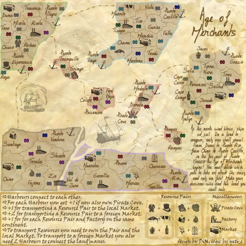
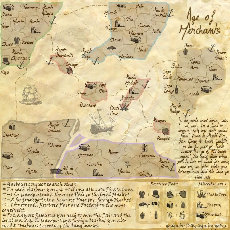
not considering the animated one, this is the last version.KEYOGI wrote:DiM, can you post your most recent proper image? I've lost track of where you're actually at.
note that the factory icon in the legend is different from the one in the map. i want people's opinion on which one to use.
the one in the legend is my fav because even if it does not resemble a factory as we all know it it is a factory that's ~300 years old. the other one is a modern version.
“In the beginning God said, the four-dimensional divergence of an antisymmetric, second rank tensor equals zero, and there was light, and it was good. And on the seventh day he rested.”- Michio Kaku
-
DiM
- Posts: 10415
- Joined: Wed Feb 14, 2007 6:20 pm
- Gender: Male
- Location: making maps for scooby snacks
yup. look at my shoulder and my collarEnigma wrote:u did?DiM wrote:Samus wrote:
So, with these results, are you going to change your avatar?
changed it.
do you like it?
“In the beginning God said, the four-dimensional divergence of an antisymmetric, second rank tensor equals zero, and there was light, and it was good. And on the seventh day he rested.”- Michio Kaku
Ok, I'm going to be completely honest and say I haven't read every single post in the thread. It's a long thread with a lot of updates so I've found the maps progress hard to follow. So if I bring up anything that's already been covered just slap me with some bamboo. The map is a good concept but seems to lost interest, so lets see if I can kick start some sort of momentum again. 
The colours are nice and very fitting, but I'm not sure the continents are clearly defined. The border highlights do the job, I'm just not convinced they do it very well. I realise how hard this is, I had the same problem with the revamp. Perhaps add a thin and more defined border on the edge of the continents in a darker shade of the colours you have. I don't think that would interfere too much with the feel of the map, but it might be enough to help.
I know the font has been a major issue and you've done well to provide many options so I'm not going to hassle you for a change. It's just that the font you currently have takes up a lot of room which I find unnecessary.
I think the major concern with the map is the legend. It's a bit cluttered and over complicated. I understand the gameplay, I'm just not sure I could be bothered putting in the mental work each turn to work out bonuses. I know I've mentioned this before so I won't press the issue, but I feel the addition of more resources hasn't helped at all and instead magnified the problem.
While the story's a nice touch, it doesn't really add anything to the map except clutter. You're only going to read it once and then it's going to be in the way. Partly font and partly the amount of text, the legend is just too cramped.
While I really do like the concept of the map it just doesn't quite work in my opinion. Personally I think you just need to simplify the whole thing. Reduce the amount of resources, perhaps reduce the number of things you get a bonus for. I'm not entirely sure and in the end it's just my opinion on things.
I'm not sure I helped, but maybe you'll find something amoungst my ramblings that you can put to good use.
RE Border highlights...
The yellow and grey? borders don't really stand out at all... perhaps a change in colour for those too?
I agree about the story.
Latest font on Legend is a bit much too...
Prefer old Factory...
Perhaps only have 1 harbour per island and remove the Pirate Cove to reduce icon clutter (although I like the extra touch the pirate cove has)
C.

Highest score : 2297
what a novel idea! sounds good to meKEYOGI wrote:The colours are nice and very fitting, but I'm not sure the continents are clearly defined. The border highlights do the job, I'm just not convinced they do it very well. I realise how hard this is, I had the same problem with the revamp. Perhaps add a thin and more defined border on the edge of the continents in a darker shade of the colours you have. I don't think that would interfere too much with the feel of the map, but it might be enough to help.
mmhmhm, mmm mhmhmmh mhmh.KEYOGI wrote:I know the font has been a major issue and you've done well to provide many options so I'm not going to hassle you for a change. It's just that the font you currently have takes up a lot of room which I find unnecessary.
i really like the story- but i agree that its too cramped. but please dont take it out.KEYOGI wrote:While the story's a nice touch, it doesn't really add anything to the map except clutter. You're only going to read it once and then it's going to be in the way. Partly font and partly the amount of text, the legend is just too cramped.
Do you need an excuse to have a war? I mean, who for? Can't you just say "You got lots of cash and land, but I've got a big sword, so divy up right now, chop chop."
Terry Pratchet
Terry Pratchet
-
DiM
- Posts: 10415
- Joined: Wed Feb 14, 2007 6:20 pm
- Gender: Male
- Location: making maps for scooby snacks
thanks for the long post. any feedback is welcome.KEYOGI wrote:Ok, I'm going to be completely honest and say I haven't read every single post in the thread. It's a long thread with a lot of updates so I've found the maps progress hard to follow. So if I bring up anything that's already been covered just slap me with some bamboo. The map is a good concept but seems to lost interest, so lets see if I can kick start some sort of momentum again.
enigma suggested something like this a few pages back.KEYOGI wrote:The colours are nice and very fitting, but I'm not sure the continents are clearly defined. The border highlights do the job, I'm just not convinced they do it very well. I realise how hard this is, I had the same problem with the revamp. Perhaps add a thin and more defined border on the edge of the continents in a darker shade of the colours you have. I don't think that would interfere too much with the feel of the map, but it might be enough to help.
here is what i came up with:
of course it needs a bit of refining but you get the idea.
the problem is i'm not too fond of it.here are my reasons:
1. the colours do a sufficient job of defining the continents
2. i don't want to make the continents stand out even more because the map is not about continents, but about resources and toning them even more could draw away the attention from the resources.
3. there will be more cramping if i do this, while on the large land areas it could look ok, on the small islands in the middle, adding even more lines would definitely cramp the image.
i want a font to be readable and at the same time provide feeling for the map. i think this one is very readable and ok about the feeling part. i could make it smaller but then i'd get people complaining it's hard to read. if everybody agrees i guess i could take it down a bit.KEYOGI wrote:I know the font has been a major issue and you've done well to provide many options so I'm not going to hassle you for a change. It's just that the font you currently have takes up a lot of room which I find unnecessary.
actually making more resources somewhat simplified the map. now i no longer have to bother looking for a few resources that can be found in 3-4 places around the map and figure out what forms a pair and what does not. with different resources each present in only one terit it's clear what the pairs are. and it really does not matter what the symbols are. as long as i have only 2 res in each land mass i know that's my pair. i don't care if it's cows or bottles.KEYOGI wrote:I think the major concern with the map is the legend. It's a bit cluttered and over complicated. I understand the gameplay, I'm just not sure I could be bothered putting in the mental work each turn to work out bonuses. I know I've mentioned this before so I won't press the issue, but I feel the addition of more resources hasn't helped at all and instead magnified the problem.
i know it takes up space and that people will read it only a few times but i think it adds a lot to the feeling. but i do have an interesting idea about the story. a compromise and a nice touch. i could make an animated map. the story is visible then slowly fades away and the compass below becomes a tad more visible. this way you can still read the story and after 30 seconds is gone. and it would be a non looping anymation meaning it will only play when the map is loaded and not continuously.KEYOGI wrote:While the story's a nice touch, it doesn't really add anything to the map except clutter. You're only going to read it once and then it's going to be in the way. Partly font and partly the amount of text, the legend is just too cramped.
the concept has already taken quite a few simplification steps, no more economic chains, no more treasure spots, no more complicated factory bonuses. i'm afraid that if i simplify it even more i'll end up with a map very far from the original concept. and less attractive. plus you're supposed to be a merchant on a remote unknown archipelago that has to deal with tough competition and raging pirates. things aren't supposed to be that easy.KEYOGI wrote:While I really do like the concept of the map it just doesn't quite work in my opinion. Personally I think you just need to simplify the whole thing. Reduce the amount of resources, perhaps reduce the number of things you get a bonus for. I'm not entirely sure and in the end it's just my opinion on things.
I'm not sure I helped, but maybe you'll find something amoungst my ramblings that you can put to good use.
“In the beginning God said, the four-dimensional divergence of an antisymmetric, second rank tensor equals zero, and there was light, and it was good. And on the seventh day he rested.”- Michio Kaku
-
DiM
- Posts: 10415
- Joined: Wed Feb 14, 2007 6:20 pm
- Gender: Male
- Location: making maps for scooby snacks
i agree the yellow could be more visible but the grey is helped by the closeness to the violet and it is visible.yeti_c wrote:RE Border highlights...
The yellow and grey? borders don't really stand out at all... perhaps a change in colour for those too?
I agree about the story.
Latest font on Legend is a bit much too...
Prefer old Factory...
Perhaps only have 1 harbour per island and remove the Pirate Cove to reduce icon clutter (although I like the extra touch the pirate cove has)
C.
about the font, it is a bit much too...what?
i too prefer the old factory.
only one harbour per island would drasticaly decrease the movement options and the trading options. and no way i'm removing the pirate cove. i love it.
“In the beginning God said, the four-dimensional divergence of an antisymmetric, second rank tensor equals zero, and there was light, and it was good. And on the seventh day he rested.”- Michio Kaku
-
DiM
- Posts: 10415
- Joined: Wed Feb 14, 2007 6:20 pm
- Gender: Male
- Location: making maps for scooby snacks
Enigma wrote:what a novel idea! sounds good to meKEYOGI wrote:The colours are nice and very fitting, but I'm not sure the continents are clearly defined. The border highlights do the job, I'm just not convinced they do it very well. I realise how hard this is, I had the same problem with the revamp. Perhaps add a thin and more defined border on the edge of the continents in a darker shade of the colours you have. I don't think that would interfere too much with the feel of the map, but it might be enough to help.
Enigma wrote:mmhmhm, mmm mhmhmmh mhmh.KEYOGI wrote:I know the font has been a major issue and you've done well to provide many options so I'm not going to hassle you for a change. It's just that the font you currently have takes up a lot of room which I find unnecessary.mmm mhmhmm mhm mmmmm mhmhhm...
Enigma wrote:i really like the story- but i agree that its too cramped. but please dont take it out.KEYOGI wrote:While the story's a nice touch, it doesn't really add anything to the map except clutter. You're only going to read it once and then it's going to be in the way. Partly font and partly the amount of text, the legend is just too cramped.
“In the beginning God said, the four-dimensional divergence of an antisymmetric, second rank tensor equals zero, and there was light, and it was good. And on the seventh day he rested.”- Michio Kaku
I was thinking the darker line would go on the outside of the highlight, not the inside. If it's going to clutter the map then I understand why you don't want to include it.DiM wrote:
Fair point, I didn't look at it that way.DiM wrote:actually making more resources somewhat simplified the map. now i no longer have to bother looking for a few resources that can be found in 3-4 places around the map and figure out what forms a pair and what does not. with different resources each present in only one terit it's clear what the pairs are. and it really does not matter what the symbols are. as long as i have only 2 res in each land mass i know that's my pair. i don't care if it's cows or bottles.
-
DiM
- Posts: 10415
- Joined: Wed Feb 14, 2007 6:20 pm
- Gender: Male
- Location: making maps for scooby snacks
it's going to clutter especially in the small islands part.KEYOGI wrote:I was thinking the darker line would go on the outside of the highlight, not the inside. If it's going to clutter the map then I understand why you don't want to include it.DiM wrote:
i did not either but mibi pointed out i should have more resources. one in each territory. so i combined mibi's idea with my idea and got this. which is a nice compromise for better understanding of the gameplay.KEYOGI wrote:Fair point, I didn't look at it that way.DiM wrote:actually making more resources somewhat simplified the map. now i no longer have to bother looking for a few resources that can be found in 3-4 places around the map and figure out what forms a pair and what does not. with different resources each present in only one terit it's clear what the pairs are. and it really does not matter what the symbols are. as long as i have only 2 res in each land mass i know that's my pair. i don't care if it's cows or bottles.
“In the beginning God said, the four-dimensional divergence of an antisymmetric, second rank tensor equals zero, and there was light, and it was good. And on the seventh day he rested.”- Michio Kaku
-
DiM
- Posts: 10415
- Joined: Wed Feb 14, 2007 6:20 pm
- Gender: Male
- Location: making maps for scooby snacks
how's this? i i made the purple less visible. but i can't decrease the bridge transparency even more because then i'll have a bridge that stands out more than the resource icons. at the moment the bridge is a bit more transparent then the resource icons. and before you tell me to make the icons even more visible i'm gonna tell you that won't work because then they'll pretty much stick out and hurt the eye.yeti_c wrote:Dim, the bridge obviously has some transparency on it - you can see the purple outline through it - could you clean that up?DiM wrote:
C.
i also reintroduced the old factory because people seem to like it. and modified one of the ships.
v69
Last edited by DiM on Sat Apr 21, 2007 7:09 am, edited 2 times in total.
“In the beginning God said, the four-dimensional divergence of an antisymmetric, second rank tensor equals zero, and there was light, and it was good. And on the seventh day he rested.”- Michio Kaku
-
DiM
- Posts: 10415
- Joined: Wed Feb 14, 2007 6:20 pm
- Gender: Male
- Location: making maps for scooby snacks
keyogi, i need to know if this (^) is ok. it would mean both small and large will be animated, with no static version. but since the animation is non looping i hope it won't be too much of a stress for slower connections.DiM wrote:i know it takes up space and that people will read it only a few times but i think it adds a lot to the feeling. but i do have an interesting idea about the story. a compromise and a nice touch. i could make an animated map. the story is visible then slowly fades away and the compass below becomes a tad more visible. this way you can still read the story and after 30 seconds is gone. and it would be a non looping animation meaning it will only play when the map is loaded and not continuously.KEYOGI wrote:While the story's a nice touch, it doesn't really add anything to the map except clutter. You're only going to read it once and then it's going to be in the way. Partly font and partly the amount of text, the legend is just too cramped.
.
“In the beginning God said, the four-dimensional divergence of an antisymmetric, second rank tensor equals zero, and there was light, and it was good. And on the seventh day he rested.”- Michio Kaku
It's something I'll have to discuss with Andy and perhaps Lack as well.DiM wrote:keyogi, i need to know if this (^) is ok. it would mean both small and large will be animated, with no static version. but since the animation is non looping i hope it won't be too much of a stress for slower connections.
-
DiM
- Posts: 10415
- Joined: Wed Feb 14, 2007 6:20 pm
- Gender: Male
- Location: making maps for scooby snacks
lack is on vacation for another 3 weeks so don't bother him. he said andy is in charge (not on this one but on some other things i asked him about)KEYOGI wrote:It's something I'll have to discuss with Andy and perhaps Lack as well.DiM wrote: keyogi, i need to know if this (^) is ok. it would mean both small and large will be animated, with no static version. but since the animation is non looping i hope it won't be too much of a stress for slower connections.
“In the beginning God said, the four-dimensional divergence of an antisymmetric, second rank tensor equals zero, and there was light, and it was good. And on the seventh day he rested.”- Michio Kaku
A bit better - you could try zooming in and removing it pixel by pixel?!DiM wrote:how's this? i i made the purple less visible. but i can't decrease the bridge transparency even more because then i'll have a bridge that stands out more than the resource icons. at the moment the bridge is a bit more transparent then the resource icons. and before you tell me to make the icons even more visible i'm gonna tell you that won't work because then they'll pretty much stick out and hurt the eye.yeti_c wrote:Dim, the bridge obviously has some transparency on it - you can see the purple outline through it - could you clean that up?DiM wrote:
C.
i also reintroduced the old factory because people seem to like it. and modified one of the ships.
v69
C.
Highest score : 2297
-
DiM
- Posts: 10415
- Joined: Wed Feb 14, 2007 6:20 pm
- Gender: Male
- Location: making maps for scooby snacks
yeti_c wrote:
A bit better - you could try zooming in and removing it pixel by pixel?!
C.
“In the beginning God said, the four-dimensional divergence of an antisymmetric, second rank tensor equals zero, and there was light, and it was good. And on the seventh day he rested.”- Michio Kaku