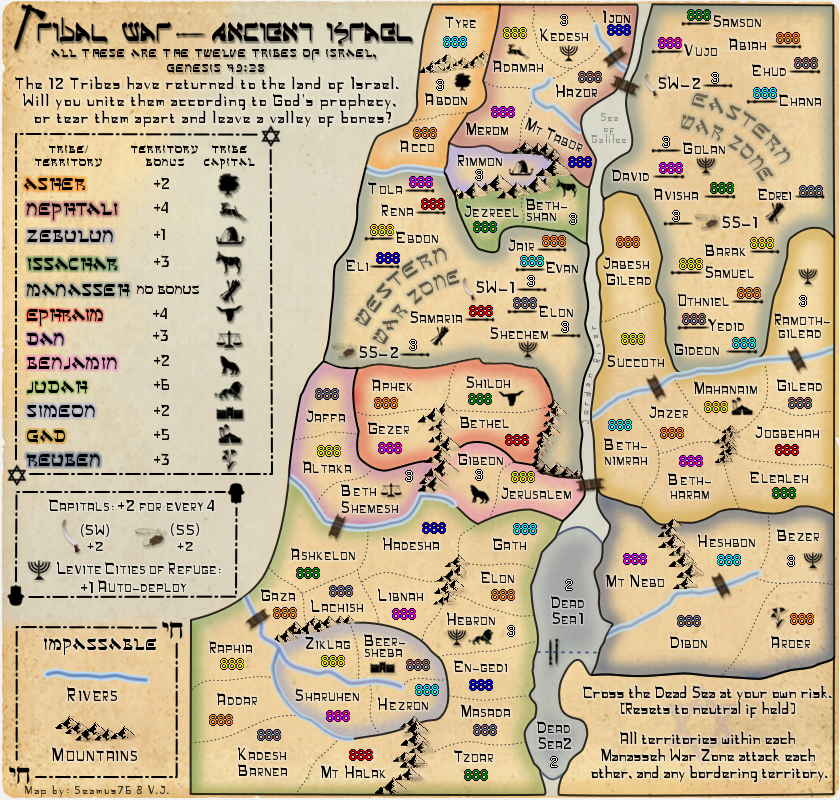
koontz1973 wrote:Rivers
Mountains need shadows
Bridges look very blurred
Some of the glows do not reach the borders
Why are you asking, you must know these things already.

You know how it is after you look at the same image for weeks at a time, you miss some of those little things. I'll work on the glows, which might be off just a tad. The bridges are from an extremely large and detailed image, so maybe it's the drop shadow that is making them look blurred, but I'll try loading them and scaling them again to see if that helps as well.
You need to be more specific when you say "Rivers", I'm not sure what you mean. Also for the mountains as well. I've added the black side to them to give the shadow so I'm not sure what you mean.
Post by generalhead » Sat Dec 01, 2012 8:25 am
I would like to see what it would look like with some color integrated into the Jordan river. It looks a little bland now.
Koontz is correct the bridges do look blurry.
I thought the mountains did have shading, does he mean a drop shadow?
like Koontz said the highlight too ex the bottom left of DIBON and Bottom of JEZREEL
Could you try lowing your bonus region borders to 75% opacity too see if that looks good. It might not, i will leave that up to your discretion.
There is a strange faint white line above the title of the map I don't know if that was meant to be there.
Is there a way to blend in the line better between the Jordan river and the Dead sea. It looks a little odd, like it is a seperate entity and not joined.
The highlight for Simeon blend in with the river around it. I don't know if you have any colors left to use but a different color might make the river stand out more.
The highlight around Rimmon too blends in with the water, especially with it being at the end of the river it looks like it flows into it. Again I don't know if you have any colors left to use.
Sorry I haven't commented lately, I am no good commenting on game play. I like looking at graphics though.
As always these are suggestions, just trying to give a new way to look at the map. I am no where experienced in the graphics field. just trying to give my opinion for what it's worth
I want the Jordan to be that way actually. I want it to be a background thought and not really noticeable. I tried a couple of ways to color it, and stripe it, and give it a feel like the other rivers, but it didn't work, I didn't like it, and I'm not planning to put anything else in there. The Dead Sea is a separate entity, so it should actually look like that. The faint white line is just a part of the background paper image texture, and is there on TW-Fla as well, since they are the same image. I guess I have to work on the Rimmon color, since it is not a lake, and shouldn't be confused as such, if in fact that is what you are referring to. Keep up the comments GH.