Re: WWI: Gallipoli [9.9.15] V39 (p22) [Quenched]
Moderator: Cartographers
Forum rules
Please read the Community Guidelines before posting.
Please read the Community Guidelines before posting.

Re: [Vacation Valid until May 2013] WWI: Gallipoli [13.8]
There will ber an update posted for this in the next day or so. 

* Pearl Harbour * Waterloo * Forbidden City * Jamaica * Pot Mosbi
Re: WWI: Gallipoli [13.8] v21-P13 Gameplay
Now that i am back in production, and while i am re-drawing this map, i find it a bit defeatist to have a map in the cycling box when for GAMEPLAY input it really needs to be back in the foundry workshop where people can comment on whatever.nolefan5311 wrote:As it appears development on this map has stalled (it has been several months since an update), this map is being Moved to the Recycling Bin for the time being. If the mapmaker wants to continue with the map, then one of the Foundry Moderators will be able to help put the thread back into the Foundry system, after an update has been made.
Can i get this moved back please.
* Pearl Harbour * Waterloo * Forbidden City * Jamaica * Pot Mosbi
Re: WWI: Gallipoli [13.8] v21-P13 Gameplay
Please refer to front page V21 for drop positions, and these are all random positions...i have just placed coloured number around everywhere to show where you will be dropped.nolefan5311 wrote:And I can't really do anymore GP analysis until you answer this for me.nolefan5311 wrote: That's all I've got for now, but that should keep you busy. I need to study a bit more closely the potential drop combinations and if there could be any potential issues. But just to clarify, the only drop associations are the battleship and its bordering L ship, right (as in, I won't be dropped Suffren, L7, L6, Krithia, and F8 every time, right? Those last three regions will be randomly distributed?)
* Pearl Harbour * Waterloo * Forbidden City * Jamaica * Pot Mosbi
Re: WWI: Gallipoli [13.8] v21-P13 Gameplay
nolefan...yes they should be HMS...but i inclined the keep them as BS for simpler designation so that there are not two types of battleships that will cause confusion when players are using them.nolefan5311 wrote:...
BS Vengeance, BS Goliath, BS Queen Elizabeth, BS Swiftsure, BS Albion, BS Majestic should all be HMS ________. Gaulois and Suffren were both French and it does not appear the French put such designations for their ships...
* Pearl Harbour * Waterloo * Forbidden City * Jamaica * Pot Mosbi
Re: WWI: Gallipoli [13.8] v21-P13 Gameplay
http://www.gallipoli.com.tr/if_stones_c ... morial.htmnolefan5311 wrote:..
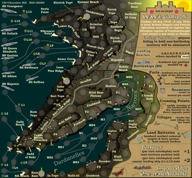
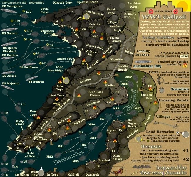
Gendarmerie…does this reference something in particular? All I’ve been able to locate is that it is the general word for Turkish Armed Forces of some sort. Near that, there is a Tepe…should that be Tekke Tepe or Kiretch Tepe?
...
type in Gendarmerie at gallipoli to google and there are several references...
yes the gendarmes were a fighting force...so why not put an area in the map to commemorate their existance??
sometimes because of space limitations and the desire for creativity, it is necessary to be not so to-the-point but rather capture the culture and feeling of the map
* Pearl Harbour * Waterloo * Forbidden City * Jamaica * Pot Mosbi
Re: [Vacation Valid until May 2013] WWI: Gallipoli [13.8]
Version 23.
Couple of large changes..
* the land and mountains have been completely re-drawn by hand
* change to the visibility of the text
Couple of large changes..
* the land and mountains have been completely re-drawn by hand
* change to the visibility of the text
* Pearl Harbour * Waterloo * Forbidden City * Jamaica * Pot Mosbi
Re: WWI: Gallipoli [13.8] v21-P13 Gameplay
http://www.google.com.au/url?sa=t&rct=j ... _SQKfkIhXwnolefan5311 wrote:...
I only see Suvla referenced as a Bay or a Cape and not a Point (most often referred to as Sulva Bay)
...
I think you'll find a reference here.
Suvla Bay is exactly that...a bay (of water surrounded on some sides by land)
It was the point (of land) that the landing occured at...
* Pearl Harbour * Waterloo * Forbidden City * Jamaica * Pot Mosbi


Re: WWI: Gallipoli [13.8] v21-P13 Gameplay
using opera, version 23 is visually clear, while i can hardly make out anything at all on version 21. [Moved] back to the main foundry workshop!
ian.
ian.

Re: WWI: Gallipoli [13.8] v21-P13 Gameplay
Excellent...v23 is the one going forward...iancanton wrote:using opera, version 23 is visually clear, while i can hardly make out anything at all on version 21. [Moved] back to the main foundry workshop!
ian.
thansk ian...and for moving this
* Pearl Harbour * Waterloo * Forbidden City * Jamaica * Pot Mosbi
Re: WWI: Gallipoli [5.12] V23-P14
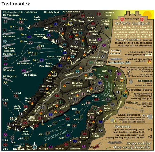
And this is V23 with 888s to show spacing...which i will add to the front page..

* Pearl Harbour * Waterloo * Forbidden City * Jamaica * Pot Mosbi
Re: WWI: Gallipoli [6.12] V23(888s)-P14
yes tnb80, it is indeed dark, and i might be able to lighten that up a bit, but i really want to capture this map being before dawn on the west coast.thenobodies80 wrote:Btw, the map is really dark now...at least for me. no?
* Pearl Harbour * Waterloo * Forbidden City * Jamaica * Pot Mosbi
Re: WWI: Gallipoli [6.12] V23(888s)-P14
V23a. Is this better tnb80cairnswk wrote:...thenobodies80 wrote:Btw, the map is really dark now...at least for me. no?
* Pearl Harbour * Waterloo * Forbidden City * Jamaica * Pot Mosbi

Re: WWI: Gallipoli [9.12] V23a-P14
very nice new design.
I think the last version is too light...
Oneyed
I think the last version is too light...
Oneyed
-
thenobodies80

- Posts: 5401
- Joined: Wed Sep 05, 2007 4:30 am
- Gender: Male
- Location: Milan
Re: WWI: Gallipoli [9.12] V23a-P14
If the borders are clear without have to strain the eyes, you can do it darker.
I understand what you're trying to achieve here and I agree...it's a nice idea.
I would use the shadows of mountains to get that effect more than the overall map brightness. If the sun is low, you should have long and dark shadows...but if the sun is going to appear on the horizon the land should be visible anyway...the land you represented is so small that a strong dark/light separation is almost impossible, this because light diffusion has effect on a larger area than the one you have on your map. You should be very very distant (altitude) from that point to be able to see half map dark and half in light, for example this image http://www.memic.net/sfondi/images/desk ... azio-4.jpg
The biggest issue is that the ships can't be so visible into the waters if the sea is so dark.
I think my favourite version is this one (i know it's a old one, but I'm talking only about light):
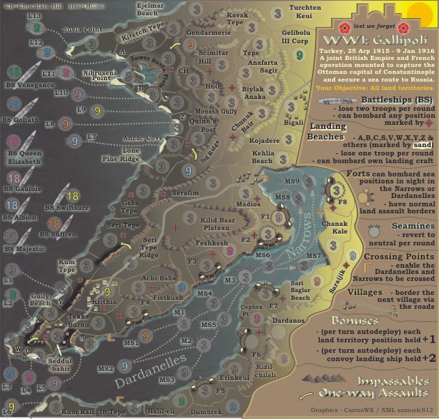
I think you need only to make the mountains a bit darker on teh left side playing with lights, but that one was a great result, specially in this part:
Anyway, we're not the NASA so if you can achieve the effect you want without make hard to understand borders you can set the lights as you want.
Must be said...what you're trying to do is not a so easy thing.
I understand what you're trying to achieve here and I agree...it's a nice idea.
I would use the shadows of mountains to get that effect more than the overall map brightness. If the sun is low, you should have long and dark shadows...but if the sun is going to appear on the horizon the land should be visible anyway...the land you represented is so small that a strong dark/light separation is almost impossible, this because light diffusion has effect on a larger area than the one you have on your map. You should be very very distant (altitude) from that point to be able to see half map dark and half in light, for example this image http://www.memic.net/sfondi/images/desk ... azio-4.jpg
The biggest issue is that the ships can't be so visible into the waters if the sea is so dark.
I think my favourite version is this one (i know it's a old one, but I'm talking only about light):
I think you need only to make the mountains a bit darker on teh left side playing with lights, but that one was a great result, specially in this part:
Anyway, we're not the NASA so if you can achieve the effect you want without make hard to understand borders you can set the lights as you want.
Must be said...what you're trying to do is not a so easy thing.
Re: WWI: Gallipoli [9.12] V23-P14
Oneyed wrote:very nice new design.
I think the last version is too light...
Oneyed
OK then we move forward with version 23, and i will do something about the borders in the dark areas to make them clearer.thenobodies80 wrote:If the borders are clear without have to strain the eyes, you can do it darker.
...
* Pearl Harbour * Waterloo * Forbidden City * Jamaica * Pot Mosbi
-
HardAttack
- Posts: 1935
- Joined: Fri Jul 11, 2008 12:15 pm
Re: WWI: Gallipoli [9.12] V23-P15
pretty nice work right here,
impatient to see in play...
congrats.
impatient to see in play...
congrats.
LEGENDS of WAR
Re: WWI: Gallipoli [10.12] V24-P15
thank-you hardattack, very kind of you.HardAttack wrote:pretty nice work right here,
impatient to see in play...
congrats.
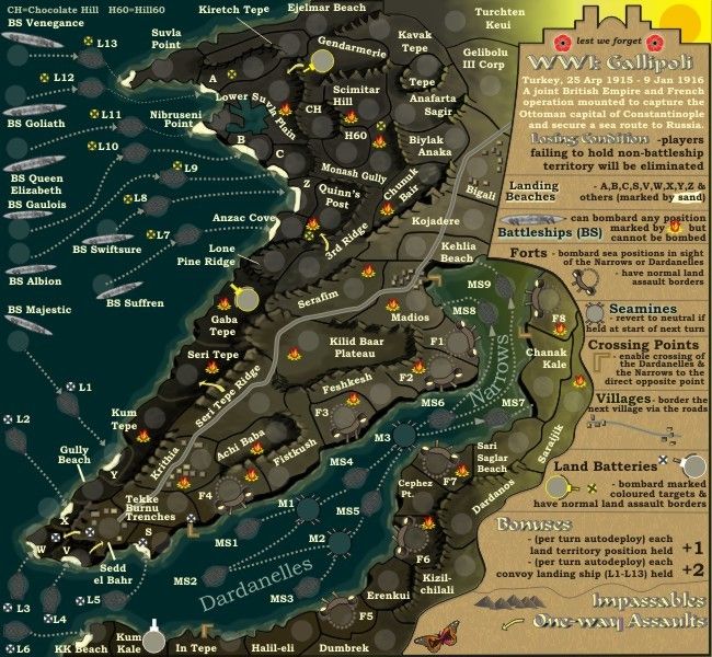
Now Version 24.
1. i have outlilned some of the lower darker borders to make them clearer...hope this does the trick.
2. i have changed the battleship targets to flame explsosions.
3. i have differented the targets for the local gunneries into white and yellow as these show up better for CB players.
* Pearl Harbour * Waterloo * Forbidden City * Jamaica * Pot Mosbi
-
Funkyterrance

- Posts: 2492
- Joined: Wed Jan 19, 2011 10:52 pm
- Gender: Male
- Location: New Hampshire, USA
Re: WWI: Gallipoli [10.12] V24-P15
Oh my!cairnswk wrote:thank-you hardattack, very kind of you.HardAttack wrote:pretty nice work right here,
impatient to see in play...
congrats.
Now Version 24.
1. i have outlilned some of the lower darker borders to make them clearer...hope this does the trick.
2. i have changed the battleship targets to flame explsosions.
3. i have differented the targets for the local gunneries into white and yellow as these show up better for CB players.
What I can say from a partially colorblind standpoint is that the land batteries are definitely distinguishable between the yellow and the white. I'm not sure if there are any other questions regarding color but the rest of the map appears to me varying degrees of dark brown/black that are more or less indistinguishable aside from the ivory colored parts (x,y, etc.). However, this could be intentional, I don't really know. I can just barely make out the impassables though. Were there any other areas where color is important?
On a side note the map does seem to hurt the back of my eyeballs when I have to focus on the smaller white/yellow images lol. I'm not sure if this has anything to do with color blindness but I figured it couldn't hurt to add.
Hope this all helps. I'll keep an eye on this thread if you like.
-FT

Re: WWI: Gallipoli [10.12] V24-P15
Good.Funkyterrance wrote:..
Oh my!
What I can say from a partially colorblind standpoint is that the land batteries are definitely distinguishable between the yellow and the white.
i take it you can determine the battleship targets.I'm not sure if there are any other questions regarding color but the rest of the map appears to me varying degrees of dark brown/black that are more or less indistinguishable aside from the ivory colored parts (x,y, etc.). However, this could be intentional, I don't really know.
the land is not the traditional coloured regions as per other maps as these bonus regions are not needed. it is simply a coloured grandient from slight yellow in the east to dark brown almost black in the west.
you mean you cannot see the mountains at all?I can just barely make out the impassables though.
no, as long as the text and all other elements are legible for you.Were there any other areas where color is important?
Mmmm. not sure about that one, although i have trouble down there sometimes also, but the large map should alleviate that.On a side note the map does seem to hurt the back of my eyeballs when I have to focus on the smaller white/yellow images lol. I'm not sure if this has anything to do with color blindness but I figured it couldn't hurt to add.
Please do, your imput is important to all maps regardless of whether you intend to play them or not.Hope this all helps. I'll keep an eye on this thread if you like.
-FT
Thanks.
* Pearl Harbour * Waterloo * Forbidden City * Jamaica * Pot Mosbi
Re: WWI: Gallipoli [10.12] V24-P15
And this is what the map will look like with coloured 88s on it.
Version 24.
Version 24.
* Pearl Harbour * Waterloo * Forbidden City * Jamaica * Pot Mosbi
-
Funkyterrance
- Posts: 2492
- Joined: Wed Jan 19, 2011 10:52 pm
- Gender: Male
- Location: New Hampshire, USA
Re: WWI: Gallipoli [10.12] V24-P15
Hmm, it is interesting how putting the colored numbers does seem to make some difference but only in the color of the battleship targets as it makes them a little bit more washed out but this probably happens to everyone.cairnswk wrote:And this is what the map will look like with coloured 88s on it.
Version 24.
Speaking of the battleship targets, they all appear yellow with orange-ish flames.
-I can see the mountains but when they go underwater they are very faint and I must really focus to see them. I guess I am having a hard time telling the border between land and sea as well, especially in the lower right where I see no borders at all.
Aside from all this I have to say this looks like a well thought-out and I am assuming historically accurate map.
Re: WWI: Gallipoli [10.12] V24-P15
That's good, in my full colour they have yellow bases and red and orange flamesFunkyterrance wrote:...
Speaking of the battleship targets, they all appear yellow with orange-ish flames.
I'll see what i can do about putting some shore-wash around the land outline to differentiate that.-I can see the mountains but when they go underwater they are very faint and I must really focus to see them. I guess I am having a hard time telling the border between land and sea as well, especially in the lower right where I see no borders at all.
well, i did a fair bit of research...and you have to allow for creative influence in making a board that works with mechinations of the game...but yeh, i think it is fairly accurate.Aside from all this I have to say this looks like a well thought-out and I am assuming historically accurate map.
Last edited by cairnswk on Tue Dec 18, 2012 3:52 pm, edited 1 time in total.
* Pearl Harbour * Waterloo * Forbidden City * Jamaica * Pot Mosbi
Re: WWI: Gallipoli [10.12] V24-P15
V25. the shore outline has been addded with waves.
* Pearl Harbour * Waterloo * Forbidden City * Jamaica * Pot Mosbi
-
koontz1973
- Posts: 6960
- Joined: Thu Jan 01, 2009 10:57 am
Re: WWI: Gallipoli [10.12] V24-P15 Front Page updated
cairns, the only thing from me about GP is can you bring the sea mines out a little. Make the territ outline the same shade as the spikes with the spikes going all around. M2 is easy to spot but M1 is not.
I am liking the glow for the shoreline. That does look really nice.
I am liking the glow for the shoreline. That does look really nice.

Re: WWI: Gallipoli [10.12] V24-P15 Front Page updated
koontz, refresh above...i have added the spikes to bottom only of the mines and moved the names a bit to make them more visible.koontz1973 wrote:cairns, the only thing from me about GP is can you bring the sea mines out a little. Make the territ outline the same shade as the spikes with the spikes going all around. M2 is easy to spot but M1 is not.
I am liking the glow for the shoreline. That does look really nice.
* Pearl Harbour * Waterloo * Forbidden City * Jamaica * Pot Mosbi