[Abandoned] Massacre à Paris
Moderator: Cartographers
Forum rules
Please read the Community Guidelines before posting.
Please read the Community Guidelines before posting.

Re: Massacre à Paris [14.12.12] V8-P5 GP - Guards
FT, what about Moscow?

* Pearl Harbour * Waterloo * Forbidden City * Jamaica * Pot Mosbi
Re: Massacre à Paris [14.12.12] V8-P5 GP - Guards
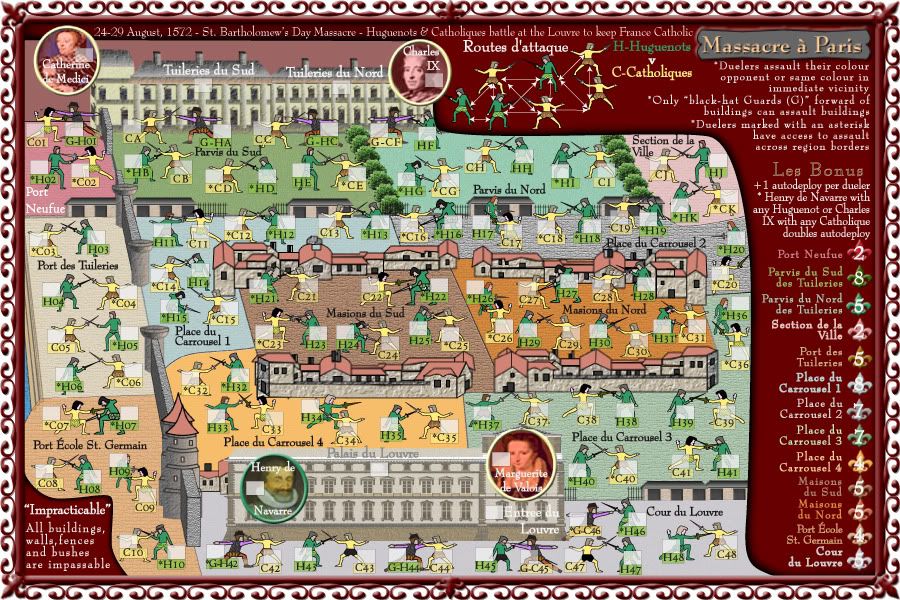
OK, can anyone think of any better way to indicate the duelers that attack across borders.
At present the guards can attack across the building borders once conquered.
And the other duelers that can attack across borders are indicated by * in front of their name, but i am thinking maybe we can do better than that.
At present the guards can attack across the building borders once conquered.
And the other duelers that can attack across borders are indicated by * in front of their name, but i am thinking maybe we can do better than that.
* Pearl Harbour * Waterloo * Forbidden City * Jamaica * Pot Mosbi

Re: Massacre à Paris [14.12.12] V8-P5 GP - Guards
can HC, CE, CF, and HG attack each other through the shrubs, and if so why not CI and CJ?
Re: Massacre à Paris [14.12.12] V8-P5 GP - Guards
You didn't read the legend...sorry nicarusnicarus wrote:can HC, CE, CF, and HG attack each other through the shrubs, and if so why not CI and CJ?
Plus they are not marker with the asterisk."All buildings, walls, fences and bushes are impassable"
but thanks for taking time to have a look at map. Any other suggestions?"*Duelers marked with an asterisk have access to assault across region borders"
Last edited by cairnswk on Sat Dec 22, 2012 7:55 pm, edited 1 time in total.
* Pearl Harbour * Waterloo * Forbidden City * Jamaica * Pot Mosbi
Re: Massacre à Paris [23.12.12] V9-P5 GP - Guards
Version 9.
All guards now in picture...8 of them
Guards now have designation G in front of them
plus the legend has been changed.
All guards now in picture...8 of them
Guards now have designation G in front of them
plus the legend has been changed.
- Click image to enlarge.
* Pearl Harbour * Waterloo * Forbidden City * Jamaica * Pot Mosbi
-
Funkyterrance

- Posts: 2492
- Joined: Wed Jan 19, 2011 10:52 pm
- Gender: Male
- Location: New Hampshire, USA
Re: Massacre à Paris [14.12.12] V8-P5 GP - Guards
How about pools of blood at their feet that connect duelers? Sorry that's all I've got atm, I'll think about it.cairnswk wrote:OK, can anyone think of any better way to indicate the duelers that attack across borders.
At present the guards can attack across the building borders once conquered.
And the other duelers that can attack across borders are indicated by * in front of their name, but i am thinking maybe we can do better than that.

Re: Massacre à Paris [14.12.12] V8-P5 GP - Guards
1. would you see them except in a colour that isn't blood red?Funkyterrance wrote:How about pools of blood at their feet that connect duelers? Sorry that's all I've got atm, I'll think about it.cairnswk wrote:OK, can anyone think of any better way to indicate the duelers that attack across borders.
At present the guards can attack across the building borders once conquered.
And the other duelers that can attack across borders are indicated by * in front of their name, but i am thinking maybe we can do better than that.
2. there is already a lot happening at their feet with armies and names.
3. i like that you'll think more about it!
* Pearl Harbour * Waterloo * Forbidden City * Jamaica * Pot Mosbi
-
Funkyterrance
- Posts: 2492
- Joined: Wed Jan 19, 2011 10:52 pm
- Gender: Male
- Location: New Hampshire, USA
Re: Massacre à Paris [14.12.12] V8-P5 GP - Guards
Good point lol.cairnswk wrote:
1. would you see them except in a colour that isn't blood red?
2. there is already a lot happening at their feet with armies and names.[/quote]
True, but that's where your eye tends to go I think.
3. i like that you'll think more about it!
Ok, a couple more ideas to denote adjacents:
Dotted lines
Swooping arrows
Footprints (bloody?
Shadows (shade)
Re: Massacre à Paris [14.12.12] V8-P5 GP - Guards
Mmmm, now i;m totally doubtful /coz you used "i think"Funkyterrance wrote:True, but that's where your eye tends to go I think.cairnswk wrote:2. there is already a lot happening at their feet with armies and names.
Mmm...i was hoping to stay away from these this map, but i'll consider if nothing better arisesOk, a couple more ideas to denote adjacents:cairnswk wrote:3. i like that you'll think more about it!
Dotted lines...
Mmm, 8 arrows...more stuff to take in when the legend already tells us about bordering duelersSwooping arrows
...Nah! been thereFootprints (bloody?)
...then somebody would ask why all the others don't have shadowsShadows (shade)
I was think about trying to indicate with the directions of the swords so they form a X across the borders, but would also have to have the swords doing the square thing also
like a cross inside a square image.
* Pearl Harbour * Waterloo * Forbidden City * Jamaica * Pot Mosbi
-
Funkyterrance
- Posts: 2492
- Joined: Wed Jan 19, 2011 10:52 pm
- Gender: Male
- Location: New Hampshire, USA
Re: Massacre à Paris [14.12.12] V8-P5 GP - Guards
I was thinking more along the lines of maybe a tree or a wall or a flag or something casting a shadow on the adjacent duelers but I'm no mapmaker so I don't know how feasible something like that would be.cairnswk wrote:...then somebody would ask why all the others don't have shadowsShadows (shade)
Hmm, yes that could get tricky since the duelers are squished pretty closely as it stands; It may make it hard to tell what's actually going on. Besides, I think that the duelers look pretty cool in the positions they are now, would be a shame to spoil the continuous look of the battle.cairnswk wrote: I was think about trying to indicate with the directions of the swords so they form a X across the borders, but would also have to have the swords doing the square thing also
like a cross inside a square image.
EDIT: New Idea. Use the same arrow patterns in the legend on the map instead of in the legend. Most areas are self explanatory so you wouldn't need a whole mess of arrows, just ones to clarify the areas where it gets fuzzy(borders). I don't think it would make the map too busy if they were in a bright red color and thin. I think it would look cool tbh.
Re: Massacre à Paris [14.12.12] V8-P5 GP - Guards
Shadow...not cool idea, sorry.Funkyterrance wrote:I was thinking more along the lines of maybe a tree or a wall or a flag or something casting a shadow on the adjacent duelers but I'm no mapmaker so I don't know how feasible something like that would be.cairnswk wrote:...then somebody would ask why all the others don't have shadowsShadows (shade)
Phew!Hmm, yes that could get tricky since the duelers are squished pretty closely as it stands; It may make it hard to tell what's actually going on. Besides, I think that the duelers look pretty cool in the positions they are now, would be a shame to spoil the continuous look of the battle.cairnswk wrote: I was think about trying to indicate with the directions of the swords so they form a X across the borders, but would also have to have the swords doing the square thing also
like a cross inside a square image.
FT, i can draw blood on the ground, that's not an issue and prob appropriate in some places where dead bodies are lying.EDIT: New Idea. Use the same arrow patterns in the legend on the map instead of in the legend. Most areas are self explanatory so you wouldn't need a whole mess of arrows, just ones to clarify the areas where it gets fuzzy(borders). I don't think it would make the map too busy if they were in a bright red color and thin. I think it would look cool tbh.
Perhaps i should just go with similar to G for Guards, and do B for Borders in front of the names
* Pearl Harbour * Waterloo * Forbidden City * Jamaica * Pot Mosbi
Re: Massacre à Paris [23.12.12] V9-P5 GP - Guards
FT, have you had any more thought on this. I have tried several methods of showing these borders including the arrows. dotted lines, shadows etc. but none work as succesfully as the notated text.
In the meantime while awaiting other gameplay feedback, i reworking design.
In the meantime while awaiting other gameplay feedback, i reworking design.
* Pearl Harbour * Waterloo * Forbidden City * Jamaica * Pot Mosbi
-
Funkyterrance
- Posts: 2492
- Joined: Wed Jan 19, 2011 10:52 pm
- Gender: Male
- Location: New Hampshire, USA
Re: Massacre à Paris [23.12.12] V9-P5 GP - Guards
Honestly, having a second look at this I think that little dotted black lines with arrows on both sides showing how duelers can attack in those areas on the map where there could be confusion is the best and clearest route.cairnswk wrote:FT, have you had any more thought on this. I have tried several methods of showing these borders including the arrows. dotted lines, shadows etc. but none work as succesfully as the notated text.
In the meantime while awaiting other gameplay feedback, i reworking design.
Ex: Dueler 1 <--------------> Dueler 2
Obviously you can get as fancy or basic as you wish with this technique but when it comes down to it I think that there are definitely areas on the map where it's unclear who can attack who and simpler is probably better on this one. The map is gorgeous man, it just needs a tiny bit of explanation to be more accessible. The asterisks are enough explanation for me at this point but I have also been following this map all along; I feel that if I had just looked at it for the first time(as though I was considering playing it for the first time) I might still have questions about the asterisks. For example, in the clusters of duelers whom have asterisks, can they all attack each other or just the ones who are closest? It may sound stupid but looking from the outside in and considering all the many types of players we have on the sight(including those who don't read English well) I think that there is still room for confusion.
Hopefully this input helps and not hurts your progress.
-FT
Re: Massacre à Paris [23.12.12] V9-P5 GP - Guards
Brilliant thought food, thank-you!Funkyterrance wrote:Honestly, having a second look at this I think that little dotted black lines with arrows on both sides showing how duelers can attack in those areas on the map where there could be confusion is the best and clearest route.cairnswk wrote:FT, have you had any more thought on this. I have tried several methods of showing these borders including the arrows. dotted lines, shadows etc. but none work as succesfully as the notated text.
In the meantime while awaiting other gameplay feedback, i reworking design.
Ex: Dueler 1 <--------------> Dueler 2
Obviously you can get as fancy or basic as you wish with this technique but when it comes down to it I think that there are definitely areas on the map where it's unclear who can attack who and simpler is probably better on this one. The map is gorgeous man, it just needs a tiny bit of explanation to be more accessible. The asterisks are enough explanation for me at this point but I have also been following this map all along; I feel that if I had just looked at it for the first time(as though I was considering playing it for the first time) I might still have questions about the asterisks. For example, in the clusters of duelers whom have asterisks, can they all attack each other or just the ones who are closest? It may sound stupid but looking from the outside in and considering all the many types of players we have on the sight(including those who don't read English well) I think that there is still room for confusion.
Hopefully this input helps and not hurts your progress.
-FT
* Pearl Harbour * Waterloo * Forbidden City * Jamaica * Pot Mosbi
Re: Massacre à Paris [23.12.12] V9-P5 GP - Guards
the map has been approved for supersize at 900W x 600H Small.
I am asking for an increase to 900W x 650H Small, so that i have adequate space to better display/explain the legend, and then hopefully move some of the more squashed elements up a fraction to provide better eye-space for some dueler/border challenges.
I am asking for an increase to 900W x 650H Small, so that i have adequate space to better display/explain the legend, and then hopefully move some of the more squashed elements up a fraction to provide better eye-space for some dueler/border challenges.
* Pearl Harbour * Waterloo * Forbidden City * Jamaica * Pot Mosbi
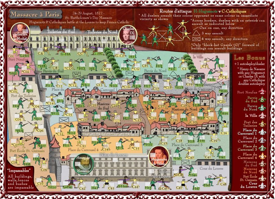
Re: Massacre à Paris [9.1.13] V10-P5 border assaults
OK, I've added another 50 pixels to the top of this so that i can flesh out the legend and top part of the map a little to see what these assault lines are going to look like.
I mut say i am not impressed with them at present, but maybe they can be improved.
My choice would be to do with out them and only have the asterisk text in the legend, but we'll see.
There's a few movements in the graphics also.
I mut say i am not impressed with them at present, but maybe they can be improved.
My choice would be to do with out them and only have the asterisk text in the legend, but we'll see.
There's a few movements in the graphics also.
- Click image to enlarge.
Last edited by cairnswk on Wed Jan 09, 2013 7:23 pm, edited 1 time in total.
* Pearl Harbour * Waterloo * Forbidden City * Jamaica * Pot Mosbi

Re: Re: Massacre à Paris [9.1.13] V10-P7 border assaults
The attack routes are definitely well detailed and explained at the top, but you're right, on the map it's a little chaotic. It's not to hard to figure out what attacks what though, so nice job. It sounds like you're working on some other options, which based on how you evolve maps should be an improvement. Other than that, some of the bonus values are a bit hard to read, it could be my monitor, but one in particular is Place du Carrousel.


-
Funkyterrance
- Posts: 2492
- Joined: Wed Jan 19, 2011 10:52 pm
- Gender: Male
- Location: New Hampshire, USA
Re: Massacre à Paris [9.1.13] V10-P5 border assaults
The "boxes" of dotted lines imho now leave no question as far as attack routes and I feel they are the better choice. I'm assuming this is a rough version of the "boxes" though? You're right in thinking that they don't look quite right atm but I think that making them a little less rigid and more "human" would improve the feel greatly. This was the best image I could find to explain the sort of "organic" feel I was thinking for the dotted lines(minus the footprints of course):cairnswk wrote:OK, I've added another 50 pixels to the top of this so that i can flesh out the legend and top part of the map a little to see what these assault lines are going to look like.
I mut say i am not impressed with them at present, but maybe they can be improved.
My choice would be to do with out them and only have the asterisk text in the legend, but we'll see.
There's a few movements in the graphics also.
- Click image to enlarge.

Last edited by Funkyterrance on Wed Jan 09, 2013 11:06 pm, edited 1 time in total.
Re: Massacre à Paris [23.12.12] V9-P5 GP - Guards
I think we can allow you the extra 50px for the legend ONLY. If you can come up with a way to make everything clear with the original approved size, then we would prefer you to do so..cairnswk wrote:the map has been approved for supersize at 900W x 600H Small.
I am asking for an increase to 900W x 650H Small, so that i have adequate space to better display/explain the legend, and then hopefully move some of the more squashed elements up a fraction to provide better eye-space for some dueler/border challenges.
Re: Massacre à Paris [23.12.12] V9-P5 GP - Guards
thank-you isaish40.isaiah40 wrote:I think we can allow you the extra 50px for the legend ONLY. If you can come up with a way to make everything clear with the original approved size, then we would prefer you to do so..cairnswk wrote:the map has been approved for supersize at 900W x 600H Small.
I am asking for an increase to 900W x 650H Small, so that i have adequate space to better display/explain the legend, and then hopefully move some of the more squashed elements up a fraction to provide better eye-space for some dueler/border challenges.
you know i will be as frigal as possible.
* Pearl Harbour * Waterloo * Forbidden City * Jamaica * Pot Mosbi
-
Nola_Lifer

- Posts: 819
- Joined: Mon Oct 13, 2008 4:46 pm
- Location: 雪山
- Contact:
Re: Massacre à Paris [9.1.13] V10-P5 border assaults
I agree. Unless there was a way to make them sexier.cairnswk wrote:OK, I've added another 50 pixels to the top of this so that i can flesh out the legend and top part of the map a little to see what these assault lines are going to look like.
I mut say i am not impressed with them at present, but maybe they can be improved.
My choice would be to do with out them and only have the asterisk text in the legend, but we'll see.
There's a few movements in the graphics also.

Re: Massacre à Paris [9.1.13] V10-P5 border assaults
FT. I have to comment on this....i think this works well because there are only two elements on the page....the feet, and the arrow-dotted lines.Funkyterrance wrote:....
it is much clearer here because of this, but doesn't necessarily work on our map because of all the other elements.
just my thoughts on that.
* Pearl Harbour * Waterloo * Forbidden City * Jamaica * Pot Mosbi
-
Nola_Lifer
- Posts: 819
- Joined: Mon Oct 13, 2008 4:46 pm
- Location: 雪山
- Contact:
Re: Massacre à Paris [9.1.13] V10-P7 border assaults
Can you position them closer so that it is more obvious?
Re: Massacre à Paris [9.1.13] V10-P7 border assaults
Sorry, how do you mean?Nola_Lifer wrote:Can you position them closer so that it is more obvious?
* Pearl Harbour * Waterloo * Forbidden City * Jamaica * Pot Mosbi
-
Funkyterrance
- Posts: 2492
- Joined: Wed Jan 19, 2011 10:52 pm
- Gender: Male
- Location: New Hampshire, USA
Re: Massacre à Paris [9.1.13] V10-P5 border assaults
Hmm. Then I have to ask, do you like the look of the dotted lines in the latest version you put up or are you just not liking the dotted lines at all? Because I think that the "arrow squares" and arrows on your map are very effective, just that they would be a better fit for the map if they were curved and a little more random looking(like a battle between humans would be).cairnswk wrote:FT. I have to comment on this....i think this works well because there are only two elements on the page....the feet, and the arrow-dotted lines.Funkyterrance wrote:....
it is much clearer here because of this, but doesn't necessarily work on our map because of all the other elements.
just my thoughts on that.
I have to say I love that image, I think it's dance steps or something but it really appeals to me lol.