Kinder Kare - New Attack Rules

Have an idea for a map? Discuss ideas and concepts here.

Moderator: Cartographers

Forum rules
Please read the Community Guidelines before posting.
Post Reply

What do you think of this map so far?

Poll ended at Sat Jun 16, 2007 7:54 pm

 
Total votes: 0

User avatar
JupitersKing
Posts: 145
Joined: Fri Dec 29, 2006 4:13 pm
Location: 1 Up
Contact:

Kinder Kare - New Attack Rules

Post by JupitersKing »

KINDER KARE

Image

http://i142.photobucket.com/albums/r118 ... inder3.png

http://i142.photobucket.com/albums/r118 ... rkare2.png

Original
http://i142.photobucket.com/albums/r118 ... erkare.png

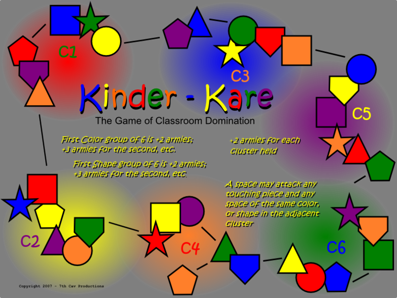
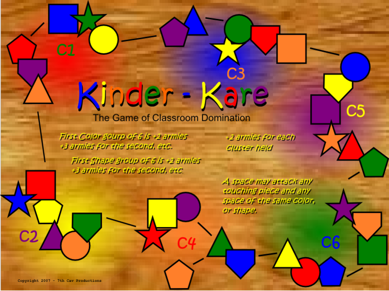
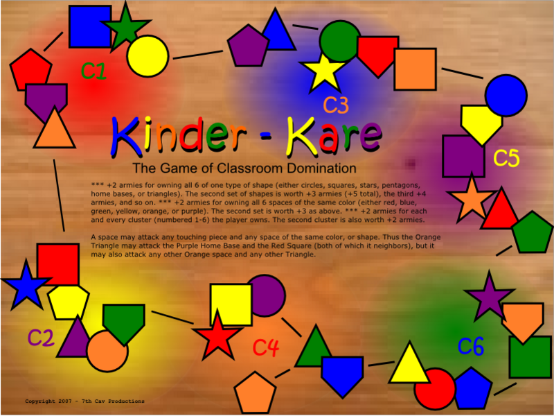
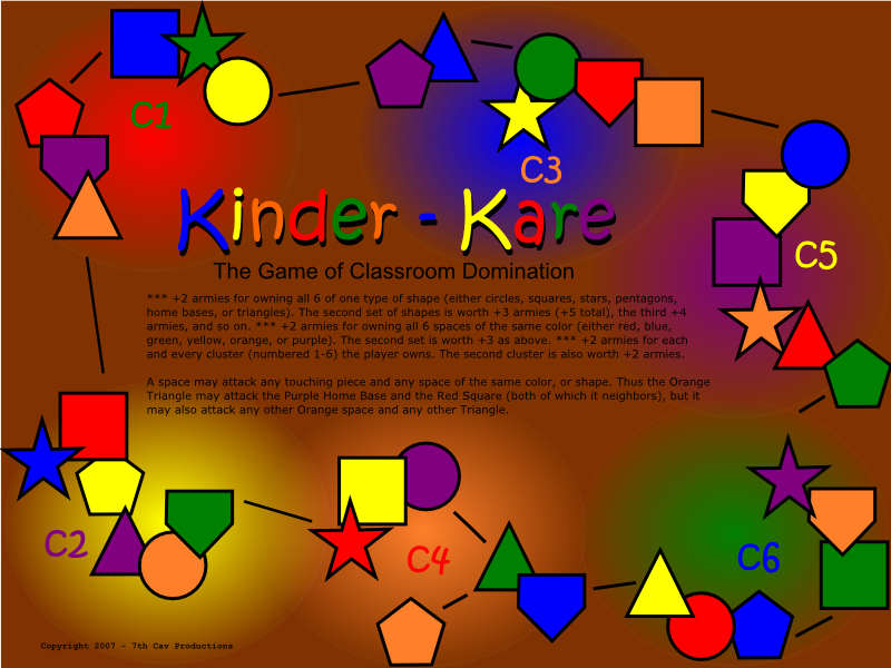
36 Spaces. 6 Shapes. 6 Colors. 6 Clusters.


This is an idea I had while looking through the Doodle Earth map and seeing everyone complain about how small it is. Love that map by the way.

This is the other extreme. This map looks simple until you read the rules.

Every space can attack its neighbor, like normal, but also every other space of the same color and of the same shape. Which means that minimum every space has 11 borders. Some have 14.

This is why the lines of attack are so limited.

Also I used primary and secondary colors and hopefully no one will be able to find fault in that. The shapes are the most simple forms I could think of with out looking repetitious, which is why I didn't use rectangles or ovals.

The reinforcements are a straight forward.

Own a cluster and its worth 2 armies, the second is worth 2 armies, or 4 total.

If you own all six of a shape or color its worth 2 armies, but the second group you own is worth 3 armies, for a total of 5 armies.

Owning all the orange and all the stars is only worth 4 armies. But if you own stars and squares is worth 5.

I think this has potential to become CC's most diffucult, nerve-racking map. If only because it looks so non-threatening.

JK
Last edited by JupitersKing on Sat Jun 02, 2007 7:55 pm, edited 7 times in total.
"Oh Shit!" George Armstrong Custer, 25 June 1876.

7th Cav Productions
User avatar
Coleman
Posts: 5402
Joined: Tue Jan 02, 2007 10:36 pm
Gender: Male
Location: Midwest

Post by Coleman »

I hate you. ](*,)
Warning: You may be reading a really old topic.
User avatar
JupitersKing
Posts: 145
Joined: Fri Dec 29, 2006 4:13 pm
Location: 1 Up
Contact:

Post by JupitersKing »

Coleman wrote:I hate you. ](*,)
Could you be more specific?

JK
"Oh Shit!" George Armstrong Custer, 25 June 1876.

7th Cav Productions
User avatar
mibi
Posts: 3350
Joined: Thu Mar 01, 2007 8:19 pm
Location: The Great State of Vermont
Contact:

Post by mibi »

don't you have three other maps you can not finish on?
User avatar
Coleman
Posts: 5402
Joined: Tue Jan 02, 2007 10:36 pm
Gender: Male
Location: Midwest

Post by Coleman »

JupitersKing wrote:
Coleman wrote:I hate you. ](*,)
Could you be more specific?

JK
Okay, I like the top one better, but there has to be a better way to explain things then that wall of text.
Warning: You may be reading a really old topic.
User avatar
wcaclimbing
Posts: 5598
Joined: Fri May 12, 2006 10:09 pm
Location: In your quantum box....Maybe.
Contact:

Post by wcaclimbing »

Why is the background all pixelated?

PS: I greatly dislike the theme of this map. It needs something more than just colored shapes. right now its kinda boring...
Image
User avatar
PimpCaneYoAss
Posts: 185
Joined: Fri Feb 16, 2007 3:04 pm
Location: Connecticut

Post by PimpCaneYoAss »

You need a new name...Kinder Kare is the name of a Day care chain in the north east part of the US
Image
User avatar
JupitersKing
Posts: 145
Joined: Fri Dec 29, 2006 4:13 pm
Location: 1 Up
Contact:

Post by JupitersKing »

PimpCaneYoAss wrote:You need a new name...Kinder Kare is the name of a Day care chain in the north east part of the US
I know, I'm a graduate of that fine institution, class of '81. Which is probably why I connect the two.

Kinder Care?

JK
"Oh Shit!" George Armstrong Custer, 25 June 1876.

7th Cav Productions
User avatar
Kaplowitz
Posts: 3088
Joined: Tue May 01, 2007 5:11 pm

Post by Kaplowitz »

wcaclimbing wrote:Why is the background all pixelated?
I think it looks kinda like wood.
Image
User avatar
JupitersKing
Posts: 145
Joined: Fri Dec 29, 2006 4:13 pm
Location: 1 Up
Contact:

Post by JupitersKing »

It's supposed to be a desk top but it's not big enough.

I'll take a picture of my desk and use that if I have to. But for now it lightens the board.

JK
"Oh Shit!" George Armstrong Custer, 25 June 1876.

7th Cav Productions
User avatar
wcaclimbing
Posts: 5598
Joined: Fri May 12, 2006 10:09 pm
Location: In your quantum box....Maybe.
Contact:

Re: Kinder Kare - New Key

Post by wcaclimbing »

JupitersKing wrote:This is the other extreme. This map looks simple until you read the rules.

Every space can attack its neighbor, like normal, but also every other space of the same color and of the same shape. Which means that minimum every space has 11 borders. Some have 14.

This is why the lines of attack are so limited.
Those rules are VERY confusing for me.
Any map that needs a paragraph to explain the rules is too confusing for me, sorry...
Image
User avatar
mibi
Posts: 3350
Joined: Thu Mar 01, 2007 8:19 pm
Location: The Great State of Vermont
Contact:

Post by mibi »

i like the complicated game play... but im not so sure about the graphics.. also the instructions are a bit confusing, better to reword and reduce.
User avatar
Spockers
Posts: 390
Joined: Mon Oct 02, 2006 11:11 pm

Post by Spockers »

wow thats bad
KEYOGI
Posts: 1632
Joined: Tue Oct 10, 2006 6:09 am

Post by KEYOGI »

This isn't a serious idea is it? There's so many good ideas out there, why must we persist with crap ones?
User avatar
JupitersKing
Posts: 145
Joined: Fri Dec 29, 2006 4:13 pm
Location: 1 Up
Contact:

Post by JupitersKing »

mibi wrote:i like the complicated game play... but im not so sure about the graphics.. also the instructions are a bit confusing, better to reword and reduce.
DONE.
Spockers wrote:wow thats bad
Thank you, sir, very much.
KEYOGI wrote:This isn't a serious idea is it? There's so many good ideas out there, why must we persist with crap ones?
Yes, it's serious. I thought we where supposed to come up with UNIQUE ideas for maps.

I think two things, 1) it's different and a bit confused at first so people are put off, and 2) it's a very hard map and I think people are scared off.

Crossword sucks (sorry) and the Circus Maximus board is boring. Maybe this will be better, maybe not.

Personally I think it's so simple yet hard that it's ready to be tested (once XML is done) so we can find out if it'll actually work as a game.

End of Speech.

JK
"Oh Shit!" George Armstrong Custer, 25 June 1876.

7th Cav Productions
User avatar
yeti_c
Posts: 9624
Joined: Thu Jan 04, 2007 9:02 am
Gender: Male

Post by yeti_c »

Hmmm - not sure... it's a bit like someone vomited on the screen...

Playability might be a bit too intense... Practically all vs all.

C.
Image
Highest score : 2297
User avatar
AndyDufresne
Posts: 24919
Joined: Fri Mar 03, 2006 8:22 pm
Location: A Banana Palm in Zihuatanejo
Contact:

Post by AndyDufresne »

The idea has yet to win me over... This map has little appeal, if any, to myself.


--Andy
User avatar
JupitersKing
Posts: 145
Joined: Fri Dec 29, 2006 4:13 pm
Location: 1 Up
Contact:

Post by JupitersKing »

yeti_c wrote:Playability might be a bit too intense... Practically all vs all.
Vomit aside...

What if the rules changed so that you couldn't attack your neighbor, only like shapes and colors?

Or leave in neighboring attacks and limit cluster to cluster attacks to say the opposite cluster (1-6, 2-5, 3-4, and vice versa), or to the cluster two to the right?

Also, if the board where changed (less vomitty) would you find it more appealing?

****

Also, I must be new, but I thought a simple idea might work.

JK
"Oh Shit!" George Armstrong Custer, 25 June 1876.

7th Cav Productions
User avatar
JupitersKing
Posts: 145
Joined: Fri Dec 29, 2006 4:13 pm
Location: 1 Up
Contact:

New Attack Rules

Post by JupitersKing »

I know people hate this map... but...

I changed the attack rules to cut way down on the borders of each spaces. Now Cluster 1 & 6, 2 & 5, and 3 & 4 are connected and you can only attack across the board, not all over.

JK
"Oh Shit!" George Armstrong Custer, 25 June 1876.

7th Cav Productions
User avatar
Wisse
Posts: 4448
Joined: Fri Oct 13, 2006 2:59 pm
Location: The netherlands, gelderland, epe

Post by Wisse »

i would love the gameplay and borders :) only graphics are to low
Image Image
User avatar
Spockers
Posts: 390
Joined: Mon Oct 02, 2006 11:11 pm

Post by Spockers »

wow. you really just don't get it.
User avatar
JupitersKing
Posts: 145
Joined: Fri Dec 29, 2006 4:13 pm
Location: 1 Up
Contact:

Post by JupitersKing »

Wisse wrote:i would love the gameplay and borders :) only graphics are to low
In what way?

Do you mean loose the shape/color idea all together and go with barbie dolls and matchbox cars? Or do you mean fix up the current idea?


JK
"Oh Shit!" George Armstrong Custer, 25 June 1876.

7th Cav Productions
User avatar
The Random One
Posts: 111
Joined: Mon Apr 09, 2007 6:58 am

Post by The Random One »

I'm hoping this is a first first draft - you should make the graphics look more like "colorful stickers on a wall" and less like "my son's first trip to MS Paint".

Gameplay means it'll be nigh impossible to hold any continent. It's a very unique idea, and I'd love to see it through, but I can't see any way to make it more playable without either taking away what makes it unique or making the rules even more complex.

On the other hand, "The Game of Classroom Domination" totally won me over.
User avatar
Sparqs
Posts: 173
Joined: Tue May 29, 2007 5:52 am

Post by Sparqs »

A Critic's Anti-Critic Rant
Again I am astonished at the negative feedback map ideas garner. I'm glad designers appear to have the fortitude to press ahead. I'm familiar with the net so I know that this is a pointless directive, nevertheless: critics should limit themselves to constructive criticism and declarations of their personal interest in playing a particular map; blanket statements about how others will respond are unnecessary, and the fact that something even needs to be said about personal attacks is just sad. Perhaps there have been cases of erstwhile-designers wasting peoples time with junk, but that hasn't been the case with the proposals I've looked at so far. Not that anyone is going to restrain themselves...

Any idea that explores new gameplay ought to be encouraged. They won't appeal to everyone and some might fail utterly, but just as designers have engineered features that Lack did not foresee, we ought to encourage modes whose benefits are not yet clear. For radical gameplay ideas, I don't think we can know how fun they are before we play them.

Comments on Kinder Kare
I think this idea is great. I like the shape/color attack rules. The explanation has improved, though I think the bonus rules could use a little clarification.

I like the primary-color look of the current map (v. 09 May 2007). A chalkboard might be a bit cliche (and is used on CCU), but a more stylized display of the explanatory text would be good.
Post Reply

Return to “Melting Pot: Map Ideas”