DiMs a bevel whore and when eh tells you to take it out you know its a problemDiM wrote:haven't read the thread so probably some of my points have already been discussed/suggested. sorry bout that.
so here goes:
1. mountains. they don't fit with the style of the map at all. scrap them and try something else. the bevel on them and the white dots spoil everything.
2. corsica. the white outline is pixelated and strangely done. make it like the border of the lengend and round it a bit.
3. the gradient of the title should be horizontal not vertical. with blue on the left to represent the flag of france.
4. font. mother or alps.
5. legend. move it a bit down. at this moment it touches brittanny.
6. spelling. not sure but burgAndy should be burgUndy
7. borders. in some places the borders are thicker. like the easter most part of burgundy.
8. bevel. in the lower left corner the water looks like it is on top of the dead area.
9. strange lines. in the upper right corner you have some strange white lines on the margin of the map.
France [Quenched]
Moderator: Cartographers
Forum rules
Please read the Community Guidelines before posting.
Please read the Community Guidelines before posting.
-
gimil

- Posts: 8599
- Joined: Sat Mar 03, 2007 12:42 pm
- Gender: Male
- Location: United Kingdom (Scotland)
What do you know about map making, bitch?
Top Score:2403natty_dread wrote:I was wrong
-
DiM

- Posts: 10415
- Joined: Wed Feb 14, 2007 6:20 pm
- Gender: Male
- Location: making maps for scooby snacks
you got me wrong. i don't want the bevel gone. i just want him to invert the bevel so that the watter is below the ground not on topgimil wrote:DiMs a bevel whore and when eh tells you to take it out you know its a problemDiM wrote:haven't read the thread so probably some of my points have already been discussed/suggested. sorry bout that.
so here goes:
1. mountains. they don't fit with the style of the map at all. scrap them and try something else. the bevel on them and the white dots spoil everything.
2. corsica. the white outline is pixelated and strangely done. make it like the border of the lengend and round it a bit.
3. the gradient of the title should be horizontal not vertical. with blue on the left to represent the flag of france.
4. font. mother or alps.
5. legend. move it a bit down. at this moment it touches brittanny.
6. spelling. not sure but burgAndy should be burgUndy
7. borders. in some places the borders are thicker. like the easter most part of burgundy.
8. bevel. in the lower left corner the water looks like it is on top of the dead area.
9. strange lines. in the upper right corner you have some strange white lines on the margin of the map.
“In the beginning God said, the four-dimensional divergence of an antisymmetric, second rank tensor equals zero, and there was light, and it was good. And on the seventh day he rested.”- Michio Kaku

kyle got forum band and wanted me to post this for him
DiM wrote
haven't read the thread so probably some of my points have already been discussed/suggested. sorry bout that.
so here goes:
1. mountains. they don't fit with the style of the map at all. scrap them and try something else. the bevel on them and the white dots spoil everything.
2. corsica. the white outline is pixelated and strangely done. make it like the border of the lengend and round it a bit.
3. the gradient of the title should be horizontal not vertical. with blue on the left to represent the flag of france.
4. font. mother or alps.
5. legend. move it a bit down. at this moment it touches brittanny.
6. spelling. not sure but burgAndy should be burgUndy
7. borders. in some places the borders are thicker. like the easter most part of burgundy.
8. bevel. in the lower left corner the water looks like it is on top of the dead area.
9. strange lines. in the upper right corner you have some strange white lines on the margin of the map

My Response and what i've fixed.
1. I'm working on new ideas for the mountains, will be fixed soon.
2. Fixed.
3. Fixed.
4. Done pole said mother.
5. Done I also had to redo it because for whatever reason I didn't save that update on the psd file I only saved it for web. My bad
6. Fixed
7. Should be fixed.
8. There is no bevel here nad the dead area layer is below the water I don't understand what you're saying looking at it either.
9. Fixed.
10 I also added the name of all of the countries. I think we're getting pretty close here.
DiM wrote
haven't read the thread so probably some of my points have already been discussed/suggested. sorry bout that.
so here goes:
1. mountains. they don't fit with the style of the map at all. scrap them and try something else. the bevel on them and the white dots spoil everything.
2. corsica. the white outline is pixelated and strangely done. make it like the border of the lengend and round it a bit.
3. the gradient of the title should be horizontal not vertical. with blue on the left to represent the flag of france.
4. font. mother or alps.
5. legend. move it a bit down. at this moment it touches brittanny.
6. spelling. not sure but burgAndy should be burgUndy
7. borders. in some places the borders are thicker. like the easter most part of burgundy.
8. bevel. in the lower left corner the water looks like it is on top of the dead area.
9. strange lines. in the upper right corner you have some strange white lines on the margin of the map
My Response and what i've fixed.
1. I'm working on new ideas for the mountains, will be fixed soon.
2. Fixed.
3. Fixed.
4. Done pole said mother.
5. Done I also had to redo it because for whatever reason I didn't save that update on the psd file I only saved it for web. My bad
6. Fixed
7. Should be fixed.
8. There is no bevel here nad the dead area layer is below the water I don't understand what you're saying looking at it either.
9. Fixed.
10 I also added the name of all of the countries. I think we're getting pretty close here.
-
DiM
- Posts: 10415
- Joined: Wed Feb 14, 2007 6:20 pm
- Gender: Male
- Location: making maps for scooby snacks
3. blue should be on the left white in the middle and red on the right.
8. look at the bottom left corner at the border between the water and the dead area. the water casts a shadow on the land looking like it is on top of the land instead of the land being on top of the water.
9. you removed those lines but others appeared. top part on the dead area margin.
8. look at the bottom left corner at the border between the water and the dead area. the water casts a shadow on the land looking like it is on top of the land instead of the land being on top of the water.
9. you removed those lines but others appeared. top part on the dead area margin.
“In the beginning God said, the four-dimensional divergence of an antisymmetric, second rank tensor equals zero, and there was light, and it was good. And on the seventh day he rested.”- Michio Kaku
-
gimil
- Posts: 8599
- Joined: Sat Mar 03, 2007 12:42 pm
- Gender: Male
- Location: United Kingdom (Scotland)
[quote="DiM"
8. look at the bottom left corner at the border between the water and the dead area. the water casts a shadow on the land looking like it is on top of the land instead of the land being on top of the water.
[/quote]
Theres nothing wrong with this its an inner shadow which is in all territories i dont think it makes the water look above the land.
Im still concerned with the title, the strong bevel, like i said does look good BUT its strong 3D effect put it at a contrast with the rest of your map which is alot flatter. I really think you should consider other options
What do you know about map making, bitch?
Top Score:2403natty_dread wrote:I was wrong
-
DiM
- Posts: 10415
- Joined: Wed Feb 14, 2007 6:20 pm
- Gender: Male
- Location: making maps for scooby snacks
to me it seems that the water is above the land.  but that's just me.
if others think it's ok then i'm fine.
if others think it's ok then i'm fine.
“In the beginning God said, the four-dimensional divergence of an antisymmetric, second rank tensor equals zero, and there was light, and it was good. And on the seventh day he rested.”- Michio Kaku
-
DiM
- Posts: 10415
- Joined: Wed Feb 14, 2007 6:20 pm
- Gender: Male
- Location: making maps for scooby snacks
yes i know but it still looks odd to megimil wrote:if you take another look you'll notice that inner shadow is also going into the water.DiM wrote:to me it seems that the water is above the land.
if others think it's ok then i'm fine.
“In the beginning God said, the four-dimensional divergence of an antisymmetric, second rank tensor equals zero, and there was light, and it was good. And on the seventh day he rested.”- Michio Kaku
-
gimil
- Posts: 8599
- Joined: Sat Mar 03, 2007 12:42 pm
- Gender: Male
- Location: United Kingdom (Scotland)
but DiM your a difficult bevel whoreDiM wrote:yes i know but it still looks odd to megimil wrote:if you take another look you'll notice that inner shadow is also going into the water.DiM wrote:to me it seems that the water is above the land.
if others think it's ok then i'm fine.
What do you know about map making, bitch?
Top Score:2403natty_dread wrote:I was wrong
-
hecter

- Posts: 14632
- Joined: Tue Jan 09, 2007 6:27 pm
- Gender: Female
- Location: Tying somebody up on the third floor
- Contact:
Kyle got forumband and wanted me to post this for him.

1. I tried a new thing on the title to hopefully please DiM and gimil as they are the only ones giving comments.
2. I added attack lines to the new inset.
3. I hopefully got rid of all the white pixels at the top, the problem is transparency which is easier to see on the web than in photoshop as it blends in photoshop for whatever reason.
In heaven... Everything is fine, in heaven... Everything is fine, in heaven... Everything is fine... You got your things, and I've got mine.

-
WidowMakers
- Posts: 2774
- Joined: Mon Nov 20, 2006 9:25 am
- Gender: Male
- Location: Detroit, MI
1) I would fix the background of the legend to make the text stand out more from the water
2) Corsica should not be in a little box. I assume you did this because it is too far off of the actual map. I just don't think it looks good. Just remove the surrounding line and keep the connection line only.
WM
2) Corsica should not be in a little box. I assume you did this because it is too far off of the actual map. I just don't think it looks good. Just remove the surrounding line and keep the connection line only.
WM


reverend kyle asked me to post this for him because he's been band.
I tried to fix this one as per widowmakers and gimil's requests. I don't think it looks good. I've since found out that widowmaker wasn't talking about the texture and just wanted a darker color for differentiation and I am working on that.

I tried to fix this one as per widowmakers and gimil's requests. I don't think it looks good. I've since found out that widowmaker wasn't talking about the texture and just wanted a darker color for differentiation and I am working on that.
-
Bad Speler
- Posts: 1027
- Joined: Fri Jun 02, 2006 8:16 pm
- Gender: Male
- Location: Ottawa
- Contact:

I like this title better, except for the shadow. Maybe it's an optical illusion (or I just can't see properly) but it appears shorter and less intense on the previous title.
I hope you keep the white borders. It's a nice change from all the dark borders we see.
I had a comment on the legend, but I guess you're redoing that still.
Are you changing/updating the mountains? At the least, you should get rid of the white bits that show up in it.
I hope you keep the white borders. It's a nice change from all the dark borders we see.
I had a comment on the legend, but I guess you're redoing that still.
Are you changing/updating the mountains? At the least, you should get rid of the white bits that show up in it.
I feel like a messenger pigeon.... *shits on Andy's head* 
This post is going to have to tide you guys over for like a week as I am in Spokane for a week partying it up and won't have photoshop, or the necessary files.
I left the bevel on this one so that people just coming to the thread can see which one they prefer and voice their opinions. I still prefer the bevel.
I also edited the legend as per what widowmaker was going for at least what i've gotten from my talks with him. Any other input... all the white is staying because I really like that about my map. The white vibrant pastelish colors i'm quite proud of.

Again same as in the egypt map friend of kyle's from rl here he asked me to post this for him.

The only real input i've gotten here is from private email and IM, all it has really said was from 2 people to get rid of the corsica inset and just make it an island. So I did that. The other was Gimil really wanted the font he chose instead of the white one, so I did that to show what it'd look like and I really prefer the white.. any thoughts?
The only real input i've gotten here is from private email and IM, all it has really said was from 2 people to get rid of the corsica inset and just make it an island. So I did that. The other was Gimil really wanted the font he chose instead of the white one, so I did that to show what it'd look like and I really prefer the white.. any thoughts?
-
Bad Speler
- Posts: 1027
- Joined: Fri Jun 02, 2006 8:16 pm
- Gender: Male
- Location: Ottawa
- Contact:
-
DiM
- Posts: 10415
- Joined: Wed Feb 14, 2007 6:20 pm
- Gender: Male
- Location: making maps for scooby snacks
is this small or large? if it is large you have a huge problem if it is small you still have a problem but it can be solved. just like in your egypt map you have no space for army circles in some terits. saone et loire, cote d'or, puy de dome. there are other zones with this problem but they border the sea or the dead area so you can move the name there and make space for the army numbers.
other problems are white spots around the borders, the mountains the attack lines that are too shiny and the bevel in the title.
other problems are white spots around the borders, the mountains the attack lines that are too shiny and the bevel in the title.
“In the beginning God said, the four-dimensional divergence of an antisymmetric, second rank tensor equals zero, and there was light, and it was good. And on the seventh day he rested.”- Michio Kaku
Once again kyle made me post something for him. I need to change my phone number.

I'm really quite excited about this update because I feel I have hit on the most pressing issue finally and finished it. That is the mountains. I think these mountains have the feel i'm going for down. Which is fantastic. If they are going a step in the wrong direction that would be handy to know also.
Even though the other font won this font is coming with the least complaints so I may just go with it. Though if you object do feel free to voice your opinion.
I don't intend to put army circles dim because I feel I used light enough colors that the numbers will be perfectly legible, but your point still stands about no room for the numbers.. I'll fix that.
Other problems addressed were hopefully there are no white spots and if there are you should address them specifically, and I took off the glow and the bevel on the title. I still like the bevel but I figure putting an equal number of updates with and without the bevel will allow others to voice their opinion.
That is all for now.
-
DiM
- Posts: 10415
- Joined: Wed Feb 14, 2007 6:20 pm
- Gender: Male
- Location: making maps for scooby snacks
the mountains are very nice a great improvement.
even without army circles you still need to make room for numbers but you said you'll fix that so it's ok. just make sure there's enough room for 3 digits not just 2.
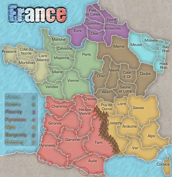
title. still looks somehow bad. try some effect on it. maybe make it like it is painted or something. anyway i circled the white spots only in the red continent. there are so many i don't have the time to circle the whole map.
just zoom in and you'll see white pixels between the normal gray ones.
even without army circles you still need to make room for numbers but you said you'll fix that so it's ok. just make sure there's enough room for 3 digits not just 2.
title. still looks somehow bad. try some effect on it. maybe make it like it is painted or something. anyway i circled the white spots only in the red continent. there are so many i don't have the time to circle the whole map.
just zoom in and you'll see white pixels between the normal gray ones.
“In the beginning God said, the four-dimensional divergence of an antisymmetric, second rank tensor equals zero, and there was light, and it was good. And on the seventh day he rested.”- Michio Kaku
I like this title better but it still seems off. Maybe make it slightly transparent to have it blend in a bit more?
the mountains seem fine to me
you should probably do the xml just to see where your army numbers are going to be. what I mean is that at this point like Dim said, you'll have spacing issues. Are they going to go onto the water, or cross over borders you have. Circles would probably help to be honest. But, they might change the look of your map drastically, so test it out to see how it goes if you haven't already.
a pet peeve of mine is continents that share the names of territories. both Alps and Pyrenees share this nuance.
speaking of continent names, are you working on a different legend? I think you said you were. maybe it's just the shadow around the names, but I think it could be clearer. maybe a different style would help. I'm just not a fan.
you have what looks very close to a 4-way border in the purple area. nord, somme, pais de calais, ardennes. maybe move it slightly to avoid confusion
this is reverend kyle directly this time. I'm quite proud of this update, so much that instead of waiting til Zach was awake I just went ahead and got on his account to post it. Because I feel we're nearing completion in this update we have a large AND a small image.


Issues addressed.
Legend, I put this legend and am quite happy with it, i haven't seen any major objections and it is quite legible so I am going to have to mark that as resolved.
Mountains, everyone seems to like them wonderful I'll mark that as resolved.
I moved some fonts enough that they'd fit regular army shadows I figure those are big enough to fit 3 digits, but the actual shadows looked bad so here we are today. I'm going to mark that as resolved.
The line thickness dim tried to point out I couldn't see 90% of I fixed what I could see and I'm going to mark the rest as his LCD monitor, but since I can't fix what I can't see I'm going to advise him to switch to a CRT monitor and mark that as resolved.
I have the continents that share with territories fixed on another page, but i'm too lazy to go back and look and it doesn't bother me but if you want to go find that i'll fix it otherwise I'll mark it as not caring enough which resolves this.
4 way border, if you notice it does go slightly north making it not a 4 way border, you may have to look closer or go to the large but it isnt one.
title, I reduced opacity a bit and I think it blends much better(thanks edbeard) I really like the look it made me come around to the unbeveled so I'll go ahead and mark this as resolved.
I hope final forge comes soon because I feel we've come a long way
-
DiM
- Posts: 10415
- Joined: Wed Feb 14, 2007 6:20 pm
- Gender: Male
- Location: making maps for scooby snacks
first of all both maps exceed the maximum size regulations you have to resize them.
the white spots are still there. checked on 2 crts and 2 lcds
the 4 way border needs to be solved even if there's a little movement to the north it is not enough. so just move the borders a bit more.
the white spots are still there. checked on 2 crts and 2 lcds
the 4 way border needs to be solved even if there's a little movement to the north it is not enough. so just move the borders a bit more.
“In the beginning God said, the four-dimensional divergence of an antisymmetric, second rank tensor equals zero, and there was light, and it was good. And on the seventh day he rested.”- Michio Kaku