I know id miss something. Where would acores ocidental and oriental go?_sioux_ wrote:Someone said this, and i have said it before... if it doesn´t give much trublle why not changed it ? Put it : "Açores Ocidental, Açores Centro, Açores Oriental, "Now the islands:
If you want everything with the native name, then it's Açores and not Azores.
And there is no north or south in Açores, only east, center and west.
I am Portuguese, the rivers are not realistic but that would give a lot of trouble to change.. when will it be able to play?
Portugal [Quenched]
Moderator: Cartographers
Forum rules
Please read the Community Guidelines before posting.
Please read the Community Guidelines before posting.
-
gimil

- Posts: 8599
- Joined: Sat Mar 03, 2007 12:42 pm
- Gender: Male
- Location: United Kingdom (Scotland)
What do you know about map making, bitch?
Top Score:2403natty_dread wrote:I was wrong

Im wondering if there is something more appropriate instead of Porto for that territory? Maybe nicas or _sioux_ could help with that?nicas wrote:The river is south of Porto, not north.
I completely understand why you dont want to start the map again, but I think you should try to get the map as accurate as possible, at least without making major changes like moving rivers. Alot of people complain about mistakes in maps, you may as well try and solve as much as you can now rather than later.
Just a thought anyway.


-
AndyDufresne

- Posts: 24919
- Joined: Fri Mar 03, 2006 8:22 pm
- Location: A Banana Palm in Zihuatanejo
- Contact:
-
DiM

- Posts: 10415
- Joined: Wed Feb 14, 2007 6:20 pm
- Gender: Male
- Location: making maps for scooby snacks
large: http://i25.photobucket.com/albums/c64/G ... ARGE-6.png
small:
http://i25.photobucket.com/albums/c64/G ... MALL-5.png
xml:
http://h1.ripway.com/gimil01/Portugal.XML
small:
http://i25.photobucket.com/albums/c64/G ... MALL-5.png
xml:
http://h1.ripway.com/gimil01/Portugal.XML
“In the beginning God said, the four-dimensional divergence of an antisymmetric, second rank tensor equals zero, and there was light, and it was good. And on the seventh day he rested.”- Michio Kaku
-
AndyDufresne
- Posts: 24919
- Joined: Fri Mar 03, 2006 8:22 pm
- Location: A Banana Palm in Zihuatanejo
- Contact:
-
DiM
- Posts: 10415
- Joined: Wed Feb 14, 2007 6:20 pm
- Gender: Male
- Location: making maps for scooby snacks
i would also post the coord results but for some strange reason the images don't lad when i try to test.AndyDufresne wrote:Half way there.
--Andy
“In the beginning God said, the four-dimensional divergence of an antisymmetric, second rank tensor equals zero, and there was light, and it was good. And on the seventh day he rested.”- Michio Kaku
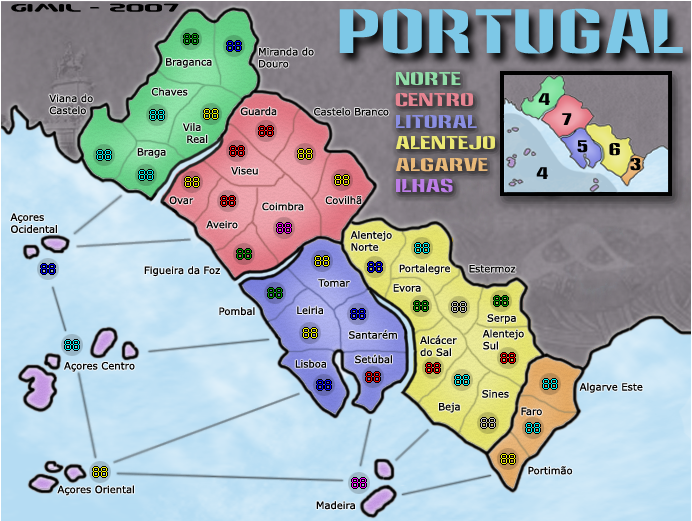
I'm not sure if it's an effect applied to the continents or their borders, but some of the territory lines don't seem to go all the way to the continent border. Also, the Alentejo/Centro "T" shaped border doesn't seem to join up properly.
The Serpa/Alentejo Sul border could perhaps use some work on the small map, it's barely noticeable. Maybe a slight bump up in the colour differention between border and territory in all of Alentejo probably wouldn't hurt.
Nice work though gimil, you're nearly there.
The Serpa/Alentejo Sul border could perhaps use some work on the small map, it's barely noticeable. Maybe a slight bump up in the colour differention between border and territory in all of Alentejo probably wouldn't hurt.
Nice work though gimil, you're nearly there.
-
gimil
- Posts: 8599
- Joined: Sat Mar 03, 2007 12:42 pm
- Gender: Male
- Location: United Kingdom (Scotland)
LARGE

SMALL

FILE LINKS
LARGE
http://i25.photobucket.com/albums/c64/G ... ARGE-7.png
SMALL
http://i25.photobucket.com/albums/c64/G ... MALL-6.png
XML
http://h1.ripway.com/gimil01/Portugal.XML
SMALL
FILE LINKS
LARGE
http://i25.photobucket.com/albums/c64/G ... ARGE-7.png
SMALL
http://i25.photobucket.com/albums/c64/G ... MALL-6.png
XML
http://h1.ripway.com/gimil01/Portugal.XML
What do you know about map making, bitch?
Top Score:2403natty_dread wrote:I was wrong
Sory for the late reply, i habe ben away-
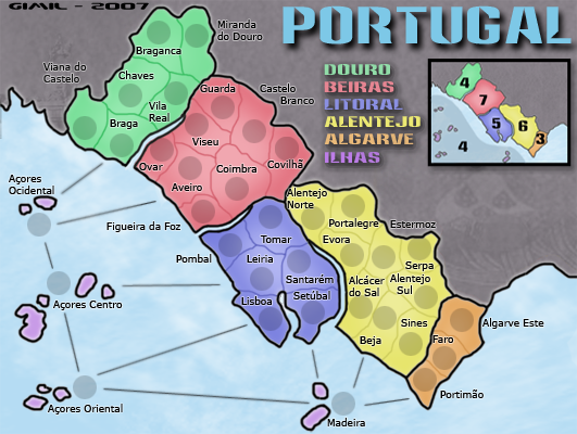
Can´t take the Porto Name. Because its the 2ª biggest city in the country, almost similar importance to the Capital Lisboa. If "Ovar" goes to the Porto place, then Porto has to take "Braga" place, and "braga" takes the place of "viana"!
It´s like this, "Braga" is a big city and capital of distric, "Viana do Castelo" is just a small city (like Ovar) and Porto is a must city.
i don´t live there, but it his well knoned in other countrys, because of Oporto Wine, The Porto Club that wined UEFFA Chapions LEAGUE, its the place that has more Students in Uneversity form other countrys.... and the country only has two airports, one in Lisboa - The Capital and another in Porto.
By the way, that is a great way to correct the North River and the citys around them, "Ovar" is the wright responce, but Porto must stay, so as Braga (with is in the Top5 Citys of the country)
Im apology for note responding faster to this situation...
in Açores: it´s perfect the Ocidental/oriental


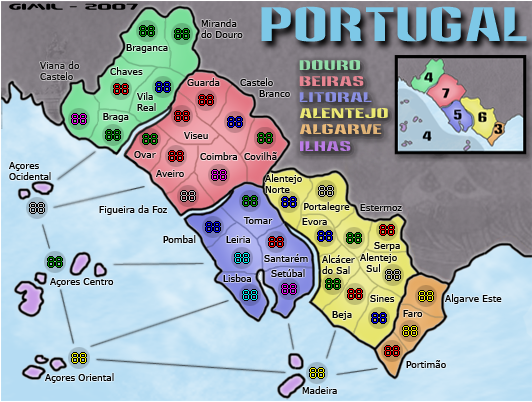
Wisse...i think the font is refreshing...i've not seen this used before in my short time in the forum. And I think it fits the style of the map gimil has created.Wisse wrote:i think everything is good exept the font, it just doesn't look right
Care to elaborate on why it doesn't look right for you?

* Pearl Harbour * Waterloo * Forbidden City * Jamaica * Pot Mosbi
-
gimil
- Posts: 8599
- Joined: Sat Mar 03, 2007 12:42 pm
- Gender: Male
- Location: United Kingdom (Scotland)
LARGE

SMALL


FILE LINKS
LARGE
http://i25.photobucket.com/albums/c64/G ... ARGE-8.png
SMALL
http://i25.photobucket.com/albums/c64/G ... MALL-7.png
XML
http://h1.ripway.com/gimil01/Portugal.XML
SMALL
FILE LINKS
LARGE
http://i25.photobucket.com/albums/c64/G ... ARGE-8.png
SMALL
http://i25.photobucket.com/albums/c64/G ... MALL-7.png
XML
http://h1.ripway.com/gimil01/Portugal.XML
What do you know about map making, bitch?
Top Score:2403natty_dread wrote:I was wrong
it looks a bit pixely, but if you all don't think so then don't mind itcairnswk wrote:Wisse...i think the font is refreshing...i've not seen this used before in my short time in the forum. And I think it fits the style of the map gimil has created.Wisse wrote:i think everything is good exept the font, it just doesn't look right
Care to elaborate on why it doesn't look right for you?


-
AndyDufresne
- Posts: 24919
- Joined: Fri Mar 03, 2006 8:22 pm
- Location: A Banana Palm in Zihuatanejo
- Contact:
-
gimil
- Posts: 8599
- Joined: Sat Mar 03, 2007 12:42 pm
- Gender: Male
- Location: United Kingdom (Scotland)
that doesn't work. Because i used a layer style called stroke. When i add the littlest blur (which i tried earlier) The stroke take a fit and starts going crazy lolAndyDufresne wrote:The white blur behind the text does add a little fuzziness/pixeliness to the names. I'm not sure how you can get around that...perhaps a slight blur over the name, without blurring the name to the point it can't be read?
--Andy
wait i lie.
I managed to get it to work
Ill ahve it up in a few minutes
What do you know about map making, bitch?
Top Score:2403natty_dread wrote:I was wrong
-
gimil
- Posts: 8599
- Joined: Sat Mar 03, 2007 12:42 pm
- Gender: Male
- Location: United Kingdom (Scotland)


FILE LINKS
LARGE
http://i25.photobucket.com/albums/c64/G ... ARGE-9.png
SMALL
http://i25.photobucket.com/albums/c64/G ... MALL-8.png
XML
http://h1.ripway.com/gimil01/Portugal.XML
What do you know about map making, bitch?
Top Score:2403natty_dread wrote:I was wrong
-
AndyDufresne
- Posts: 24919
- Joined: Fri Mar 03, 2006 8:22 pm
- Location: A Banana Palm in Zihuatanejo
- Contact: