i think it would conflict only in 4 digit armies but i'll move it to be sure.cairnswk wrote:Dim...just a small comment....Ayr and Eon army shields if side-by-side like that, would create conflict for army numbers from Ayr....i know you'll adjust them though.
Age of Realms: Age of Might [Quenched]
Moderator: Cartographers
Forum rules
Please read the Community Guidelines before posting.
Please read the Community Guidelines before posting.
-
DiM

- Posts: 10415
- Joined: Wed Feb 14, 2007 6:20 pm
- Gender: Male
- Location: making maps for scooby snacks
“In the beginning God said, the four-dimensional divergence of an antisymmetric, second rank tensor equals zero, and there was light, and it was good. And on the seventh day he rested.”- Michio Kaku
-
DiM
- Posts: 10415
- Joined: Wed Feb 14, 2007 6:20 pm
- Gender: Male
- Location: making maps for scooby snacks
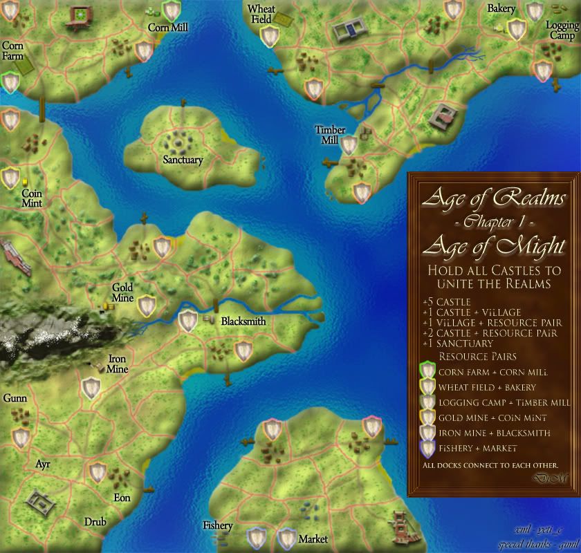
IMPORTANT
i forgot to mention one important thing.
the map is mission based.
to win one must hold all the castles. the rest of the terits don't matter.
this first chapter is about different realms from an old broken apart kingdom and the goal is to unite the six realms.
i forgot to mention one important thing.
the map is mission based.
to win one must hold all the castles. the rest of the terits don't matter.
this first chapter is about different realms from an old broken apart kingdom and the goal is to unite the six realms.
“In the beginning God said, the four-dimensional divergence of an antisymmetric, second rank tensor equals zero, and there was light, and it was good. And on the seventh day he rested.”- Michio Kaku
-
DiM
- Posts: 10415
- Joined: Wed Feb 14, 2007 6:20 pm
- Gender: Male
- Location: making maps for scooby snacks
V17
* switched to large version to see things better. small version is doable as proved by earlier versions.
* moved central right castle off the cliff
* added shadow in the courtyard of top left castle
* redid the legend with colors to match the resource pairs. i think it's pretty obvious now. do i still need to make the terit names colored?
* all important terits will have colored shields and all the neutrals will have simple shields.
*accidentally made the legend darker. but i liked it and i decided to leave it as it is. is it too dark?
please comment
“In the beginning God said, the four-dimensional divergence of an antisymmetric, second rank tensor equals zero, and there was light, and it was good. And on the seventh day he rested.”- Michio Kaku


few mistakes with the territories border i saw in two main places. They dont quite seem to reach the edge of the border.
Whereas one line goes over

probably more, i will keep a eye open for more.
The coloured glow looks slight pixelated
could you maybe add some different terrain, maybe some lovely cliffs, maybe the top left castle could have some cliffs around to reduce the ease of attacking the villages.
the darker legend, it is alright, could you try and make the font look engraved, would could make the engraving lighter than the wood.
Whereas one line goes over
probably more, i will keep a eye open for more.
The coloured glow looks slight pixelated
could you maybe add some different terrain, maybe some lovely cliffs, maybe the top left castle could have some cliffs around to reduce the ease of attacking the villages.
the darker legend, it is alright, could you try and make the font look engraved, would could make the engraving lighter than the wood.
-
Aerial Attack

- Posts: 1132
- Joined: Mon Jun 04, 2007 7:59 pm
- Location: Generation One: The Clan
I agree the legend is just a wee bit dark. I like the engraving idea. The A's overlap the frame slightly (Age of Realms and Age of Might [crowds]). Either make the frame less thick ...
Add a line for village (with an appropriately colored shield next to it). You might want to add a shield next to castle as well.
I like your six different designs for the castles, but they just don't seem grand or finished or something. The best castle is the one with the garden (you just updated). The one next to the mountains looks a little like a beached battleship. I'm not sure what I'm saying - you can probably just ignore me ...
Oh yeah - you definitely need a line in the legend about the mission.
-
DiM
- Posts: 10415
- Joined: Wed Feb 14, 2007 6:20 pm
- Gender: Male
- Location: making maps for scooby snacks
thanks for the input guys.cairnswk wrote:Agreed, DiM, love the map, but the legend font is simply too dark on the dark brown background.yeti_c wrote:Too dark with black text...
C.
so should i make the text lighter or switch back to the lighter background?
i prefer the latter.
“In the beginning God said, the four-dimensional divergence of an antisymmetric, second rank tensor equals zero, and there was light, and it was good. And on the seventh day he rested.”- Michio Kaku
-
DiM
- Posts: 10415
- Joined: Wed Feb 14, 2007 6:20 pm
- Gender: Male
- Location: making maps for scooby snacks
thanks telvannia for the borders. i'll make them fit.Telvannia wrote:few mistakes with the territories border i saw in two main places. They dont quite seem to reach the edge of the border.
Whereas one line goes over
probably more, i will keep a eye open for more.
The coloured glow looks slight pixelated
could you maybe add some different terrain, maybe some lovely cliffs, maybe the top left castle could have some cliffs around to reduce the ease of attacking the villages.
the darker legend, it is alright, could you try and make the font look engraved, would could make the engraving lighter than the wood.
as for engraving the text. hmm. might be a good idea but i think it might take too much space.
i'll try it though.
it would be nice to have the text seem like it's cut in the wood.
“In the beginning God said, the four-dimensional divergence of an antisymmetric, second rank tensor equals zero, and there was light, and it was good. And on the seventh day he rested.”- Michio Kaku
-
DiM
- Posts: 10415
- Joined: Wed Feb 14, 2007 6:20 pm
- Gender: Male
- Location: making maps for scooby snacks
Aerial Attack wrote:I agree the legend is just a wee bit dark. I like the engraving idea. The A's overlap the frame slightly (Age of Realms and Age of Might [crowds]). Either make the frame less thick ...
Add a line for village (with an appropriately colored shield next to it). You might want to add a shield next to castle as well.
I like your six different designs for the castles, but they just don't seem grand or finished or something. The best castle is the one with the garden (you just updated). The one next to the mountains looks a little like a beached battleship. I'm not sure what I'm saying - you can probably just ignore me ...
Oh yeah - you definitely need a line in the legend about the mission.
i'll make the title not overlap the frame.
to add 2 more lines for the village and the castle might be a problem since i already forgot to add the part where one needs to hold all castles to win and the legend space is very tight
as for the castles. look through the thread at the previous updates. the castles have been modified a few times according to what people said. i'm afraid that if i modify them previous satisfied people will become unsatisfied
“In the beginning God said, the four-dimensional divergence of an antisymmetric, second rank tensor equals zero, and there was light, and it was good. And on the seventh day he rested.”- Michio Kaku

-
DiM
- Posts: 10415
- Joined: Wed Feb 14, 2007 6:20 pm
- Gender: Male
- Location: making maps for scooby snacks
here is V18.
i corrected the borders as telvannia suggested.
and redid the legend.
new type of font. easier to read and less space consuming. with a small bevel to it and a pale color to look nice
hit me
i corrected the borders as telvannia suggested.
and redid the legend.
new type of font. easier to read and less space consuming. with a small bevel to it and a pale color to look nice
hit me
“In the beginning God said, the four-dimensional divergence of an antisymmetric, second rank tensor equals zero, and there was light, and it was good. And on the seventh day he rested.”- Michio Kaku
-
DiM
- Posts: 10415
- Joined: Wed Feb 14, 2007 6:20 pm
- Gender: Male
- Location: making maps for scooby snacks
finallygimil wrote:im hoping to make a comeback with feudal in the next couple of days
prepare for some heavy competition
you've been playing with that map for too long time to speed up.
“In the beginning God said, the four-dimensional divergence of an antisymmetric, second rank tensor equals zero, and there was light, and it was good. And on the seventh day he rested.”- Michio Kaku
-
DiM
- Posts: 10415
- Joined: Wed Feb 14, 2007 6:20 pm
- Gender: Male
- Location: making maps for scooby snacks
actually they reach all the castles except for one. already corrected and will be shown in the next update.Telvannia wrote:the paths going round the map seem odd.
they never quite reach the castles, and they sometime dont even go to the castle to begin with.
maybe try adding some path blocks in the villages, you could add some more variation to the villages will you are at it
and what do you mean by blocks?
variatin...ahhh but there is plenty of variation but it's so small it's barely noticeable
for example in the villages some houses have courtyards where they grow vegetables or cattle or pigs. the problem is the size. a pink pixel is a pig and a brown one is a cow while a green one is a cabbage. i don't have the space to draw so much detail. but believe me the pixels are there.
if you are referring to the colors of the houses then sorry but they stay the same. look up some medieval poor villages and you'll see all the houses are small cottages made in the same style and color. they didn't care too much about design when the family was hungry.
“In the beginning God said, the four-dimensional divergence of an antisymmetric, second rank tensor equals zero, and there was light, and it was good. And on the seventh day he rested.”- Michio Kaku
Hi There,
The only thing I can comment on is, as being partially colour blind, I cannot make out the differences on the colours around the shields. Maybe something more contrasting?
For example, it looks like the following to me (in the legend, going down the list), but that can't be right!
Yellow
Yellow
Brown
Yellow
Grey
Blue

-
DiM
- Posts: 10415
- Joined: Wed Feb 14, 2007 6:20 pm
- Gender: Male
- Location: making maps for scooby snacks
ApophisNL wrote:Hi There,
The only thing I can comment on is, as being partially colour blind, I cannot make out the differences on the colours around the shields. Maybe something more contrasting?
For example, it looks like the following to me (in the legend, going down the list), but that can't be right!
Yellow
Yellow
Brown
Yellow
Grey
Blue
Yellow - light green
Yellow - ok
Brown - dark green
Yellow - orange
Grey - ok
Blue - ok.
well i could go for contrasting colors and add red and purple and stuff but that wouldn't be realistic as i chose the colors to represent the resource pair. blue for fish orange for gold dark green for timber, etc.
plus, it seems your color blindness has a problem with green and they are seen as yellow.
and i have to consider the fact that other forms of color blindness will cause other problems like seeing red and green as grey and all sorts of combinations.
the problem is i don't think i can find a compromise because there will always be somebody unhappy.
“In the beginning God said, the four-dimensional divergence of an antisymmetric, second rank tensor equals zero, and there was light, and it was good. And on the seventh day he rested.”- Michio Kaku

Do colors as they are and make it so they all aren't the same shields or maybe different shapes.
That seems the easiest to me. It's hard to solve for colorblindness, but when you consider 10% of the world's population has some form of it... It's become somewhat necessary to consider.
Oh, the gold mine in the legend looks a lot like the orange shields you are using for other things to me. I can tell the difference on the map itself though.
Warning: You may be reading a really old topic.
-
Aerial Attack
- Posts: 1132
- Joined: Mon Jun 04, 2007 7:59 pm
- Location: Generation One: The Clan
Coleman is right, the shield in the legend for Gold Mine looks a lot like the ones used to denote "village." Meanwhile, the ones you are using on the map for Gold Mine look an lot like the ones for Wheat Field. Probably just got slightly confused.Coleman wrote:Do colors as they are and make it so they all aren't the same shields or maybe different shapes.
That seems the easiest to me. It's hard to solve for colorblindness, but when you consider 10% of the world's population has some form of it... It's become somewhat necessary to consider.
Oh, the gold mine in the legend looks a lot like the orange shields you are using for other things to me. I can tell the difference on the map itself though.
I like the new legend a lot. "Logging Camp + Timber Mill" is just a long resource pair name - too long for the legend. Either change logging camp to "log forest" or "forest" or make the frame around the legend a few pixels less thick.
-
DiM
- Posts: 10415
- Joined: Wed Feb 14, 2007 6:20 pm
- Gender: Male
- Location: making maps for scooby snacks
the villages have red shields the gold mine and coin mint have orange and and the wheat and bakery have yellow.Coleman wrote:Do colors as they are and make it so they all aren't the same shields or maybe different shapes.
That seems the easiest to me. It's hard to solve for colorblindness, but when you consider 10% of the world's population has some form of it... It's become somewhat necessary to consider.
Oh, the gold mine in the legend looks a lot like the orange shields you are using for other things to me. I can tell the difference on the map itself though.
i'll what i can do about the colors as for the shield shapes. i'm not sure i like the idea but i'll see what kind of shapes i can do.
“In the beginning God said, the four-dimensional divergence of an antisymmetric, second rank tensor equals zero, and there was light, and it was good. And on the seventh day he rested.”- Michio Kaku

-
DiM
- Posts: 10415
- Joined: Wed Feb 14, 2007 6:20 pm
- Gender: Male
- Location: making maps for scooby snacks
nice one with the icons. but it works for the large version in the small one either i make the icons to fit and they appear too small or i make them large and they overlap borders and stuff.Telvannia wrote:here is a idea of how you could show the different resources:
i know it is far from perfect, i also tried to show what i meant about the paths, both the not getting to the castle and the blocks in the villages.
i still don't understand what you mean by blocks
“In the beginning God said, the four-dimensional divergence of an antisymmetric, second rank tensor equals zero, and there was light, and it was good. And on the seventh day he rested.”- Michio Kaku
DiM wrote:i still don't understand what you mean by blocks
like the path is there because the people walking have rubbed off the grass and left the mud, the people milling about villages have done the same thing, so basically the whole ground area round the village is a path, so the village would seem to be standing on a block of path.
Also did you seem what i meant about the castles?
-
DiM
- Posts: 10415
- Joined: Wed Feb 14, 2007 6:20 pm
- Gender: Male
- Location: making maps for scooby snacks
finally i understand. yep i will make the villages like that. also the castles connect but it's really faint at the end. i will solve that issue too.Telvannia wrote:DiM wrote:i still don't understand what you mean by blocks
like the path is there because the people walking have rubbed off the grass and left the mud, the people milling about villages have done the same thing, so basically the whole ground area round the village is a path, so the village would seem to be standing on a block of path.
Also did you seem what i meant about the castles?
“In the beginning God said, the four-dimensional divergence of an antisymmetric, second rank tensor equals zero, and there was light, and it was good. And on the seventh day he rested.”- Michio Kaku