thanks tel. i'm at work now so i'll take care of those pesky borders tomorrow because i don't have photoshop at work.
but i'll post later an image (in paint) with the value of each neutral army to see if everybody agrees with the values.
Age of Realms: Age of Might [Quenched]
Moderator: Cartographers
Forum rules
Please read the Community Guidelines before posting.
Please read the Community Guidelines before posting.

-
DiM

- Posts: 10415
- Joined: Wed Feb 14, 2007 6:20 pm
- Gender: Male
- Location: making maps for scooby snacks
gimil wrote:thats not commitmentDiM wrote:thanks tel. i'm at work now so i'll take care of those pesky borders tomorrow because i don't have photoshop at work.
“In the beginning God said, the four-dimensional divergence of an antisymmetric, second rank tensor equals zero, and there was light, and it was good. And on the seventh day he rested.”- Michio Kaku
-
Aerial Attack

- Posts: 1132
- Joined: Mon Jun 04, 2007 7:59 pm
- Location: Generation One: The Clan
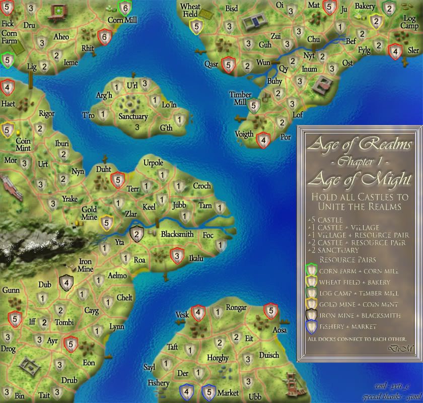
1) I noticed you reused the name Tombi from AoM *smirk*
2) I assume you're only calculating the number of territories away from the castle "closest" to it.
terr Ju needs to be updated to 2 (castle next to Oi can more easily reach Bakery/Log Camp than can castle next to Ost)
I didn't immediately notice anything else. But I'm guessing there are a few other situations where the combinations of # of armies across # of territories is uneven.
This actually looks decent for having been done in MS Paint.
-
DiM
- Posts: 10415
- Joined: Wed Feb 14, 2007 6:20 pm
- Gender: Male
- Location: making maps for scooby snacks
good eyes.Aerial Attack wrote:1) I noticed you reused the name Tombi from AoM *smirk*
yep. you're right.Aerial Attack wrote:2) I assume you're only calculating the number of territories away from the castle "closest" to it.
indeed that should be a 2.Aerial Attack wrote:terr Ju needs to be updated to 2 (castle next to Oi can more easily reach Bakery/Log Camp than can castle next to Ost)
it could be. that's why i put the map to get feedback. hopefully i'll get more feedback on this and we'll have a perfectly balanced gameplay.Aerial Attack wrote:I didn't immediately notice anything else. But I'm guessing there are a few other situations where the combinations of # of armies across # of territories is uneven.
i couldn't stand the horror of working in paint so i downloaded photoshop trial.Aerial Attack wrote:This actually looks decent for having been done in MS Paint.
“In the beginning God said, the four-dimensional divergence of an antisymmetric, second rank tensor equals zero, and there was light, and it was good. And on the seventh day he rested.”- Michio Kaku

-
Aerial Attack
- Posts: 1132
- Joined: Mon Jun 04, 2007 7:59 pm
- Location: Generation One: The Clan
I took a pretty good look and found these (not that there aren't more):
1) Definitely make Ikalu 4 (since any dock can attack another dock, it's effectively 1 away from another country).
2) Not sure about this, but I think Rhit actually needs to be 7 - you can immediately hit any other port and be within 1 terr of a 2-protected resource.
1) Definitely make Ikalu 4 (since any dock can attack another dock, it's effectively 1 away from another country).
2) Not sure about this, but I think Rhit actually needs to be 7 - you can immediately hit any other port and be within 1 terr of a 2-protected resource.
-
DiM
- Posts: 10415
- Joined: Wed Feb 14, 2007 6:20 pm
- Gender: Male
- Location: making maps for scooby snacks
good point. will doAerial Attack wrote:I took a pretty good look and found these (not that there aren't more):
1) Definitely make Ikalu 4 (since any dock can attack another dock, it's effectively 1 away from another country).
i don't think a 7 is needed. yes you can go to other islands BUT the only 2 protected resources are the log camp. which is also protected by a 4 in Sler and it's worthless without the timber mill and the blacksmith which will be protected by a 4 in Ikalu and again worthless without the iron mine.Aerial Attack wrote:2) Not sure about this, but I think Rhit actually needs to be 7 - you can immediately hit any other port and be within 1 terr of a 2-protected resource.
“In the beginning God said, the four-dimensional divergence of an antisymmetric, second rank tensor equals zero, and there was light, and it was good. And on the seventh day he rested.”- Michio Kaku
-
DiM
- Posts: 10415
- Joined: Wed Feb 14, 2007 6:20 pm
- Gender: Male
- Location: making maps for scooby snacks
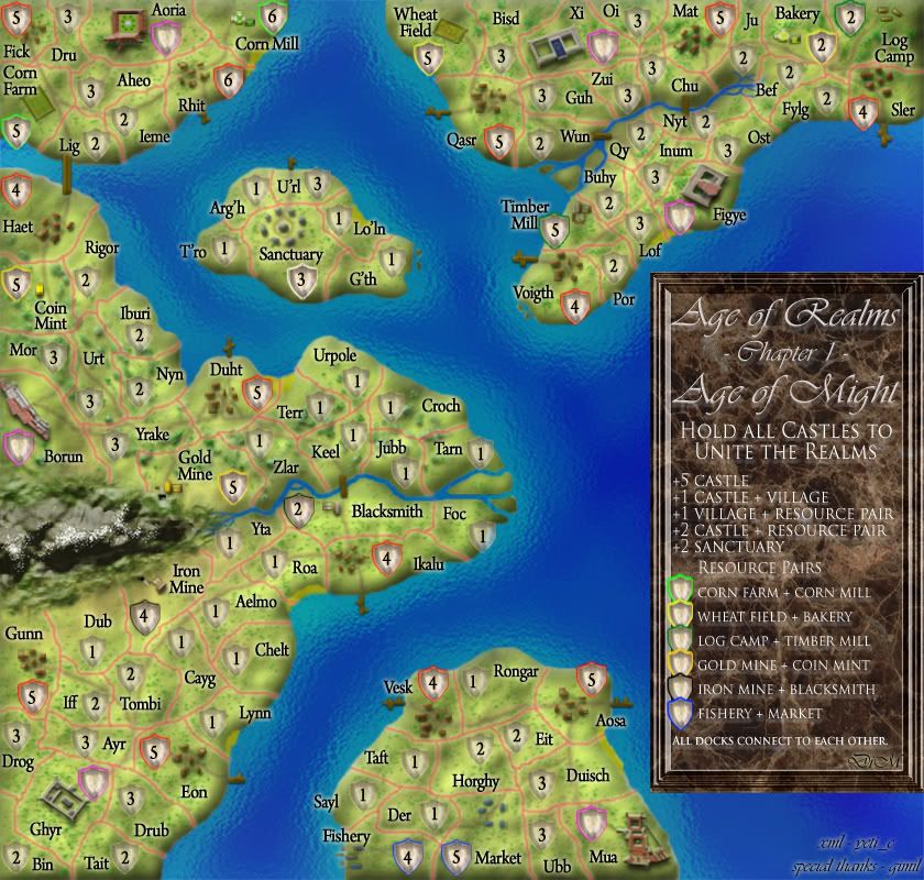
V21
DONE:
* shields have a new outer rim that's more blended and fuzzy rather than solid.
* moved some shields around
* corrected borders
* new legend that's more granite like.
* shields and names to castles
* shield to sanctuary
* corrected neutral numbers.
TO-DO:
* xml
NOTES:
* size of the small map. i'd like to request to make it just a wee bigger. it's currently possible at 630*600 but in my opinion the overall aspect is kinda spoiled by the cluttering. maybe go up to 660. pls. pretty please. world 2.1 was allowed up to 700 and great lakes up to 727 and nobody commented anything.
V21
“In the beginning God said, the four-dimensional divergence of an antisymmetric, second rank tensor equals zero, and there was light, and it was good. And on the seventh day he rested.”- Michio Kaku


-
DiM
- Posts: 10415
- Joined: Wed Feb 14, 2007 6:20 pm
- Gender: Male
- Location: making maps for scooby snacks
it's a slab of granite with letters engraved on it. i think it fits. but as you said it's personal taste. i aim to please everybody but since that's impossible i'll settle for the majority. so if most people think it fits then it stays if not then it will be changed.Gnome wrote:that's what they call personal taste I guess
I don't mind it stays that way, I like the way it looks...I just don't think it has the same style as the rest of the map...
“In the beginning God said, the four-dimensional divergence of an antisymmetric, second rank tensor equals zero, and there was light, and it was good. And on the seventh day he rested.”- Michio Kaku


-
DiM
- Posts: 10415
- Joined: Wed Feb 14, 2007 6:20 pm
- Gender: Male
- Location: making maps for scooby snacks
V21.1 a small update on the previous update.
DONE:
* shields have a new outer rim that's more blended and fuzzy rather than solid.
* moved some shields around
* corrected borders
* new legend that's more granite like.
* shields and names to castles
* shield to sanctuary
* corrected neutral numbers.
* moved the text and shields in the legend so they don't touch the sides.
TO-DO:
* xml
NOTES:
* size of the small map. i'd like to request to make it just a wee bigger. it's currently possible at 630*600 but in my opinion the overall aspect is kinda spoiled by the cluttering. maybe go up to 660. pls. pretty please. world 2.1 was allowed up to 700 and great lakes up to 727 and nobody commented anything.
V21.1
“In the beginning God said, the four-dimensional divergence of an antisymmetric, second rank tensor equals zero, and there was light, and it was good. And on the seventh day he rested.”- Michio Kaku

well you can guess what i coming next:
1. black glow, it does not seem as visable as any of the others.
2.the new legend, you haev made a bad mix of marble and wood. granite is grey and spotting, marble is white with dark lines, wood is brown, the new legend looks very odd, i will post what i think it should look like in a bit.
3. half the villages still seem to lack any paths within them.
4.i think the sanctuary and castle shields should be a lot more different to the normal shields.
5.legend again, if it is engraved you would not get as fancy writing style.
6.some of the shields are still of the map, look at the log camp.
7.im still finding the important places hard to spot, could you try and make the more obvious, how about a glow on the territory lines, i will show a example in a bit.
that should be enough for now.
-
DiM
- Posts: 10415
- Joined: Wed Feb 14, 2007 6:20 pm
- Gender: Male
- Location: making maps for scooby snacks
solved in next update.Telvannia wrote:well you can guess what i coming next:
1. black glow, it does not seem as visable as any of the others.
actually you got your facts wrong. granite actually ranges from deep black to very light grey passing through shades of brown violet and blue. there are many types of granite. for example in my kitchen i have a huge slab of black granite with white vines on the counter (i don't know what the thing where you do the cooking and cutting and stuff is called)Telvannia wrote:2.the new legend, you haev made a bad mix of marble and wood. granite is grey and spotting, marble is white with dark lines, wood is brown, the new legend looks very odd, i will post what i think it should look like in a bit.
same thing for marble. it can be white with brown/red/black lines but it can also be pink black creamy or dark red.
and again same thing for wood it can be white-ish brown creamy green red and even black.
the legend i used it's actually a granite called something that i forget right now. i'll look it up on the net to see if i find it.
all the villages have paths but some villages are in a forest zone (like mat or sler) and the paths aren't very visible.Telvannia wrote:3. half the villages still seem to lack any paths within them.
why? i'd rather have them like this or people will start asking why is that different? i don't see anything in the legend on this matter. i'm confused.Telvannia wrote:4.i think the sanctuary and castle shields should be a lot more different to the normal shields.
yeah and on AoM if it was a really old treasure map that withstood centuries of bad weather and stuff it would surely have a really crappy and hard to see handwriting. but people need to understand what the legend says and thus more readable and carefully drawn fonts have to be used.Telvannia wrote:5.legend again, if it is engraved you would not get as fancy writing style.
will fix in next update.Telvannia wrote:6.some of the shields are still of the map, look at the log camp.
nope i don't want to add highlights on the borders or who knows what other stuff. it will only make the map more cluttered.Telvannia wrote:7.im still finding the important places hard to spot, could you try and make the more obvious, how about a glow on the territory lines, i will show a example in a bit.
that should be enough for now.
there are several ways to tell a terit is important.
1. it's name is in the legend
2. it has a graphic inside (a village a farm, etc)
3. it has a colored army circle
4. it has a non transparent more visible army circle.
i think this is enough. pretty soon i'll have too add big red arrows pointing at various terits and writing "LOOK HERE"
“In the beginning God said, the four-dimensional divergence of an antisymmetric, second rank tensor equals zero, and there was light, and it was good. And on the seventh day he rested.”- Michio Kaku
My thought on the size.
I know you feel it is cluttered, but right now I am not getting the OMG WTF! feel that recently quenched pearl harbor gives me. Your map is conducted in a sane way that feels a bit more obvious to me.
As for your current neutral allocation I'll need to do some maths and research. Not that I don't trust the research you already did, but the conquest gameplay has the potential for severe imbalance and I don't want to take any chances. If I come to results that shows a castle having a severe advantage or disadvantage I'll post them.
Warning: You may be reading a really old topic.
up to you, but i have never liked a black glow, because it think it does not work, but that is meDiM wrote:make it thicker? make it another color?Telvannia wrote:1. black glow, it does not seem as visable as any of the others.
Maybe only castles need to be different because they are the important territoties that you have to hold, does not need to be anything drastic, maybe just a different style of shield, so they stand out.DiM wrote:why? i'd rather have them like this or people will start asking why is that different? i don't see anything in the legend on this matter. i'm confused.Telvannia wrote:4.i think the sanctuary and castle shields should be a lot more different to the normal shields.
i dont think i explained what i meant very well, i personally i thin the title looks out of place, because it is so curly, because that would be nearly impossible to carve, so maybe if it simpler,DiM wrote:yeah and on AoM if it was a really old treasure map that withstood centuries of bad weather and stuff it would surely have a really crappy and hard to see handwriting. but people need to understand what the legend says and thus more readable and carefully drawn fonts have to be used.Telvannia wrote:5.legend again, if it is engraved you would not get as fancy writing style.
also along that vein, i think the bonuses should be in roman numerals all Is and Vs.
DiM wrote:i think this is enough. pretty soon i'll have too add big red arrows pointing at various terits and writing "LOOK HERE"
i like this idea...
do it
-
DiM
- Posts: 10415
- Joined: Wed Feb 14, 2007 6:20 pm
- Gender: Male
- Location: making maps for scooby snacks
i agree but i have the same feeling on this map as i have on the supermax one. the small version is somewhat of less quality than the large.Coleman wrote:My thought on the size.
I know you feel it is cluttered, but right now I am not getting the OMG WTF! feel that recently quenched pearl harbor gives me. Your map is conducted in a sane way that feels a bit more obvious to me.
i'll wait for your research results.Coleman wrote:As for your current neutral allocation I'll need to do some maths and research. Not that I don't trust the research you already did, but the conquest gameplay has the potential for severe imbalance and I don't want to take any chances. If I come to results that shows a castle having a severe advantage or disadvantage I'll post them.
“In the beginning God said, the four-dimensional divergence of an antisymmetric, second rank tensor equals zero, and there was light, and it was good. And on the seventh day he rested.”- Michio Kaku