
lets start the poll n how bad my spelling is . . .
P.s. id really like to here valid arguments from more foundry regulars to see how they feel on this.
new look Crossword 1.1 [Vacation]
Moderator: Cartographers
Forum rules
Please read the Community Guidelines before posting.
Please read the Community Guidelines before posting.


Well Spinwizard....i'm sorry and indeed disappointed to hear you say that because it would lead me to believe that you think you are finished with this map or you intend to leave it to WL_Southern to pick up the pieces; i hope there is plenty more that you can do with the graphics, and you having been here in this foundry before and almost got a map up, you should know better.spinwizard wrote:About the graphics...there is not much more I can do to them as it is only squares...
Having gotten myself in the S*** with pushing this into the Foundry for you, and i freely admit that i may have been wrong in doing so, let me point out some of the short-comings of your graphics.
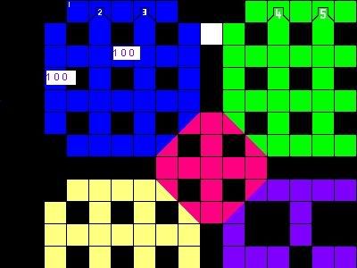
As you can see from the image i did above with the placing of the numbers....
1. For the squares you have white numbered, the actual army number will sit over the top of them making them illegible.
2. As has been pointed out by one of the foundry commentors, if someone has an army of 100 troops, you are going to be hard placed to fit that number in the squares, which will overflow to the right and cover part of the next square.
3. There is plenty to do with the colour scheme as you can see from the blue region and the colour scheme and some same colours on same coloured areas.
4. Your whole small map has to fit into a 600px wide image, so perhaps you need cut down the number of squares and perhaps think about a map that it not so symmetrical or change from square to alternative shapes that fit together.
5. You have 23 squares across...at 26 px wide each that could be enough room to create a map 598 px wide.
However, the height will have to be less than 600 px high and that will have to include your instructions and legend. Perhaps leave 100-150 px for legend, leaving you perhaps 17 squares down.
Please see what you and WL_Southern can do with this, otherwise those supporters who voted for the map will be very disappointed if this slips down the ladder....to the pit.

* Pearl Harbour * Waterloo * Forbidden City * Jamaica * Pot Mosbi
-
DiM

- Posts: 10415
- Joined: Wed Feb 14, 2007 6:20 pm
- Gender: Male
- Location: making maps for scooby snacks
aside from what cairns said about the size and the overlapping numbers i think you need a total redesign to make the map attractive. what you have now looks like something done in paint and is not a single bit superior to the original crossword map that has been done a year and a half ago.
break the patterns think outside the box and create a different design. i whipped a totally different thing in 15 minutes (see above) and there are endless possibilities to make this totally different.
since the theme is bad and the gameplay is awful at least make the map look good.
break the patterns think outside the box and create a different design. i whipped a totally different thing in 15 minutes (see above) and there are endless possibilities to make this totally different.
since the theme is bad and the gameplay is awful at least make the map look good.
“In the beginning God said, the four-dimensional divergence of an antisymmetric, second rank tensor equals zero, and there was light, and it was good. And on the seventh day he rested.”- Michio Kaku
-
WidowMakers
- Posts: 2774
- Joined: Mon Nov 20, 2006 9:25 am
- Gender: Male
- Location: Detroit, MI
I agree with DiM. His version is much more appealing visually than the current one. And gameplay is very confusing. Maybe if each word row or column was surrounded by a colored line which represented the territory, the map would be easier to read and understand. SO use DiM's newspaper style map and color and add individual territory color lines around the edges of each border.DiM wrote:aside from what cairns said about the size and the overlapping numbers i think you need a total redesign to make the map attractive. what you have now looks like something done in paint and is not a single bit superior to the original crossword map that has been done a year and a half ago.
break the patterns think outside the box and create a different design. i whipped a totally different thing in 15 minutes (see above) and there are endless possibilities to make this totally different.
since the theme is bad and the gameplay is awful at least make the map look good.
Keeps DiM's great theme
Makes it easier to read and understand.
WM

WM...my thanks to you and the others - Dim, Gimil etc for your concerns about this map.WidowMakers wrote:I agreegimil wrote:I also dont understand why this map has been moved while the soviet union map is still an idea
In all the work involved in Foundry, i too am apt to make mistakes in the eyes of some of those people who have been here some time - a part of the regular 30 or more that put their views forward on most maps.
I made the decision after spinwizard asked me to, and at that stage as you can see on page 4 from below my reply was:
I made this decision after checking the "How A Map Progresses Through the Foundry" guidelines, and seeing that a first image had been posted by WL_Southern, followed by an update with Title and legned numbers only by Spinwizard, asked him for one more update to complete the concept as that was my interpretation.cairnswk wrote:spinwizard wrote:
Hey m8, can u move the new crossword map thread to the main foundery...or shall i start a new thread for it...
hi Spinwizard....thanks for the question and contact....
If you haven't done so already please familiarise yourselves with How A Map Progresses Through the Foundry where u will see there are some changes as to how a map must be presented to the New Ideas Foundry.
I cannot move this map as I believe it is still being formulated and must have at least two graphical updates....you only have 1 so far.
I believe you have some gameplay there, but how are the xml coordinates going to be identified? And in wl_southern's lead article for the map there is no concept stated. if you could fix this please.
If you could state something on the map about this in your next update then i will definitely consider moving it.
There is no need to start a new thread.
Also, i would like to see a poll put up to determine if there is any interest for this map; i can see that there is some support, but it would also be good to gauge this via a poll, if you would.
I had read through the posts and ascertained that there was some support for the map, and this did not take into account my inexpreience for those people who obviously don't visit here regularly, however, there was also some positive feedback and suggestions from regular foundry posters.
Thus i decided to move the map.
I also checked the Russia map, and I also checked your Dungeons map and that was in the same boat. Subsequently neither of these maps were moved as they had only 1 update.
As for everyone's concern where the votes are coming from, that is neither here nor there to me, since i don't see the foundry as an exclusive club for only those people who visit here on a regular basis. Everyone should be able to come in here and vote if they wish to regardles of whether they are egged on by team members/players/friends.
If this is such a bad map, then there is every possibility that it may "go down" however that is not for me to deny someone the opportunity of attempting to have a map forged, provided in the final process it attains the standard that is required. I believe this map is only in the early stage yet.
For those who wish to confirm that the original Crossword is indeed one the most unplayed maps, below is the weekly count i do for the maps that have only achieved 1 Page in a week, you will note that there are several in this category, including two of mine.
Progress | This Wk | Map | Last Wk
1 44 8 Thoughts 43
1 34 Battle for Australia 33
1 35 Caribbean Islands 34
1 50 Circus Maximus 49
1 37 Crossword 36
1 74 Discworld 73
1 23 Ext. Glbl. Warming 22
1 58 Hong Kong 57
1 39 Mongol Empire 38
1 66 Philippines 65
1 72 Space 71
1 75 USApocalypse 74
1 16 Valley Of The Kings 15
* Pearl Harbour * Waterloo * Forbidden City * Jamaica * Pot Mosbi
-
DiM
- Posts: 10415
- Joined: Wed Feb 14, 2007 6:20 pm
- Gender: Male
- Location: making maps for scooby snacks
the stats you make are great for maps that are played in large amounts for the maps above it's really skewed because all have less than 100 active games but for example mongol empire has 80+ active games while crosswords has less than half.cairnswk wrote: For those who wish to confirm that the original Crossword is indeed one the most unplayed maps, below is the weekly count i do for the maps that have only achieved 1 Page in a week, you will note that there are several in this category, including two of mine.
Progress | This Wk | Map | Last Wk
1 44 8 Thoughts 43
1 34 Battle for Australia 33
1 35 Caribbean Islands 34
1 50 Circus Maximus 49
1 37 Crossword 36
1 74 Discworld 73
1 23 Ext. Glbl. Warming 22
1 58 Hong Kong 57
1 39 Mongol Empire 38
1 66 Philippines 65
1 72 Space 71
1 75 USApocalypse 74
1 16 Valley Of The Kings 15
the both fall under the same category but when you look at actual game numbers you see mongol is twice as played as crosswords.
a fact supported by the total number f games played. mongol empire has managed to get to 3900 games despite the fact it's been released less than half a year ago. while crosswords ahs reached just 3700 games despite being 1 and a half years old. so mongol amassed more games in a third of the time.
“In the beginning God said, the four-dimensional divergence of an antisymmetric, second rank tensor equals zero, and there was light, and it was good. And on the seventh day he rested.”- Michio Kaku
-
rebelman

- Posts: 2968
- Joined: Thu Aug 02, 2007 5:24 pm
- Gender: Male
- Location: People's Republic of Cork
- Contact:
DiM I hadn't seen your post where you "named and shamed" the new posters hence my defence. I want to make one or two points firstly about the general issue secondly about this map.
General issue raised by DiM and others:
Cairns answered this well and some of the comments made on my post in the abuse forum echoed that point. The foundry was never intended to be an exclusive place for just foundry regulars. I see no problem with any of the 18K regular players coming in here commenting on 1 map or several this should be encouraged, and if anything maybe some others in here could take advice from southy as he has done more to open up the foundry to new people than anyone has in my time here on cc. I'm speaking as someone by the way whos first ever post was in the foundry and I now have over 600 posts mainly in general discussion but scattered all over forums. The foundry and it's members do great work and should be applauded for this but it needs to be more inclusive not exclusive, well done Southy for doing something that has made some baby steps towards making this happen.
This map:
I said in an earlier post crosswords remain popular (not the crossword map DiM) and as a map idea they have lots of scope as the newspaper idea above showed.
I'm no graphic artist or mathematician but the original crossword map was also symmetrical. I play crosswords regularly and most of them are.
Obviously this map must meet size and numbers guidelines - that's a no brainer and until it does it will never be any more than an idea.
I actually think having read some of the criticism some clever gameplay maybe involving simple and crytic clues or the use of letters instead of numbers might make this map much more appealing.
I actually dont like the areas being all coloured in as having played thousands of crosswords I have never seen 1 that looked like that.
Don't now why people on here don't like being cooks, remember under siege: A former SEAL, now cook, is the only person who can stop a gang of terrorists when they sieze control of a US Navy battleship.
-
DiM
- Posts: 10415
- Joined: Wed Feb 14, 2007 6:20 pm
- Gender: Male
- Location: making maps for scooby snacks
not named and shamed. just named.rebelman wrote:DiM I hadn't seen your post where you "named and shamed" the new posters hence my defence. I want to make one or two points firstly about the general issue secondly about this map.
i agree to this to a certain extent. yes everybody is welcome to the foundry but as long as he gives proper feedback and he reads before he writes. a guy that comes in the foundry and posts in a map idea thread "quench" or on the contrary "this is crap" isn't welcome. at least in my opinion. that person has no idea how a map is created and simply wastes his time posting because he will most likely be ignored. these persons come from time to time and their stay is brief and generally they don't disrupt the balance of the foundry. but when lots of people come all of a sudden and say this map is great well, how should i say this gently, actually i can't say it gently. so when a lot of people come and say this map is great we come in a situation where a shitty map (yes i'm talking about this one, sorry but these are my feelings) is actually taken seriously and moved from ideas to main foundry. this is absurd.rebelman wrote:General issue raised by DiM and others:
Cairns answered this well and some of the comments made on my post in the abuse forum echoed that point. The foundry was never intended to be an exclusive place for just foundry regulars. I see no problem with any of the 18K regular players coming in here commenting on 1 map or several this should be encouraged, and if anything maybe some others in here could take advice from southy as he has done more to open up the foundry to new people than anyone has in my time here on cc. I'm speaking as someone by the way whos first ever post was in the foundry and I now have over 600 posts mainly in general discussion but scattered all over forums. The foundry and it's members do great work and should be applauded for this but it needs to be more inclusive not exclusive, well done Southy for doing something that has made some baby steps towards making this happen.
take the least played map with the crappiest theme and the crappiest graphics. copy it keep the crappy graphics and crappy theme and add a crappy gameplay. consider crosswords (the original) as a pile of crap. well that crap is 1.5 years old and it has turned dry and stopped smelling. why would you want now to add an even bigger pile of crap next to the old one. and remember this one is fresh and moist and smells really bad.
it's like taking the classic map putting a retarded child to draw it in paint then add really screwed bonuses like -500 (yes minus) for europe and + 9999 for afganistan.and making everything start with 1337 neutrals.
yes crosswords (not the map) are popular and we already have a map. it's made by jota. good or bad it's there to stay and we don't need another one. that's why we have revamps so we don't duplicate maps. what if everybody starts doing crosswords maps now? will we have 100 maps on the same thing?rebelman wrote:This map:
I said in an earlier post crosswords remain popular (not the crossword map DiM) and as a map idea they have lots of scope as the newspaper idea above showed.
if southy really wants the crosswords map then he should talk to jota and do a revamp. but a true revamp where the graphics are made better not crappy like they are now.
nope the original map is not symmetrical and again no crosswords aren't symmetrical. just do a google image search for crosswords. you'll find hundreds of images. most of them aren't symmetrical.rebelman wrote:I'm no graphic artist or mathematician but the original crossword map was also symmetrical. I play crosswords regularly and most of them are.
actually it's already out of the ideas forum even if it doesn't meet the size or has army issues.rebelman wrote:Obviously this map must meet size and numbers guidelines - that's a no brainer and until it does it will never be any more than an idea.
so far the map is heading in a direction where it's far less appealing than the original.rebelman wrote:I actually think having read some of the criticism some clever gameplay maybe involving simple and crytic clues or the use of letters instead of numbers might make this map much more appealing.
true that's why shades should be used like i did in the newspaper piece posted earlier.rebelman wrote:I actually dont like the areas being all coloured in as having played thousands of crosswords I have never seen 1 that looked like that.
“In the beginning God said, the four-dimensional divergence of an antisymmetric, second rank tensor equals zero, and there was light, and it was good. And on the seventh day he rested.”- Michio Kaku
I hate to be the occasional poster youre speaking of, because I dont ever check the foundry, but as a player of all maps, but I think this one is totally different than the original
Ill certainly be playing it the second it comes out... its a tough one for escalating, but has a bunch of potential for flat rate and no cards...no cards especially... the players that play these will play this one a lot because you are almost guaranteed a fair drop because theres a place for everyone
Personally I like the solid colors too because its very easy to see the different territories.
Without greasemonkey it might be tricky, but with it, its easy to figure out... and keeping the center blocked makes the whole thing come together.
Im posting this from a players perspective though... the details are lost on me, I just like a tricky map, and the simplicity of this one, actually makes it tricky, in its own way.
-
WL_southerner

- Posts: 314
- Joined: Wed Mar 08, 2006 7:25 pm
- Location: friends :- come and go _ i have loads of them
crossword 2.0
checking though rules ect i can not find where the army has to be in a round circle there for this setting could work just well by using rectangle box to put army men number in
has for over lapping has long it don't over lap in to the next line theres no problem, over lapping in to the next box in the same line, on the down lines there should be no problem lapping in to the black area has those spots do not count for any thing i come up with explample just to give the idea how it can work

i all so think i see that andy did not mind so much about the scrolling down part but not the scrolling across if this so we can use the full 600pix across and put the leg on top or under neath the map
i also have an idea that could make crossword more user friendly
has for over lapping has long it don't over lap in to the next line theres no problem, over lapping in to the next box in the same line, on the down lines there should be no problem lapping in to the black area has those spots do not count for any thing i come up with explample just to give the idea how it can work
i all so think i see that andy did not mind so much about the scrolling down part but not the scrolling across if this so we can use the full 600pix across and put the leg on top or under neath the map
i also have an idea that could make crossword more user friendly
friends :- come and go _ i have loads of them
mates :- go and come back_only have a few
Leatsa, dh'fhàgainnsa...
mates :- go and come back_only have a few
Leatsa, dh'fhàgainnsa...
-
spinwizard
- Posts: 5016
- Joined: Sun Dec 10, 2006 9:52 am
-
spinwizard
- Posts: 5016
- Joined: Sun Dec 10, 2006 9:52 am
ThanksAAFitz wrote:I hate to be the occasional poster youre speaking of, because I dont ever check the foundry, but as a player of all maps, but I think this one is totally different than the original
Ill certainly be playing it the second it comes out... its a tough one for escalating, but has a bunch of potential for flat rate and no cards...no cards especially... the players that play these will play this one a lot because you are almost guaranteed a fair drop because theres a place for everyone
Personally I like the solid colors too because its very easy to see the different territories.
Without greasemonkey it might be tricky, but with it, its easy to figure out... and keeping the center blocked makes the whole thing come together.
Im posting this from a players perspective though... the details are lost on me, I just like a tricky map, and the simplicity of this one, actually makes it tricky, in its own way.
Dim, I know u don't like this map but it is apparent alot of other ppl do, I will try to complet some more graphics updates soon.
-
cena-rules

- Posts: 9740
- Joined: Sat Apr 28, 2007 2:27 am
- Gender: Male
- Location: Chat
-
DiM
- Posts: 10415
- Joined: Wed Feb 14, 2007 6:20 pm
- Gender: Male
- Location: making maps for scooby snacks
you still don't get it do you? the map is so crappy words can't describe it.spinwizard wrote: Dim, I know u don't like this map but it is apparent alot of other ppl do, I will try to complet some more graphics updates soon.
instead of wasting your time with this go try and do something original. stop trying to copy all the ideas you encounter, or at least copy a decent idea not the crappiest one
“In the beginning God said, the four-dimensional divergence of an antisymmetric, second rank tensor equals zero, and there was light, and it was good. And on the seventh day he rested.”- Michio Kaku
-
spinwizard
- Posts: 5016
- Joined: Sun Dec 10, 2006 9:52 am
1, Im not copying maps, thats like saying Zim copyed the classic map when he made world 2.0.DiM wrote:you still don't get it do you? the map is so crappy words can't describe it.spinwizard wrote: Dim, I know u don't like this map but it is apparent alot of other ppl do, I will try to complet some more graphics updates soon.
instead of wasting your time with this go try and do something original. stop trying to copy all the ideas you encounter, or at least copy a decent idea not the crappiest one
2, I am helping out southy with the graphics.
3, Instead of getting all worked up, have you got any CONSTRUCTIVE Criticism!
-
cena-rules
- Posts: 9740
- Joined: Sat Apr 28, 2007 2:27 am
- Gender: Male
- Location: Chat
-
spinwizard
- Posts: 5016
- Joined: Sun Dec 10, 2006 9:52 am
-
DiM
- Posts: 10415
- Joined: Wed Feb 14, 2007 6:20 pm
- Gender: Male
- Location: making maps for scooby snacks
hmm. if i remember correctly you're also butting in on hulmey on his falklands map.spinwizard wrote:1, Im not copying maps, thats like saying Zim copyed the classic map when he made world 2.0.DiM wrote:you still don't get it do you? the map is so crappy words can't describe it.spinwizard wrote: Dim, I know u don't like this map but it is apparent alot of other ppl do, I will try to complet some more graphics updates soon.
instead of wasting your time with this go try and do something original. stop trying to copy all the ideas you encounter, or at least copy a decent idea not the crappiest one
also until i see jota saying this map is approved by him i still think this shouldn't be done. he came with the crossword idea an thus it's his. blatantly copying maps isn't appreciated.
well i really don't see any help. jota's map made 18 months ago looks far better than your version. i really can't see what is the "help" that you provide.spinwizard wrote:2, I am helping out southy with the graphics.
strange you should say that. if i'm not mistaking i provided the best feedback this map ever received by making a map 10 times better than what you did. look it up 1 or 2 pages back. oh and don't copy that idea. there are lots more. use your head and be original.spinwizard wrote:3, Instead of getting all worked up, have you got any CONSTRUCTIVE Criticism!
“In the beginning God said, the four-dimensional divergence of an antisymmetric, second rank tensor equals zero, and there was light, and it was good. And on the seventh day he rested.”- Michio Kaku
-
WL_southerner
- Posts: 314
- Joined: Wed Mar 08, 2006 7:25 pm
- Location: friends :- come and go _ i have loads of them
crossword
if you look at the top row it will help by making the map alittle less confusing
making it a little bit more user friendly umm with that note in mind i wish dim could be more user friendly
friends :- come and go _ i have loads of them
mates :- go and come back_only have a few
Leatsa, dh'fhàgainnsa...
mates :- go and come back_only have a few
Leatsa, dh'fhàgainnsa...
-
DiM
- Posts: 10415
- Joined: Wed Feb 14, 2007 6:20 pm
- Gender: Male
- Location: making maps for scooby snacks
Re: crossword
ohh but i am. i'm actually trying to do you guys a lot of good and spare you the trouble of working on a crappy map with no future. why waste your time using someone else's idea and make it even worse when you can come up with your own original idea and make a great map.WL_southerner wrote:wish dim could be more user friendly
“In the beginning God said, the four-dimensional divergence of an antisymmetric, second rank tensor equals zero, and there was light, and it was good. And on the seventh day he rested.”- Michio Kaku
-
WL_southerner
- Posts: 314
- Joined: Wed Mar 08, 2006 7:25 pm
- Location: friends :- come and go _ i have loads of them
crossword 2.0
need out side the foundry input on this would this make crossword more user friendly

still waiting on input from my last to post to
still waiting on input from my last to post to
friends :- come and go _ i have loads of them
mates :- go and come back_only have a few
Leatsa, dh'fhàgainnsa...
mates :- go and come back_only have a few
Leatsa, dh'fhàgainnsa...
-
Aerial Attack

- Posts: 1132
- Joined: Mon Jun 04, 2007 7:59 pm
- Location: Generation One: The Clan
Re: crossword
This image definitely seems better.WL_southerner wrote:
if you look at the top row it will help by making the map alittle less confusing
The army number boxes. Please show us a box on a terr like Blue 2 (down). Are these boxes going to be completely white or a much lighter shade of the group they belong to? I would prefer a lighter shade. Remember, you need to use 88 for your tests - Coleman posted the colors and numbers for someone recently, hopefully he'll put that here too [although I wish he'd post the 888 vs 88].
Are you going to reset the numbering for each group/color? Are you going to reset for Across vs Down? I noticed that you don't have any boxes where the beginning Across overlaps the beginning Down - this greatly alleviates the confusion and potential to mis-deploy.
I wish I had some artistic skill *sigh*
DiM, you are being helpful by making your opinions known and by pointing out potential flaws in the system [that I happen to agree with]. Alas, you are most definitely not being user friendly. Many of your comments have an aggressive or condescending tone.WL_southerner wrote: making it a little bit more user friendly umm with that note in mind i wish dim could be more user friendly
Of course, sometimes that's what happens when we feel we are not being heard or are banging our heads against the wall.
-
WL_southerner
- Posts: 314
- Joined: Wed Mar 08, 2006 7:25 pm
- Location: friends :- come and go _ i have loads of them
crossword 2.0
thank you for input aerial attack
the white box was just to high light that men placement could work using that shape but i favour a lighter of the same colour has a fill in, and would not over lap into the next line ie like a line going across over lapping into a line going down where there's not anough room then i can lap in to the black area
where it dont matter like on some maps now where they use the sea to over lap for men placement
friends :- come and go _ i have loads of them
mates :- go and come back_only have a few
Leatsa, dh'fhàgainnsa...
mates :- go and come back_only have a few
Leatsa, dh'fhàgainnsa...
-
Aerial Attack
- Posts: 1132
- Joined: Mon Jun 04, 2007 7:59 pm
- Location: Generation One: The Clan
One more thing, if you are going to horizontally center the numbers for Down terrs - you need to vertically center the numbers for Across terrs. I would also advise using the same arrow overlap type of thing - so for Blue Across 1, the box would now jut out to the left (black area) and create a triangle where the 1 is located.
-
WL_southerner
- Posts: 314
- Joined: Wed Mar 08, 2006 7:25 pm
- Location: friends :- come and go _ i have loads of them
crossword 2.0
thats what might happen if the idea is used it will be used right the way though the map, what i put up was just a rough drawing to give people the idea what could look like
like i favour broken lines in between the smaller box in the row
you think using the arrow type thing would help make it more user friendly
need to get this right because if the chat i am hearing in cc live chat is right theres going to be alot more playing this crossword because of the fact it is a 6 man and more type map where the other one is more for a 4 man game
friends :- come and go _ i have loads of them
mates :- go and come back_only have a few
Leatsa, dh'fhàgainnsa...
mates :- go and come back_only have a few
Leatsa, dh'fhàgainnsa...