American Civil War [Quenched]
Moderator: Cartographers
Forum rules
Please read the Community Guidelines before posting.
Please read the Community Guidelines before posting.


grtz to you too Elijah
you'll be more excited when your second map makes it to Final Forge (trust me)
Right now you might be saying to yourself, "I'll never put myself through all that again."
In a couple weeks you'll be thinking, "well this could be a good idea for a map"
Or, maybe you're already planning your next project!
I'm sure I'll tackle another map sometime down the road...edbeard wrote:grtz to you too Elijah
you'll be more excited when your second map makes it to Final Forge (trust me)
Right now you might be saying to yourself, "I'll never put myself through all that again."
In a couple weeks you'll be thinking, "well this could be a good idea for a map"
Or, maybe you're already planning your next project!
Andy, thanks for moving this into FF. I love this site and it's exciting to be able to contribute this to it!
Coleman and Cairnswk... thanks to both of you for your support and encouragement throughout the development!
Just a few other thanks while I'm at it...
Suzy1, Oaktown, Edbeard, Aerial Attack, Soundout9, Reverend Kyle, and those others who provided input. Thank you!
Now, back to polishing...


Way to go!!!
CONGRATS to you Elijah on making it to Final Forge. I am so excited for you and even more anxious to play your map now. Thanks to the moderators and anyone who gave this opportunity to you. They definitely will not regret it. AML
Last edited by Suzy1 on Thu Nov 15, 2007 6:25 pm, edited 1 time in total.
-
Qwert

- SoC Training Adviser
- Posts: 9262
- Joined: Tue Nov 07, 2006 5:07 pm
- Location: VOJVODINA
- Contact:
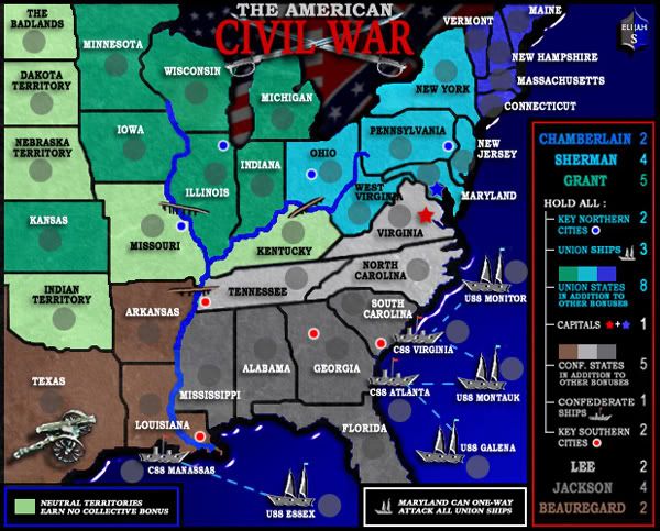
well i must also say that names is blurry,also Legend is over name Conecticut.
In legend all Bonuses is in one line except Sherman and Grant fix these.
Country Jackson,Lee have some iner Blue line.
River up have some outer light colour,but these is only up,but down river dont have any outer colour fix these.
In legend all Bonuses is in one line except Sherman and Grant fix these.
Country Jackson,Lee have some iner Blue line.
River up have some outer light colour,but these is only up,but down river dont have any outer colour fix these.

-
yamahafazer
- Posts: 211
- Joined: Fri Aug 24, 2007 9:56 am
Elijah S...on your latest version, you've changed the colour of the main legend outline to red....IMHO this doesn't work well with the overall aesthetics of the map. It stands out too much. It would still be better with the same outline as the others.
Also, the large map legend font appears to be the same size as the small map. Any reason for this? I think it would be better to have a larger size text on the legend on the larger version than the that of the smaller version. Only suggestions....
Also, the large map legend font appears to be the same size as the small map. Any reason for this? I think it would be better to have a larger size text on the legend on the larger version than the that of the smaller version. Only suggestions....

* Pearl Harbour * Waterloo * Forbidden City * Jamaica * Pot Mosbi
I changed the colors around the legends to red, white and blue. -You know how we Americans are about our flag colors.cairnswk wrote:Elijah S...on your latest version, you've changed the colour of the main legend outline to red....IMHO this doesn't work well with the overall aesthetics of the map. It stands out too much. It would still be better with the same outline as the others.
Also, the large map legend font appears to be the same size as the small map. Any reason for this? I think it would be better to have a larger size text on the legend on the larger version than the that of the smaller version. Only suggestions....
I think it somehow gives the map a little intensity and compliments the title, but I'm interested in knowing what others think about it...
As for the font sizes, the large map was enlarged directly from the same version I used to make the smaller version, and should be proportionally larger in all areas...
To Qwert's suggestions... the "bluriness" was addressed in a couple ways, including reducing the opacity of the drop shadow in the green and light blue areas.
The bonus numbers have been realigned in the main legend and the legend was moved to not cross over Connecticut.
I'll load the newest verion after this post.
Newest Version
small map - 600px wide x 483px high
large map - 700px wide x 563px high

Notable changes in this version:
-The green outline on the river in the green states has been removed and now the rivers are consistent in color and appearance.
-The fonts have been sharpened across the board.
-The bonus numbers in the main legend have all been lined to the left. -(I'm not certain that this is a better look, so may mess with this a little more)
large map - 700px wide x 563px high
Notable changes in this version:
-The green outline on the river in the green states has been removed and now the rivers are consistent in color and appearance.
-The fonts have been sharpened across the board.
-The bonus numbers in the main legend have all been lined to the left. -(I'm not certain that this is a better look, so may mess with this a little more)
-
reverend_kyle

- Posts: 9250
- Joined: Tue Mar 21, 2006 4:08 pm
- Location: 1000 post club
- Contact:

-
yamahafazer
- Posts: 211
- Joined: Fri Aug 24, 2007 9:56 am
NO. I'm done messing with the river. First of all I don't see anything wrong with it, secondly, I've changed the river about a half dozen times and still there's always someone who has an issue with it...spiesr wrote:Can you redo the river? This one looks awful...
It's a river! It's main purpose is as an impassable border. The water's blue, it follows its true geographical path...
If someone (preferably someone who's articulate enough to provide more than "it looks awful") can provide some input on exactly what they think is wrong with the rivers, I'd be happy to take another look at them.
Any advice on what can be done (a texture effect? color change?) would also be helpful... Kyle? Cairnswk? -any ideas?
Last edited by Elijah S on Sat Nov 17, 2007 4:06 pm, edited 2 times in total.
lol... Jelly? Perhaps you mean blueberry jam?yamahafazer wrote:Is it just me or dose the blue in the water look... I don't know... a little odd???
It looks more like jelly to me.
I think a lot of people are used to very flat maps, and this one, in my opinion, has a little depth to it. -(not knocking anyone else's maps here)
The effect on the water was placed a long time ago... it's actually an embossing filter which put the black area around the states, kind of like a continental shelf.
Or maybe I could change the name to West Virgin?reverend_kyle wrote:thanks for the mention on the providing input post
We need more maps based on US history and this is a great map, however, the I in west virginia blends with the border could that be moved a bit?
Hmmm.... on second thought, maybe I should move it. lol
-
Qwert
- SoC Training Adviser
- Posts: 9262
- Joined: Tue Nov 07, 2006 5:07 pm
- Location: VOJVODINA
- Contact:
Elijah S Posted: 17 Nov 2007 19:11 Post subject:
--------------------------------------------------------------------------------
NO. I'm done messing with the river. First of all I don't see anything wrong with it, secondly, I've changed the river about a half dozen times and still there's always someone who has an issue with it...spiesr wrote:
Can you redo the river? This one looks awful...
It's a river! It's main purpose is as an impassable border. The water's blue, it follows its true geographical path...
If someone (preferably someone who's articulate enough to provide more than "it looks awful") can provide some input on exactly what they think is wrong with the rivers, I'd be happy to take another look at them.
Any advice on what can be done (a texture effect? color change?) would also be helpful... Kyle? Cairnswk? -any ideas?
You know how i solve these problems-showing people several diferent style and style who people most like i put on map.
I also think that you can create better river,and you can not say that these only a river,and river also visualy must look good on map to.
-
unriggable

- Posts: 8036
- Joined: Thu Feb 08, 2007 9:49 pm

...
I really couldn't say much about some of the issues here, because I am definitely not a cartographer. However, I am not really sure why there is so much dilemma about the river. I think it's right on, actually and kind of obvious, that you can only attack where the bridges are crossing it. Sounds just a bit nit-picking to me. Elijah, earlier on, I thought you had addressed all issues with the river? I suppose once you tweak with it enough to where everyone can agree, it's "OK", there will be some other minor issue to deal with. If you like it the way the is, after all suggestions made prior to this, leave it alone!
-
yamahafazer
- Posts: 211
- Joined: Fri Aug 24, 2007 9:56 am
Ye it's not the embossing... I like that... I think it's the brightness of it as it goes into the bottom right... I'm not saying it shouldn't get brighter just it seems to get a little too bright...Elijah S wrote:lol... Jelly? Perhaps you mean blueberry jam?yamahafazer wrote:Is it just me or dose the blue in the water look... I don't know... a little odd???
It looks more like jelly to me.
I think a lot of people are used to very flat maps, and this one, in my opinion, has a little depth to it. -(not knocking anyone else's maps here)
The effect on the water was placed a long time ago... it's actually an embossing filter which put the black area around the states, kind of like a continental shelf.
But hey it's not importan.. if I'm the only one who thinks this leave it how it is... I meen.. what difference dose it make..

Updates
large version 700px wide x 463px high
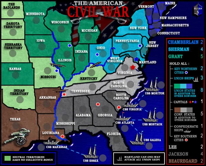
Recent Changes-
-All territories, except the neutrals, now have white type.
-A texture was added to the ocean and rivers.
-The Generals in the Legend have been moved to the left margin.
Lots of recent input, so I'll get straight to what I've done and what I'm working on.
Andew B, Yeti-c -
The blurry type has been a concern of mine too, and something I've been trying to sharpen.
In this version I've approached that in a couple ways.
I changed the black font in Lee and Sherman's states to white, which also leaves only the neutrals with black font and seems to work better.
In the legend I've enlarged the type and aligned the generals to the left margin.
I think any burriness now would be with the "In addition to other bonuses" lines, which I'm addressing.
Yamahafazer -
I've added a slight texture to the rivers and ocean.
I think this reduces that "jelly" look you referred too and gives the ocean some added depth.
Qwert and Spiesr -
The rivers looked good to me but I added the same texture used in the ocean to give them a subtle difference.
If you could give me some specific reason you don't like them, I'd have something to go by, otherwise I think we should move on...
Unriggable -
Louisiana can attack Mississippi and vice-verse. I know the river running completely through it could be confusing, but I think necessary in keeping with somewhat accurate geography.
The black border area between Louisiana and Mississippi and the way the type "Louisiana" is positioned across both sides of the river should indicate that these two states have a shared border.
-Ultimately, if a player is in doubt, the drop-down choices when attacking from one of them will clear it up.
Reverend Kyle -
In changing the color from black to white it fixed the legibility of West Virginia.
Cairnswk -I see your point about the legend colors and will be starting a poll with the one you preferred vs. the red, white and blue one I recently submitted.
In my opinion, the colored one is more intense and the other more aesthetic, but either one works for me.
-
Qwert
- SoC Training Adviser
- Posts: 9262
- Joined: Tue Nov 07, 2006 5:07 pm
- Location: VOJVODINA
- Contact:
Suzy1
Joined: 12 May 2007
Posts: 13
Posted: 18 Nov 2007 06:03 Post subject: ...
--------------------------------------------------------------------------------
I really couldn't say much about some of the issues here, because I am definitely not a cartographer. However, I am not really sure why there is so much dilemma about the river. I think it's right on, actually and kind of obvious, that you can only attack where the bridges are crossing it. Sounds just a bit nit-picking to me. Elijah, earlier on, I thought you had addressed all issues with the river? I suppose once you tweak with it enough to where everyone can agree, it's "OK", there will be some other minor issue to deal with. If you like it the way the is, after all suggestions made prior to this, leave it alone!
River is not Minor issues,these is not only terittory barrier,like Elijah say.Every thing on map must look good,well for most people,but if more people say that these river must be much better,then he must do something with that.
-
Qwert
- SoC Training Adviser
- Posts: 9262
- Joined: Tue Nov 07, 2006 5:07 pm
- Location: VOJVODINA
- Contact:
Visualy these river is very low,and like i say before you must show more diferent style of river,and people can se who style is good.elijah
Qwert and Spiesr -
The rivers looked good to me but I added the same texture used in the ocean to give them a subtle difference.
If you could give me some specific reason you don't like them, I'd have something to go by, otherwise I think we should move on...