[Official] British Isles REVAMP [Quenched]
Moderator: Cartographers
Forum rules
Please read the Community Guidelines before posting.
Please read the Community Guidelines before posting.
-
PerkinsRooster
- Posts: 90
- Joined: Wed Feb 21, 2007 11:05 pm
- Gender: Male
- Location: Canada


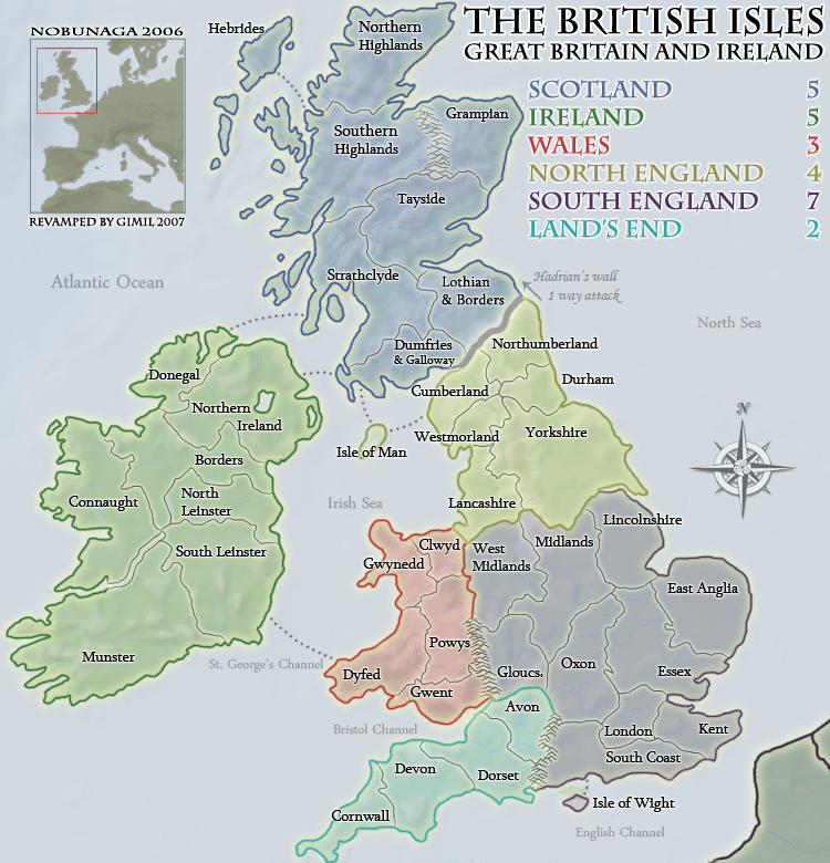
central england still lacks areas that are recognisably the east midlands (excluding lincolnshire) and west midlands government regions.iancanton wrote:as mentioned before, can we rename “cheshire” as “west midlands”, then expand west midlands to include staffordshire, warwickshire, herefordshire and worcestershire, then redraw the southern england continent to exclude cheshire (which is culturally part of the north of england), then expand “lancashire” to include cheshire? the “west midlands” territory then becomes identical to the government office region of the same name.
a similar renaming can be done for “midland” to “east midlands”, which will include derbyshire, nottinghamshire, leicestershire, rutland and northamptonshire, again following the government office regional boundary (excluding lincolnshire). in this way, the borders have some basis in reality, rather than being drawn at random.
http://www.statistics.gov.uk/geography/gor.asp
ian.
the isle of mull has somehow managed to stick to the south-west corner of strathclyde, as has anglesey to the north-west corner of gwynedd.
ian.
-
Night Strike

- Posts: 8509
- Joined: Wed Apr 18, 2007 2:52 pm
- Gender: Male

-
gimil

- Posts: 8599
- Joined: Sat Mar 03, 2007 12:42 pm
- Gender: Male
- Location: United Kingdom (Scotland)
dumfires and galloway is the only one i see. I have fixed it and it will be up in the next draftNight Strike wrote:There are several territories, such as Dumfries & Galloway, on the small map whose names take up the entire territory. Where are the army numbers going to be (because it could get very crowded in that specific area)??
What do you know about map making, bitch?
Top Score:2403natty_dread wrote:I was wrong
-
Night Strike
- Posts: 8509
- Joined: Wed Apr 18, 2007 2:52 pm
- Gender: Male
-
WidowMakers
- Posts: 2774
- Joined: Mon Nov 20, 2006 9:25 am
- Gender: Male
- Location: Detroit, MI
I think that when you have territory names with two lines (Northern Ireland, Southern Highlands, North Leinster, etc), the text should be centered over itself. Right now they look scattered and maybe left justified.
I would suggest making all of the text center justified to keep everything consistent and neat.
WM
I would suggest making all of the text center justified to keep everything consistent and neat.
WM

-
gimil
- Posts: 8599
- Joined: Sat Mar 03, 2007 12:42 pm
- Gender: Male
- Location: United Kingdom (Scotland)
that will be done also, im sure i remeber you saying this and i forgot about itWidowMakers wrote:I think that when you have territory names with two lines (Northern Ireland, Southern Highlands, North Leinster, etc), the text should be centered over itself. Right now they look scattered and maybe left justified.
I would suggest making all of the text center justified to keep everything consistent and neat.
WM
What do you know about map making, bitch?
Top Score:2403natty_dread wrote:I was wrong

-
WidowMakers
- Posts: 2774
- Joined: Mon Nov 20, 2006 9:25 am
- Gender: Male
- Location: Detroit, MI
Actually I think you could. Make the wall in the style of the mountains (line color and glow). Like this. It is subtle but still looks like a wall and fits the theme of the map.gimil wrote:I cant make it look like a wall because of the style of the map, it wouldnt fit.spiesr wrote:Can you make Hadrian's Wall look like a wall, like how the original did?


-
gimil
- Posts: 8599
- Joined: Sat Mar 03, 2007 12:42 pm
- Gender: Male
- Location: United Kingdom (Scotland)
I tired to get them to merge better, you still not happy with them? Then ill make them all greenedbeard wrote:are you also going to extend the green border for the river between Connaught and Munster? It looks weird just having the thick green stop randomly.
What do you know about map making, bitch?
Top Score:2403natty_dread wrote:I was wrong
-
gimil
- Posts: 8599
- Joined: Sat Mar 03, 2007 12:42 pm
- Gender: Male
- Location: United Kingdom (Scotland)
I was trying not to make the river any thicker than it needed to beedbeard wrote:well it's the thickness as well not just the colour. I just don't see a good reason why it should be any different at that area. It should be uniform throughout
What do you know about map making, bitch?
Top Score:2403natty_dread wrote:I was wrong

I love the subtleness of the map, it looks really good.
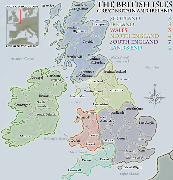
On the box of The British Isles zoomed out, above "Revamped By Gimil, 2007", there is a difference between the large and small. On the small map, the box either has a drop shadow or a extra thick left border, but the left border on the large map is normal.
Again, the map looks great.
--lanyards
On the box of The British Isles zoomed out, above "Revamped By Gimil, 2007", there is a difference between the large and small. On the small map, the box either has a drop shadow or a extra thick left border, but the left border on the large map is normal.
Again, the map looks great.
--lanyards

WANT AN ADVANTAGE WHILE WORKING TOWARDS MEDALS?
https://www.conquerclub.com/forum/viewt ... 9&t=226714
-
gimil
- Posts: 8599
- Joined: Sat Mar 03, 2007 12:42 pm
- Gender: Male
- Location: United Kingdom (Scotland)
I see it, its just an extra px in lenght, will be fixed next update.lanyards wrote:I love the subtleness of the map, it looks really good.
On the box of The British Isles zoomed out, above "Revamped By Gimil, 2007", there is a difference between the large and small. On the small map, the box either has a drop shadow or a extra thick left border, but the left border on the large map is normal.
Again, the map looks great.
--lanyards
What do you know about map making, bitch?
Top Score:2403natty_dread wrote:I was wrong
no worries, just draw it so the land becomes covered up a bit more instead of the river.gimil wrote:I was trying not to make the river any thicker than it needed to beedbeard wrote:well it's the thickness as well not just the colour. I just don't see a good reason why it should be any different at that area. It should be uniform throughout
-
gimil
- Posts: 8599
- Joined: Sat Mar 03, 2007 12:42 pm
- Gender: Male
- Location: United Kingdom (Scotland)
if it makes you happyedbeard wrote:no worries, just draw it so the land becomes covered up a bit more instead of the river.gimil wrote:I was trying not to make the river any thicker than it needed to beedbeard wrote:well it's the thickness as well not just the colour. I just don't see a good reason why it should be any different at that area. It should be uniform throughout
What do you know about map making, bitch?
Top Score:2403natty_dread wrote:I was wrong