
Yeah, hijacking a map making topic is a little rude.
Back on subject, I don't really see what the problem is with White as it is now, I guess it all falls under what you want this map to be. You obviously don't want white to be the all important feature of the map worth 10 bonus or something or you would have done that.
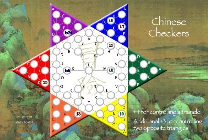
I would view the focus of the map to be taking and securing the colored triangles. Experienced players should see this map and know how to use white to secure triangles. Only the newer players would be going in the circular fashion you are afraid of I think. I would prefer it if things were just a simple +4 for triangles and leave it at that.
Chinese Checkers [Quenched] May '07 re-opener?
Moderator: Cartographers
Forum rules
Please read the Community Guidelines before posting.
Please read the Community Guidelines before posting.

czech checkers
The new lettering/labels are much better, but there is still room for confusion. I've been trying to think of something better, but don't have it yet (something like naming the white periphery based on the colored triangle it is next to...).
My concern about playability is that some player(s) will start with much better placement than others (more armies in the outer triangles, more grouped) and will be able to jump on several of those +2 bonuses very fast... which will give them a quick edge on the +4, etc. I don't mind bonuses for small groups of countries, but they should be small bonuses or the game will be over in the first turn or two.
Also, one of the reasons to move into the white space would be to get your 12, 15, 18 country bonuses. If continent bonuses are too large then they lower the value of claiming more countries. I'd vote for small triangle +1 and large triangle +2 or +3.
Another thought: what if continents overlapped? So the small blue triangle is worth +1, full blue triangle is +2 and adding white A, C, H and I gives you +3? Of course White A would also be needed for the large purple triangle. (edit: I think Molacole posted this idea too).
For the graphics I'd kinda like to see something more muted like an old ink painting with the washed ink effect for mountains, etc... do a google image search for "Chinese painting" or something like that and you'll see examples of what I'm talking about. I could see the whole background being black and white (or toned like a brownish ink?) with only the board itself having bright colors?
Hope this helps. I'm looking forward to trying this one.

Re: czech checkers
Yeah, I think going back to the straight +3 or +4 for a triangle eliminates some 'luck of the draw' factor.EvilOtto wrote:My concern about playability is that some player(s) will start with much better placement than others (more armies in the outer triangles, more grouped) and will be able to jump on several of those +2 bonuses very fast... which will give them a quick edge on the +4, etc. I don't mind bonuses for small groups of countries, but they should be small bonuses or the game will be over in the first turn or two.
I love this idea - gets back to the understated background I wanted to start with, and I can lose that stupid dragon. I really want to hang on the bright board, however - after all this is taken from a children's game. Again, later this week.EvilOtto wrote:For the graphics I'd kinda like to see something more muted like an old ink painting with the washed ink effect for mountains, etc... I could see the whole background being black and white (or toned like a brownish ink?) with only the board itself having bright colors?
I'd love to see a map with overlapping territories - maybe a series of venn diagrams? Sounds like another map entirely though. Somebody other than I should take the idea and run with it.EvilOtto wrote:Another thought: what if continents overlapped? So the small blue triangle is worth +1, full blue triangle is +2 and adding white A, C, H and I gives you +3? Of course White A would also be needed for the large purple triangle. (edit: I think Molacole posted this idea too).

sample showing how three continents converge to make seven territories. this shit writes itself.

-
Sargentgeneral

- Posts: 379
- Joined: Thu Nov 16, 2006 11:55 pm
- Location: On Conquerclub, duh!
Changes to this image:
The background image dates from the Song Dynasty, 12th Century - public domain, no copyright issues. Thoughts on the new look? Are the primary color triangles hideous against the subtle background?
The kanji in the center I like simply because it means "risk," but I could part with it if everyone things it sucks.
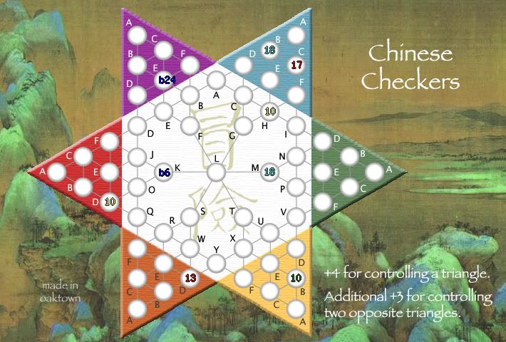
Having read the feedback both ways, I'm back to the straight bonuses for the triangles. I'm keeping the extra bonus for expanding across the map, since it means you're balsy and holding more borders.
-
btownmeggy

- Posts: 2042
- Joined: Thu Jan 04, 2007 1:43 am
-
AndyDufresne

- Posts: 24919
- Joined: Fri Mar 03, 2006 8:22 pm
- Location: A Banana Palm in Zihuatanejo
- Contact:
I agree.AndyDufresne wrote:The background is interesting, but the clash I can't stand. I know you mentioned you would like to keep the bright feel, as it's a game...but I think...if you gave everything an old classic 'wood' feel...with faded painted colors...might fit better...and look like a nice theme piece.
--Andy
-
btownmeggy
- Posts: 2042
- Joined: Thu Jan 04, 2007 1:43 am
I'd keep the triangles as the same basic colors, but tone them down in keeping with the background. Antique them a bit.AndyDufresne wrote:The background is interesting, but the clash I can't stand. I know you mentioned you would like to keep the bright feel, as it's a game...but I think...if you gave everything an old classic 'wood' feel...with faded painted colors...might fit better...and look like a nice theme piece.
--Andy
The contrast is a bit too... contrasting.
Enough said... that's my next project. I knew the primary colors were in trouble as soon as I dropped in the new background.btownmeggy wrote: I'd keep the triangles as the same basic colors, but tone them down in keeping with the background. Antique them a bit.
(grumble) stupid evilotto and his classy looking riskopoly (/grumble)
-
AndyDufresne
- Posts: 24919
- Joined: Fri Mar 03, 2006 8:22 pm
- Location: A Banana Palm in Zihuatanejo
- Contact:

OK, toned down the colors. Some are lifted directly from the colors in the painting. Better, yes?
I'm still toying with ways to make the paint look more weathered. They've added a lot of features to Photoshop since I last used it in 1995!
In addition, I'm thinking about removing the center (Y) space entirely and allowing attacks directly across. This would further encourage attacks through the center, as there won't be a bottleneck, yet I also appreciate the fun of having a strategically valuable center space. Thoughts are welcome, as always.
Last edited by oaktown on Thu Jan 18, 2007 2:10 am, edited 1 time in total.


I would like the dragon back, and another interesting picture, over a wodden table... this picture is like an artistic one, but doesnt fit well to a board of a world domination game, I think. Hmmm, maybe a battle picture would be great 
And, although they are pretty obvious, the connections are almost invisible in some triangles.
And, although they are pretty obvious, the connections are almost invisible in some triangles.

-
Lone.prophet
- Posts: 1467
- Joined: Thu Oct 12, 2006 4:37 pm
- Location: Your basement Muahaha


-
Guiscard

- Posts: 4103
- Joined: Fri Dec 08, 2006 7:27 pm
- Location: In the bar... With my head on the bar
The new background is perhaps a little much. I thought the old dragon was OK, maybe try adding a new image to your old board?
qwert wrote:Can i ask you something?What is porpose for you to open these Political topic in ConquerClub? Why you mix politic with Risk? Why you not open topic like HOT AND SEXY,or something like that.
I could, but then it increases the map size without increasing the playing area. I also played with tipping the entire thing back and scaling it to give a sense of 3-d perspective, but I decided playability was more important.Lone.prophet wrote:could u turn it a bit so it doesnt look so stiff
As for the dragon, the more I looked at it the more I thought it was just too cheesey - I'm glad to see it gone. The feedback on the new color scheme/background has been more positive than nagative, but I'll keep checking in to see how the community feels.
Maybe I need another poll - anyone know why it is impossible to set an expiration date on the polls? I am certain that I set a two day limit on this poll (just as I was certain that I set the last poll for 3), and that was four days ago.
-
DublinDoogey

- Posts: 329
- Joined: Tue Feb 28, 2006 7:03 pm
- Location: Wisconsin
I think that bringing the board down to the level of the background, like vertically lowering it into it... if that makes sense, might help the background and the board blend a little bit more.
Maybe you could put some crimson blood stains on it for those who don't think its battle-y enough, it can be someone's board that was pierced, fell on top of it, and died... hm, maybe not that's kinda morbid.
Anyway, I like it, especially with the toned down colors.
Maybe you could put some crimson blood stains on it for those who don't think its battle-y enough, it can be someone's board that was pierced, fell on top of it, and died... hm, maybe not that's kinda morbid.
Anyway, I like it, especially with the toned down colors.

i reaaalllly like the kanji on the board. its perfect. and the makeover lookes really nice- i really liked the old bright version so was apprehensive, but it works 
not just u, could you sumhow make an inset w/ the legend?johloh wrote:with the new background I find the text in the legend a bit hard to read because of the light text on the light mountains.
maybe its just me....
Do you need an excuse to have a war? I mean, who for? Can't you just say "You got lots of cash and land, but I've got a big sword, so divy up right now, chop chop."
Terry Pratchet
Terry Pratchet
I like it, but agree the center white color stands out a bit; disconnected. The center should be the same texture to match the colored triangles.
I like the background. Sometimes war games should be a bit serene. This is the game the generals play far from the battle field.
I think it would look funny without the center spot... all those lines crossing in the middle would be confusing.
I like the background. Sometimes war games should be a bit serene. This is the game the generals play far from the battle field.
I think it would look funny without the center spot... all those lines crossing in the middle would be confusing.