Asia Map Revamp please
Moderator: Cartographers
Forum rules
Please read the Community Guidelines before posting.
Please read the Community Guidelines before posting.
-
The Bison King
- Posts: 1957
- Joined: Thu Aug 27, 2009 5:06 pm
- Location: the Mid-Westeros
Re: Asia Map Revamp please
An easy way to fix pixelation is to just run the blur tool over the spot for a second.

-
porkenbeans

- Posts: 2546
- Joined: Mon Sep 10, 2007 4:06 pm
Re: Asia Map Revamp please
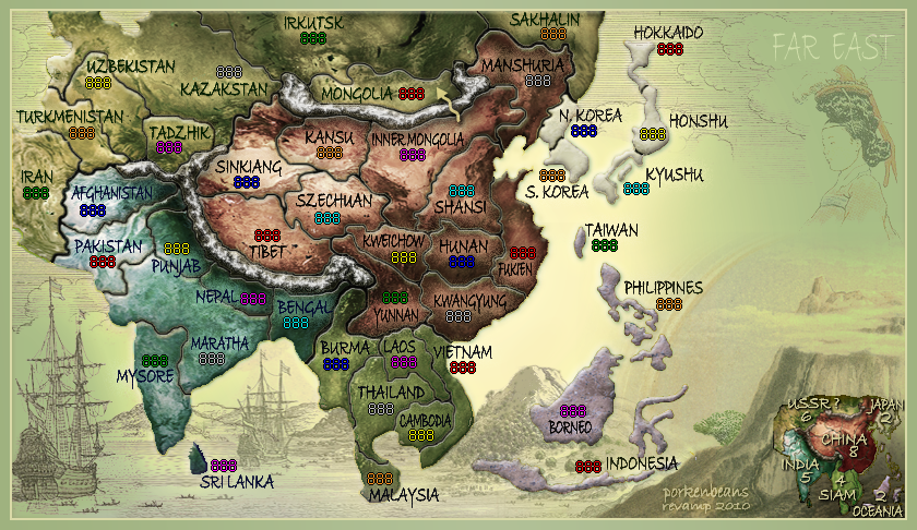
How on earth can you say my labels are pixelated ? There is a very faint outside glow with noise, that I think you are seeing. Talking about labels, what is up with your labels. They are larger than mine, but still look like crud.natty_dread wrote:- territory labels: this may just be the font, but the letters appear pixelated. I'd suggest some other font if you cannot fix the pixelation of this font.
- land/sea borders - mostly on the india bonus area, if you look closely, you can see the pixelation. Zoom in if you can't see it otherwise. It's most notable on sri lanka.
- the minimap edges
I'm not "frickin kidding" you, I'm trying to offer constructive criticism.
But seriously, My aspiration was to make the labels blend in as much as possible, and NOT stand out like most maps. I colored the text to a darker shade of the bonus region that it is located in, and I threw on an outside "colored" glow with noise, to that end. I think that I pulled it off just as I hoped for.
The problem with your labels is the bevel that you decided to use. For the most part when you are working with such small objects like labels, it is better to NOT use bevels. You can use drop shadow and outer glow along with a stroke if you need to. Those labels are horrible, and that is not even mentioning the problem you will have when you need to scale it down for the small version.
- Click image to enlarge.

-
natty dread

- Posts: 12876
- Joined: Fri Feb 08, 2008 8:58 pm
- Location: just plain fucked
Re: Asia Map Revamp please
Porkenbeans, I'm not going to enter a damn pissing contest with you again. If you can't take criticism like a man, you shouldn't be making maps, period.

-
natty dread
- Posts: 12876
- Joined: Fri Feb 08, 2008 8:58 pm
- Location: just plain fucked

Re: Asia Map Revamp please
Let me put the record straight... there are currently no plans to revamp the Asia / Far East map.
--MrBenn
--MrBenn

PB: 2661 | He's blue... If he were green he would die | No mod would be stupid enough to do that